In digital marketing, the general goal of any landing page created for brands in Nigeria is to convert site visitors into sales or leads.
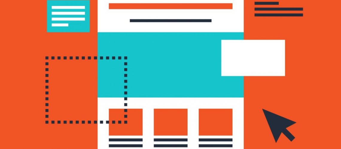
A landing page is a single web page that appears in response to clicking on a search engine optimized search result or an online advertisement. The landing page is seen as the lead capture page and its importance cannot be overemphasized.
Get 50% Discount to Master ALL Aspects of Digital Marketing That Can Earn You $2,500 - $5,000 a month (Even if you are a complete beginner!)
Our students that intentionally implement what they learn from our digital marketing course make back the entire course fee within a single month or more after completing our course because our course gives them many income generating options with unlimited earning potential with no age or location barrier. The best part is no technical skills are required.
An opportunity to change your lifestyle and make money working from anywhere in the world. The results our students get from our digital marketing course prove this could be applied to any market or country and that it is designed for any skill level and work background.
*By signing up, you agree to our privacy policy and terms of service.
Identify your audience
Whenever you are designing your landing page always makes sure that it talks to the audience. Try to figure out the problem, the need or the wants of your target audience.
Also write the copy with specific person in mind. If you succeed in driving traffic to your landing page through many advertisements. And run different Ads, create many different pages. They can m,mostly be the same, but with different headline and tweaks in the copy.
Click here to learn the easiest, quickest way to grow your business profit online. It's Free.
Define your Most Wanted Action (MWA)
The Most Wanted Action is one action people should take whenever they land on your page. This is actually dependent on your product and strategy. Generally, if your product is somewhat expensive and complicated, it is better to just get their email address and start building as relationship with them from there.
However, if you are selling your products at cheaper rate, or you sell products like wine or newspaper subscription, it makes more sense to go directly for the sell. If your product is a software for instance, I recommend offering free trial version.
Define your message
Now that you have known your audience, the problem they have and the solutions too. This is the time for you to craft a comprehensive message. The truth remains that, there is no sure or certain way what will work. All you need to do is to create a hypothesis and split test them.
Give your landing page a good design
Now you already know the Most Wanted Action, you understand and know your audience, you have the hypothesis. Mind you, the hypothesis should appeal to them. Now the issue is, how do you design a landing page?
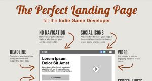
- What you need to do is to include the things that you need in the landing, and what are the things?
- Your company’s logo
- An appealing headline that speaks to the audience
- A brief explanation of your offer just above the fold (The fold is the portion that can be seen without the average user having to scroll down)
- A longer explanation of your offer below the fold if you find it deem to do so (Usually the email address and the name, but do you actually need the name?)
- A buy or a sign up button depending on your predefined most wanted response link to your privacy policy (To keep the people on the page, this will open up in a pop up window and not a load in new page)
However, it is good to know that the more field you request a visitor to feel the more frictions you are likely to cause, therefore the less people will fill the form.
Thing that you should leave out when designing your landing page
- A navigation menu- Remember to focus on only your offer
- Links to other parts of your website such as “about us page”
- Pictures or images that doesn’t relate to what you offer will only bring distractions.
- Hard to read text, anything less that 12px is not recommendable.
- Any links along the lines of “click here to subscribe” or click here to read more”. If you cannot cram all your content into the upper folder of your landing page, just let the user scroll down. Scrolling is always better than clicking to the next page.
- Scary forms with needless fields such as fax, title etc.
- Clear field buttons
Mind you, there is always exceptions and you usually cant copy best practices to use on your site, however this advice given here should be your starting point. Just try as much as possible to get the essentials first and tweak from there.
Putting it all together
Once you have created your page layout and copy, the next thing is to put together and upload it on your website. We recommend using simple URLS that users can easily recognize. Sometimes it’s a good idea to register a whole new domain for your landing page altogether- exact keyword domains get more PPC traffic.
For instance, if your website is about job offers to work on an oil rig, your URL could either be www.OilRigJobOffer.com or www.Somesite.com/oilrigjoboffers. Such URLS often generate better than normal clicks through rates on targeted Google. PPC Ads. A searcher who types oil rig job offers is more likely to click on an Ad with a keyword URL.
Did you enjoy this article? We give away 98% of our digital marketing resources for FREE. Right now, I want to prove that to you, join our community right now for FREE access to our actionable digital marketing resources to help you increase your sales and customer base online faster. It is absolutely FREE.


