You cannot improve conversion rates relying on gut feelings. Gut instincts need to be put aside when it comes to conversions. The only thing that works is testing various angles, and in this article we are bringing various tests and statistics from highly respectable sources that prove what works and what doesn’t work.
So let’s get into the list of most popular blunders Nigerian websites make when trying to increase conversions:
Using Image Sliders
While sliders can make your website very attractive they actually harm your conversion rates. First of all they drive your SEO optimization efforts down. How does it do this?
[bctt tweet=”While sliders can make your website very attractive they actually harm your conversion rates.”]
Get 50% Discount to Master ALL Aspects of Digital Marketing That Can Earn You $2,500 - $5,000 a month (Even if you are a complete beginner!)
Our students that intentionally implement what they learn from our digital marketing course make back the entire course fee within a single month or more after completing our course because our course gives them many income generating options with unlimited earning potential with no age or location barrier. The best part is no technical skills are required.
An opportunity to change your lifestyle and make money working from anywhere in the world. The results our students get from our digital marketing course prove this could be applied to any market or country and that it is designed for any skill level and work background.
*By signing up, you agree to our privacy policy and terms of service.
Well, standard SEO practice states that there should be one H1 tag per page, and it should appear before any other tag, but when a slider is used, there would be as many H1 tags depending on the amount of images. So you have one H1 tag per image.
This affects the keyword distribution mechanism of your page and also affects your page ranking.
It also decreases your conversion rates simply because according to Jacob Nielsen, many people fail to click on the image sliders, even though they might see the wordings, people fail to read it, which shows that image slider’s fail at capturing people’s attention.
Click here to learn the easiest, quickest way to grow your business profit online. It's Free.Keeping commitment secure
Most people will argue that a one step opt – in will absolutely work better than two step opt-ins, and before research and testing it myself, I would have agreed with you, one step opt-in takes less time, less effort and is simpler, so common sense should say one step opt-ins trump two step opt-ins.
This is expressed a lot more in Robert Ciadini’s book “Influence: The Psychology of persuasion”, when a small commitment is made towards a purpose, it only human nature to want to make an extra commitment.
To do this effectively on improving your conversions, first of all, you need to ensure that your headlines are very grabby and attentive. Your goal is tap into your visitor’s wants and likes.
[bctt tweet=”Your goal is tap into your visitor’s wants and likes.”]
Remove all forms of distractions
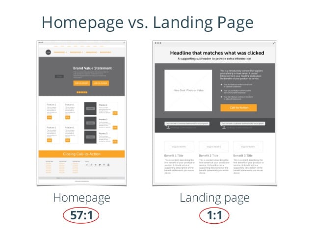
Follow the rule of KISS, which literally means keep it simple stupid, for your best work to come out you need to ensure your adhering to simplicity. Your graphic designer might not agree with this tip, but tests show that too much graphics can lend to decrease in conversions.
When landing pages are overloaded with too much texts, images, forms, animations and so forth, it’s very easy for the prospect to be confused about his next steps. Potential customers can take off simply because they have no idea what action’s they are to take.
- Keep your text to a bare minimum, go straight to the point and make it count
- Use clear and relevant images
- Ensure your form is short and sweet
- Give a freebie to get people to fill the forms
- Use arrows to lead people on the next steps
- Test! Test!! Test Always!!!
Thinking your customers are not smart enough
When pushing offers, don’t be unrealistic about the offers. an offer to increase sales by 20% is a bit more believable than a sure increase to 100% and doubling of sales figure, may be seen as unrealistic.
But when you have two offers and one seems unrealistic, run A/B split tests on both offers and check out the responses from both angles to see which one’s your prospects respond to best.
Most times, when your offer appears too good to be true, it usually appears as such and your customers will end up up clicking somewhere else.
Promoting Ads to Homepages
According to hubspot, Statistics shows 55% of visitors spend less than 15 seconds on your website, this is made worse when you send traffic directly to your homepage. It’s a terrible mistake and it’s one of the primary blunders you must avoid when trying to increase conversions for your website, except your homepage corresponds with your ad.
There are no two ways about this, to increase conversions you have to build a landing page that corresponds with your ad, along with various types of traffic.
Now if your homepage corresponds well with your ad, then you are good to go.
Why does this work? Well think about it
Let’s say you are a consumer, you just bought some bad fuel into your car and now you’re searching google online for places to buy fuel treatment in Nigeria.
So you see an Ad on google from an Online Auto e-Commerce firm selling petrol treatment additives. You are excited, you bring out your mastercard debit card in amazing excitement as you click on the Ad.
Only to your amazing disappointment you end up in some homepage where tyres, car seats and car mirrors are being sold. No sign of petrol treatment additives, how disappointed will you be, well you’ll probably continue your search on google and close that page.
That’s what you’re customer’s face when you build an Ad that doesn’t correspond with your landing page, always ensure that your unique ads correspond with unique landing pages.
But, let’s say my search leads me to a page where all I see are various brands of petrol treatment additives, my appetite is explored and my chances of converting into a customer are a lot better.
Not conducting A/B tests
You remember that saying, “what you don’t know can’t kill you” doesn’t apply here, infact the opposite is very accurate, cause the truth is, in this business of conversion and sales, “what you don’t know will harm you”.
For example, you may think that landing pages with images convert better than landing pages without images, but the opposite is actually true.
The split-test below done by hubspot.com shows one original landing page and its variation, with the only difference being one has an image and one does not. Can you guess which one performed better?
like most people, if you guessed that Version B won, you are wrong. Version A surprisingly had a 24% increase in submissions without using an image on the page.
This just goes to show the power of doing A/B tests, you can rely on a much more respected form of data and apply the results of your test into your marketing campaigns.
Create Compelling CTA’s
Before composing your call to action really think about what your customers really want, put yourself in your their shoes, what do they want out of the opt-in.
If you are offering a downloadable PDF, then your call to action should be “Get Downloadable PDF”, likewise if you are offering 20% off, then your CTA should be “Get 20% off”.
Make sure you carry out A/B splt tests on your CTA’s, try different length sizes, button colours, CTA length and so on
Communicating in an unfocused manner
As a digital marketer, it’s important that your message has some consistency built into it. The focus of your messages should be seen through your content. At Digital Marketing Skill Institute we create our articles around incredible topics to nurture our readers.
[bctt tweet=”At Digital Marketing Skill Institute we create our articles around incredible topics to nurture our readers.”]
Think of it like a series movies, let your communication have a focused message that loops from one week into another. Same thing goes for you email marketing, social media posts etc.
This can be very hard to implement as a digital marketer especially when you have a lot of communication channels to deal with, the solutions is to focus on those channels that are driving conversion and engagement with your customers and build a series of focused contents for these channels.
Click here to learn the easiest, quickest way to grow your business profit online. It's Free.Misuse of testimonials
Social proof is extremely important during conversions, people like to know that other people like them have carried out the required action. If i’m trying to purchase a purse and I see 500 people have already purchased the purse and they loved it, that will contribute immensely to my decision making criteria.
What if you don’t have 500 customers, well do you have five or maybe just two, you can request for their logo’s and put them on your website.
Also you can request for a testimonial from them, infact go the extra mile by writing out the testimonials and having them approve it. this way you save them stress from writing testimonials and all you need is their YES and go ahead approval.
In conclusion
The most important principle when it comes to conversions, and we have said it many times in this article already, can you guess it?
Well…
The most important thing is to narrow your focus and start thinking like your prospects. once you can achieve that, you stand a higher chance of success.
[bctt tweet=”The most important thing is to narrow your focus and start thinking like your prospects. once you can achieve that, you stand a higher chance of success.”]
Did you enjoy this article? We give away 98% of our digital marketing resources for FREE. Right now, I want to prove that to you, join our community right now for FREE access to our actionable digital marketing resources to help you increase your sales and customer base online faster. It is absolutely FREE.
