At Digital Marketing Skill Institute, We have help passionate small business owners and web marketers with digital marketing strategies on a daily basis. I’ve seen it all. I’m no stranger to the good, the bad, and the ugly.
First off, what do you understand by conversion?
A conversion is the most important factor to the success of your online marketing strategy and goals. It means getting your website visitors to do what you want them to do, whether your visitors are buying your product, sign up for your newsletter, register for a webinar, download a whitepaper, or fill out a lead/contact form.
Click here to learn the easiest, quickest way to grow your business profit online. It's Free.Having a marketing website is a moot point if it doesn’t present conversion opportunities, i.e., generate leads and close customers.
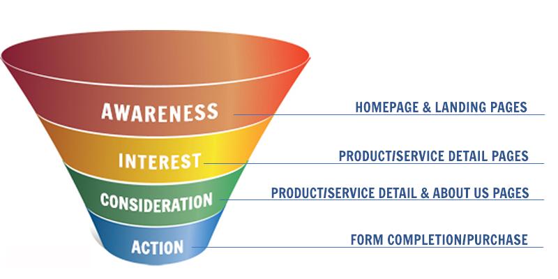
Second, what is a conversion funnel?
It’s the process of getting visitors to your site and then using various marketing techniques to convert them into leads or customers. It’s making your website work for you as a sales tool, not just an informational brochure.
Here’s an excellent graphic from HubSpot:
Get 50% Discount to Master ALL Aspects of Digital Marketing That Can Earn You $2,500 - $5,000 a month (Even if you are a complete beginner!)
Our students that intentionally implement what they learn from our digital marketing course make back the entire course fee within a single month or more after completing our course because our course gives them many income generating options with unlimited earning potential with no age or location barrier. The best part is no technical skills are required.
An opportunity to change your lifestyle and make money working from anywhere in the world. The results our students get from our digital marketing course prove this could be applied to any market or country and that it is designed for any skill level and work background.
*By signing up, you agree to our privacy policy and terms of service.
Whenever I first talk to any of our new users and try to get them on the path to web marketing success, I immediately take a look at their website to see if their pages have a couple of items that are crucial for increasing conversions.
Immediately I check to see if they have a content management system (CMS) that allows them to add/edit content on their website. The next thing I’ll check on the actual website is how do their current page titles and meta descriptions look?
Click here to learn the easiest, quickest way to grow your business profit online. It's Free.Second, do their pages contain nice headlines? Third, are they using calls-to-action? Finally, do they have contact/lead generation forms?
Each of these items can be optimized to increase the conversion rate on your small business marketing website. I’m going to show you how with the help of some real world examples.
Check your page title tags and meta descriptions
Every page of your website should contain a keyword rich title tag and a meta description. What are those things? These items are often the first impression your potential visitors get of your company in the organic search results. This means it’s important to use words in these fields to make them click through. More on that later.
Title tags and meta descriptions interpret the content of your pages to the search engines and visitors, so they know what the content of your page are all about. To optimize your own, focus on these three things:
1) Make each title tag and meta description unique
Each title tag and meta description needs to be different from other tags on your site, with particular emphasis on the first words.
Place your keywords front and forward here. For example, if you are optimizing your page for a produce delivery service in Raleigh, your title tag could be:
Raleigh Produce Delivery Service | Company Name Produce Delivery
Your meta description for this page could be:
Need a quality delivery service in Raleigh? Contact us today.
2) Keep them short
Your title tags are truly the place to keep it short and concise.** A good rule of thumb is about 70 characters or less (including spaces), so be thoughtful in coming up with a title that represents your page. Meta descriptions should be about 120-150 characters or less.
3) Remember your visitors
The effort you’ve made in #1 & #2 will help your page appear in the search engine results page (SERP), but remember, now you need to appeal to a real person and get them to click on the result to your page. Use action verbs like “Meet Our Farmers and Produce Delivery Staff” and use your company name to encourage trust.
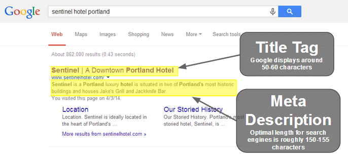
Click here to learn the easiest, quickest way to grow your business profit online. It's Free.Here is a great example of a well-optimized title tag and meta description shown from the search engine results page point-of-view:
As you can see, the keywords online video and email marketing are towards the front of both the title tag (the blue link) and the meta description (the text below the green URL).
If I wanted to add online video to my email marketing strategy, I would probably click through to see what this page has to offer.
2) Write and test your headlines
Headlines are the next part of the journey down the conversion funnel. They’re what your visitors first read once they land on your pages from the SERP.
You only have a few seconds to pique their interest, so make sure you spend some time thinking about what you’re going to say.
Consider the 50/50 Rule of Headlines: you should pay half of the entire time it takes to write a piece of compelling content on the headline.
Click here to learn the easiest, quickest way to grow your business profit online. It's Free.Think about what you’re trying to tell your readers. What do they want to hear about? What’s trending in your industry right now? How can you lure them in to read the rest of your content and get them to perform your desired action?
The key is providing the reader with a reward for reading your body copy. Don’t just sell, sell, sell. You’re talking to people, not machines.
The copywriting trainers at American Writers & Artists teach The Four U’s approach to writing headlines:
Headlines, subheads and bullets should:
1) Be USEFUL to the reader.
2) Provide them with a sense of URGENCY.
3) Convey the idea that the main benefit is somehow UNIQUE.
4) Do all of the above in a ULTRA-SPECIFIC way.
Your headlines should include keywords relevant to the body content, so be sure to include those.
Lets say I’m the owner of a coffee shop and I’m writing an article about a new, exclusive coffee I have: Rare Bean #5. My goal is to get people to register for an event where they can come and try it by filling out a simple registration form. My headlines might look something like this:
- Direct Headline – “Rare Bean #5 Tasting Event – Register Now.”
- Indirect Headline – “You’ve Been Waiting All Year For This.”
- News Headline – “Introducing Rare Bean #5 Tasting Event.”
- Question Headline – “Are You Ready To Experience The Wonders of Rare Bean #5?”
- Command Headline – “Register Today to Try Rare Bean #5″
- Reason Why Headline – “10 Reasons Why You Need To Taste Rare Bean #5″
- Testimonial Headline (if you can get one) – “‘You Need To Taste Rare Bean #5′ says Alton Brown.”
Obviously, what you don’t want to do is regurgitate a headline that is off-topic or doesn’t interest/intrigue the reader.
I’m sure you would agree that this headline would NOT be good for this particular article: “Cool Coffee.”
Be sure to use action verbs, keywords, and questions to follow the 4 U’s. It’s headline variations like these that will pique the interest of your readers and urge them to read more, pushing them to the middle of your conversion funnel.
Here’s an example of a great headline in action on the HubSpot blog:
I’m a marketer, and I want to know how to write super catchy headlines! How appropriate!
With BoostSuite’s Headline Opportunities feature, we give you everything you need to write, format, and test your headlines directly within our application.
Click here to learn the easiest, quickest way to grow your business profit online. It's Free.BoostSuite tells you which pages on your website should be tested and it measures the results for you … all based on your actual visitor and conversion data.
3) Use Calls-to-action
Calls-to-action (CTA) are phrases commonly found in links, buttons and headlines that are used to provoke an action from your website visitors. If you want your website visitor to do something, then use calls-to-action on your site.
Here’s a look at the main CTA on the BoostSuite home page (green button):
Be sure to think about what your calls-to-action say and be sure to test one CTA against another to see which one is more efficient. Ultimately this will result in more conversions.
Let’s say you just read a review of a book on a fictitious online bookstore. Now imagine these two different CTAs:
Add to Shopping Cart
That CTA isn’t very enticing. It doesn’t give you any incentive to click that link or button. In addition, this text is used on almost every website out there. Nothing differentiates this website and this CTA from all the others.
Buy The Book Now!!
This Call-To-Action emphasizes the action. It says to you, “you checked out the book; you read the reviews … NOW GO AND GET IT!” It grabs your attention.
There are many different businesses, and sign-up I cannot provide better alternatives for every call-to-action, but here are a few examples to help you start thinking about how to improve your current CTAs:
- Sign Up changes to Get your FREE account – One just asks for a sign up, the other tells you what you will get.
- Click Here changes to Want Free Music? – The first CTA doesn’t provide any insight into why you would want to click. The second CTA creates a desire.
- Buy Now changes to Download for $19.95 – The first CTA sounds like the start of a normal checkout process. The second gives you the exact price and action that the CTA will provide.
- Watch Video changes to Take The 2 Minute Tour – How long is the video? What will I learn? – The first CTA doesn’t give you info, the second not only tells you what the video is about, but it also says how much time commitment you will have.
Those are just a few examples. When examining your website think about what you are trying to get your visitor to do and what might be enticing to them. Once you have some ideas, replace your worn-out Calls-to-action with your new ones. This will push your visitors further down the conversion funnel.
4) Implement easy-to-submit forms
Now that you’ve sold your visitor and they’re ready to take action (convert) they need to submit a form on your website. Make sure you give them that opportunity! If you don’t, you’re just throwing potential leads away.
To optimize your forms for conversions, follow these tips:
Tip 1: Only add a field if you absolutely, positively need that information. The longer the form, the less likely someone will fill it out. Don’t just ask for an address (or any other item for that matter).
Click here to learn the easiest, quickest way to grow your business profit online. It's Free.Request the bare minimum: only the necessities. Think about your visitor. If they can’t figure out why you would need something, you probably shouldn’t request it.
Tip 2: Get your form at the top of the page. I have seen so many instances of a form being at the bottom of the page (what we call “below the fold”). This means you don’t even see the form when the page is first loaded.
The form is the key action point on your website. Get it in a place of prominence. Make sure it’s highly visible the second a visitor lands on that page.
Tip 3: Avoid CAPTCHAs
when possible. A CAPTCHA is a challenge-response question you commonly see on forms.
The reason to use a CAPTCHA is to keep bots and spammers from filling out your form.
However, a CAPTCHA makes it harder for a real people to fill out your form. Unless you have had a problem with lots of spam in your forms, leave the CAPTCHA out.
Tip 4: Make sure it’s clear why you are collecting an email address. If you’re collecting the email to add to a newsletter, make sure the visitor understands they are opting into this.
Click here to learn the easiest, quickest way to grow your business profit online. It's Free.The best way is not just to receive the email but put a check box next to your opt-in statement. (For example, put this statement below the email field and add a checkbox “I would like to receive the once-a-month newsletter”). You should also have a link to your privacy policy if you have one.
This increases the trust you can build with the visitor and lets them know what you will (and won’t do) with their information.
Also, consider using a email provider such as Mailerlite to make it easy for your subscriber to manage their subscription and unsubscribe.
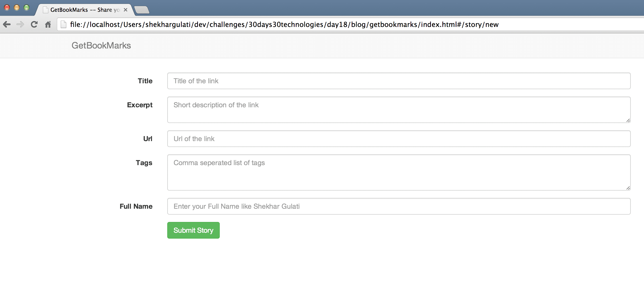
Tip 5: Use calls-to-action in your buttons. Everyone uses “Submit”. Try something that is more compelling.
Common action terms that work are “Start Today”, “Let’s Go”, and “Get Started”. You can also consider using terms specific to your industry.
For example, you might try using “Start Your Engines” if you sell auto parts. Make it fun. The more compelling your call-to-action is (including your form) the more likely you will turn your visitor into a customer.
Here’s an impressive example of a email newsletter signup form from Duct Tape Marketing that meets my requisites, check it out
Get Started Converting More Visitors Into Leads & Customers Now
Now that you know how to check your title tags and meta descriptions, write your headlines, and use calls-to-action to drive secure form submissions, it’s time to put your newfound knowledge to use on your website. Go optimize your website conversion funnel!
Spend at least an hour or two every week completing these items, and you’ll start generating more and more leads and customers through your website.
Culled from http://www.wordtracker.com/academy/learn-seo/on-page-optimisation/optimize-web-pages-for-conversion
Did you enjoy this article? We give away 98% of our digital marketing resources for FREE. Right now, I want to prove that to you, join our community right now for FREE access to our actionable digital marketing resources to help you increase your sales and customer base online faster. It is absolutely FREE.
