Landing Page Optimisation: Creating an optimised and high converting landing page can be one of the most rewarding, yet, frustrating tasks assigned to any marketer.
And that’s because there’s an unlimited number of variables that go into why a page converts or not.
At any given time there can be issues with your traffic, page design, copy, images – the list goes on and on.
And just like every other marketing operation, all of these boil down to the aim of any marketing and sales efforts, which is:
Conversion.
All your work is designed to get visitors, leads, and even customers to take the next step. Getting them more involved with your brand and products is necessary to drive sales.
There are obviously many ways of doing this. Blog posts, emails, e-books, and more.
But there’s one option that is almost always better at attracting quality leads and converting leads to the next step and that is a Landing page.
A landing page has a single goal, which you define. It might be to sign up to an email list, buy a product, or request a service or consultation. Everything on the page is focused on achieving that goal, which is why they are more effective than other types of content.
But instead of focusing on the particular reasons why your page isn’t converting, let’s focus on 10 proven hacks that you can apply to optimize your landing page conversion rate.
Although this article does not provide a practical step-by-step implementation of each hack, my goal is that by the time you finish reading, you’ll know enough to get to work creating your own converting landing page.
P.S. If you want a practical step-by-step implementation of each landing page optimisation hack, then your best bet is to register for our physical or online digital marketing course and join many students who are making a lot of money by simply creating high converting landing pages.
Get 50% Discount to Master ALL Aspects of Digital Marketing That Can Earn You $2,500 - $5,000 a month (Even if you are a complete beginner!)
Our students that intentionally implement what they learn from our digital marketing course make back the entire course fee within a single month or more after completing our course because our course gives them many income generating options with unlimited earning potential with no age or location barrier. The best part is no technical skills are required.
An opportunity to change your lifestyle and make money working from anywhere in the world. The results our students get from our digital marketing course prove this could be applied to any market or country and that it is designed for any skill level and work background.
*By signing up, you agree to our privacy policy and terms of service.
And you know the best part? You really do not need a website to get your landing page up. Our recommended landing page tools are just the best.
But first…
What is a Landing Page?
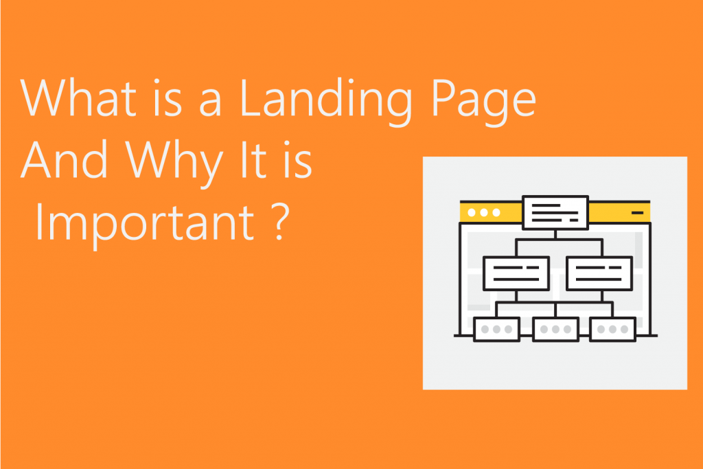
A landing page is a standalone web page linked to your site where your visitors will land and find the specific & desired content which they have been looking for all over the Internet!
It is any webpage where you send visitors, to initiate a conversation and close a deal.
A landing page lets your visitors see only the exact offer you have for them.
You simply take off the distraction factor which causes your visitors to leave your site even before seeing your offer!
Think of a landing page as an airstrip. Just as airstrips are deliberately built to receive aeroplanes, your landing page should be a goal-driven and designed page to receive your website traffic.
In the same vein, all the runway infrastructure on the airstrip that allows an airplane to land safely are your landing page essentials.
The question now is how do you build a safe airstrip (landing page) that airplanes (leads) can land safely on (leads can convert easily)?
In the history of webpage marketing, this has been one of the most puzzling questions.
Finally, in this post, you get an answer to that question. All you need to do is grab a cup of coffee or whatever delights you and keep reading.
Now the million-dollar questions are-
- Do you need a landing page?
- For what you need a landing page?
- How do you create a high converting landing page?
How do you know if you need a landing page?
You would need a landing page if you are-
- Promoting a new product or sale
- Building your email list
- Want to target a particular type of client
- Getting traffic to your website but not converting
- Converting but unable to nurture
Your website traffic is your prize bond! You need to have it on board if you want to cash out on it!
If you don’t want all your traffic to get lost in the hood simply because they did not find the right door to knock, a landing page is the most practical & proven tool at present.
Now, whether you are using a great and affordable landing page design tool like [eafl id=”6658″ name=”Instapage” text=”Instapage”] you will need to give equal priority to both of the following-
- Using the right lead magnet for landing page optimization.
- Crafting the best design and layout
So, while creating a landing page, follow these proven hacks below to ensure maximum conversion of your valuable traffic.
10 Landing Page Optimisation Hacks for Higher Sales Conversion
#1: Pimp Your Headline
Every element that goes on your landing page performs a unique function for your visitor. For example:
- The headline captures their attention and entices them to stay on the page
- The copy acquaints them with your offer
- The testimonial reassures them of the success of your product or service
- The lead capture form collects visitor information
- The call-to-action button gets you the conversion
Actually, none of these functions are possible without convincing the visitor to stay on your page in the first place — i.e. your landing page headline’s purpose.
So, what types of headlines make great impressions?
There are many things to consider when writing effective headlines. But, regardless of whether your landing page is promoting a free trial for your SaaS, or a discount coupon for your nail salon, the headline will only be effective if it possesses the following three characteristics:
- ClarityA headline should never be ambiguous, vague, or beat around the bush with metaphors. It gets right to the point and connects with the visitor as soon as he or she lands on the page.
- RelevanceHow did your visitor come to your landing page? Was it a display ad they clicked or a Google search ad? Your headline and the ad connected to it must have a message match and be relevant to each other. If your ad says “free trial” and your landing page headline doesn’t mention a trial, then you can bet your visitors will bounce.
- EmpathyAll great headlines empathize with the visitor’s problem. Headlines demonstrate the benefits of the product and reassure visitors that their problem can be solved.
When you craft great headlines, your visitors are more likely to stay on the page and convert to your offer. If your headline fails to impress, your visitors will abandon the page.
So what type of headlines should you use?
Here you go…
- Use ‘how to’ headlines – How to Increase your Conversion Rate
- Use ‘action’ headlines – Increase your Conversion Rate with this Free Tool
- Use ‘number’ headlines – Increase your Conversion Rate by 35% with this Free Tool
#2: Go Deeper With Your Sub-Headline
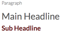
The next element is your sub-headline.
If the headline makes the user look good, then the subheadline should make them stay. Together, these pieces of copy make up the one-two punch of a landing page’s power.
Here’s what to keep in mind as you create yours:
- Normally, the persuasive subheadline is positioned directly underneath the main headline
- The subheadline should have some element of persuasiveness.
- The subheadline can go into slightly more depth and detail than the main headline.
As you write your landing page copy, remember that you don’t necessarily have to follow a specific formula. While we provide students of our digital marketing course with winning landing page headlines and copy formulas, we
Arrange your content in a way that efficiently explains what you’re offering, and you’ll be much more successful in connecting with readers.
#3: Captivate With Pictures

Visual content is an essential component of landing pages that work.
In fact, the brain processes images 60,000 times faster than text. This means that users will be affected by the images on your landing page immediately.
So as you select and place your images, remember that:
- The pictures should be large.
- The pictures should be relevant to your product or service. If you are selling a physical product, it is essential that your landing page contains an image of the product.
- If you are selling a service, the primary purpose of the image should be to grab attention and demonstrate relevance to the user.
- The pictures need to be of high quality.
And as you determine what to include, keep the focus on high-quality, relevant visuals. This is not the place to feature stock photographs.
After all, if your images are the first thing a visitor processes, they have the potential to shape that visitor’s impression of your brand before they even read your copy — and you need that impression to be a good one.
#4: Use Detailed Explanation
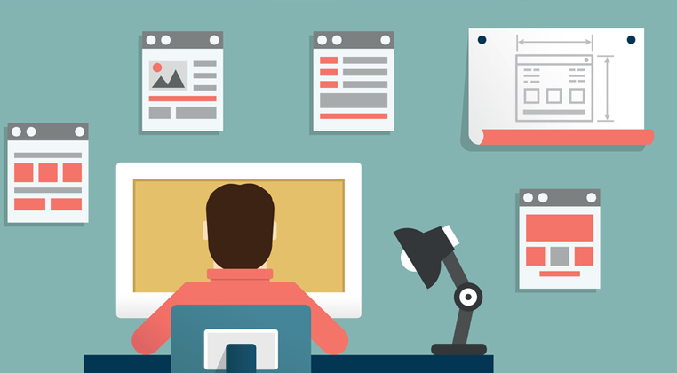
Your landing page needs to make what you’re offering perfectly clear.
After all, if a user doesn’t understand what your product or service is about, you’ve lost them. So a straightforward explanation is crucial.
If your landing page is for a simple product or service, you might be able to get away with your headline and subheadline being the only copy.
But regardless of how you choose to approach your explanation, your landing page should include:
- Be integrated with your headline, or completely separate.
- Be benefit-oriented. Explanations are functional, but functionality should be tilted in favour of the user.
So your explanation doesn’t necessarily need to be separate from your headline and subheadline. Instead of thinking of your explanation as a standalone element, consider it more of a goal that your page needs to accomplish.
That’s why for most landing pages, your best bet is to keep things straightforward. You might want to make your copy “fun” and “unique” — and that’s possible. But your top priority should always be clarity.
#5: Propose a Value
The value proposition is defined as “an innovation, service or feature intended to make a company or product attractive to customers.”
Essentially, it answers the user’s question, “What’s in it for me?”
And when it comes to your landing page, this answer needs to be featured prominently and clearly.
Like your explanation, your value proposition doesn’t need to be a standalone element. Instead, it can be spread among the other elements on your page.
Here’s what you can try out:
- One of the best ways to advance your value proposition is through a list of benefits. Use bullet lists to explain what’s in it for your leads.
- Benefits should be clearly focused on the user. Always think about the user and how he or she will benefit.
The most important thing to understand about this part of your page is that it shouldn’t be a statement about your company. A value proposition is not “we are awesome.
Instead, you’d want to rewrite it to emphasize that the user will be awesome with your product or service.
For example, let’s say you are a digital marketing training institute like us, and you want to highlight your track record. Your first thought might be to create a value proposition that says “We have successfully trained over 1,000 students and counting in digital marketing!”
But this statement focuses entirely on your company, and not your audience. You could fix this by re-writing it as “Your career and business goals would be easily achieved with a digital marketing certification from us”
See the difference?
This is a simple shift but makes the statement much more customer-oriented. And that’s the kind of benefit you should be going for.
#6: Tap Into Their Pain

Here’s the psychology behind pain: Humans are wired to avoid pain. Every product or service can help to alleviate pain in some way.
If you can cause the user to think about and realize their pain, they will subconsciously seek relief from that pain, and thereby be more likely to convert.
Here’s how to accomplish that on your landing page:
- Mention what a user will lose, not just what they will gain.
- Use real human testimonials to convey this pain in a trustworthy way.
- Be sure to relieve the pain. Your product or service is provided as an antidote to the pain.
- Don’t present a problem without providing a solution!
- Again, you can use real-life testimonials of subjects who felt similar pains but had their pains relieved using your product or service.
Essentially, you want to illustrate a pain point your reader might be experiencing. Then, conclude that your product or service provides the answer to that pain.
#7: Let Testimonials Talk

Talk is cheap, they say.
But real, trustworthy and emotional testimonials never fall short.
A user wants to know that they can trust the product or service and if they see a trustworthy testimonial, this goes a long way in cultivating their trust.
Here’s how to incorporate them well:
- Use testimonials from real people. Choose testimonials from people who are most relevant to your target audience.
- Make sure you use visuals. Pictures and videos are the keystones of trust in testimonials.
- Testimonials should be specific. The best testimonies are those that are backed by real numbers, real data, and specific applications.
#8: Prove Your Business is Legit
Is your business legit?
Then make that clear on your landing page using accurate contact information.
Some of the most persuasive landing pages that I’ve visited have multiple methods of contact, including a phone number, a physical address, an email address, and a contact form.
Some even have popups where a customer service representative asks me if they can be of help.
These go a long way to help strengthen my trust in the company and to eliminate any friction in the conversion funnel.
Here’s what to keep in mind as you add contact information to your landing page:
- At the most basic level, provide some assurance that you are a real company. Usually, this involves a name, physical address, email address, and phone number.
- Live chats featured in a popup can be helpful, but not a must-have.
It’s up to you to determine which options to give your visitors for getting in touch. The most important thing is that conversion is an easy process.
The simpler you make it for visitors to contact you, the more likely they’ll be to take action.
#9: Offer a Guarantee
Customers love guarantees.
A guarantee, regardless of what it is or how it’s presented, can help people feel reassured while on your landing page.
Simply the word itself improves the likelihood of a conversion.
Here’s what to keep in mind as you create one for your landing page:
- Guarantees can take many forms. Choose a type of guarantee that works for your business type, and state this guarantee on your landing page.
- Use a product guarantee (e.g., satisfaction, money back, etc.), or a reassuring type of guarantee such as a “100% No Spam Guarantee.”
- Position your guarantee statement close to the CTA. This proximity will help the user receive a final bit of assurance, and be ready to convert.
- Be genuine and careful with your guarantees.
As you write your guarantee, you don’t necessarily need to delve into the legalities of it. Just say it. The point is that you have a guarantee, and the customer knows it.
For instance, for our digital marketing course, our landing pages include a money-back guarantee that further convinces our leads that we’re confident in the success rate of our service and when necessary, we will offer a guarantee.
Click here to learn more about our course and see our guarantee
#10: Use a CTA that Bangs
The last thing to create landing pages with high conversion rates is the most important element of all: the call to action.
No element listed in this article is as important as your call to action. After all, this is the element that the rest of the content on the page is designed to drive visitors’ attention to.
It’s what ultimately converts users into customers.
So with that in mind, here are a few CTA must-haves
- Make it big. Generally speaking, the bigger, the better
- Make your copy compelling. The actual CTA copy is the most significant copy on your entire landing page. Don’t use the word “submit.” Instead, use something explosive, exciting, and persuasive
- Use a button. Users have been trained to expect the CTA to be a button. People know what to do when they see a button.
- Use a contrasting colour. Your landing page, your company, and your designers all have certain colours that they like. Your landing page has a colour scheme too.
Now, whatever colour you use on your CTA, make it different. At the most basic level, your CTA needs to possess colour. And, to make it stand out, that colour needs to contrast with the other colours on the screen.
Contrasting colours help to attract the eye and compel the click.
Let’s Conclude
A high converting landing page is a place where all your efforts come to fruition. This is the place where customers click, people buy, and you earn revenue.
So, don’t mess it up!
Fortunately, creating a powerful and high-converting landing page isn’t rocket science.
Start by implementing each of the 10 optimization hacks in this post, and you’ll be well on your way to engaging your visitors and converting them into customers.
Now, I’m going to ask you to do one thing:
Take time out to read about our digital marketing course here to learn how you can now effectively create high converting conversion funnels.
Your journey to a profitable and highly optimized conversion funnel is one click away. Enroll and start now
FAQs
Buyer Personas: The Complete Beginner’s Guide to Understanding Your Customers
Freelancing for Beginners: The Ultimate Guide to Making Money as a Freelancer
10 Ways to Make Extra Money Online from Home (2024)
Benefits of Digital Marketing (13 Advantages You Should Know)
