
Mobile SEO means optimizing a website so it loads fast and works well on a phone. It matters because Google now indexes the mobile version of most sites first. A slow or broken mobile page can hold back rankings on every device, not just phones.
Key Takeaways
- Google’s mobile-first indexing is complete. The mobile version of a page gets crawled, indexed, and ranked (Google Search Central).
- Only 48% of mobile page loads pass all three Core Web Vitals thresholds today. Desktop passes 56% (HTTP Archive Web Almanac).
- Google’s benchmark for a healthy page: load within 2.5 seconds, respond within 200 milliseconds, and stay visually stable, each measured at the 75th percentile of real visits (web.dev).
- Fixing load speed and responsiveness has produced named, measurable results for real companies (Google’s own case study roundup).
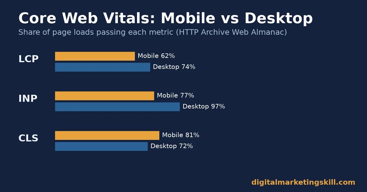
- Interactivity (INP) passes less often than load speed (LCP) on mobile: 77% good INP against 62% good LCP. Slow responses to taps are often the hidden problem (HTTP Archive).
In this guide
- Why Mobile SEO Still Trips Up Good Websites
- How Mobile SEO Actually Works
- What Differs by Site Type
- How to Lead at Each Site Type
- How to Measure Mobile SEO Performance
- The One Decision Rule: What to Fix First
- A Real Case: What Changed When One Company Fixed Mobile Speed
- Frequently Asked Questions About Mobile SEO
- Your Next Step in Mobile SEO
Why Mobile SEO Still Trips Up Good Websites
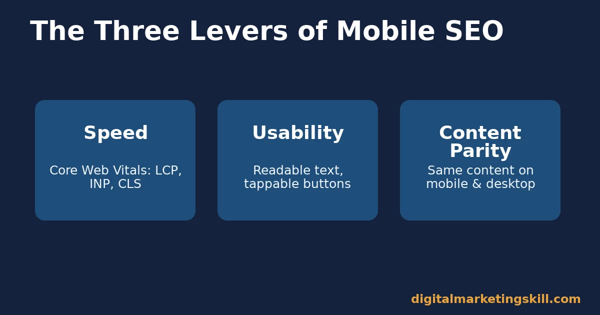
Most teams already know mobile matters. The gap is not awareness. Instead, mobile SEO gets treated as one checklist item, like “make it responsive.” In reality, it is three separate problems: speed, usability, and content parity.
A responsive layout alone does not fix a slow page. A fast page does not fix tiny, unreadable text. Readable text does not fix a page that hides content behind a tap mobile Googlebot never triggers. Each problem needs its own fix. Skipping one quietly caps the other two.
A Pattern Worth Recognizing
Here is a pattern that shows up often. A team redesigns a site to “look good on mobile,” ships it, and sees no ranking change. The design looked fine. But nobody measured load speed or checked whether the mobile crawler could actually see the full content. Looking right and performing well are two different tests, and only one of them shows up in Google Search Console.
The same gap shows up with content, not just design. A team might translate a desktop page’s visual style perfectly to mobile, yet still hide half the body text behind a “read more” toggle that the smartphone crawler never clicks. From a visitor’s seat, nothing looks wrong. From Google’s seat, half the page effectively does not exist.
This guide treats mobile SEO as a measurable system, with limits stated upfront. The figures below come from Google’s own documentation and from HTTP Archive’s crawl of millions of real sites. They describe the web in aggregate. Your own site’s numbers, checked directly, always outrank any industry average.
How Mobile SEO Actually Works
Mobile SEO rests on one foundational fact. Google mostly stopped looking at your desktop site. Google’s own guidance confirms the mobile version of a page, crawled with a smartphone user agent, is what gets indexed and ranked. That single fact changes what “optimized” even means.
This also means a desktop-only improvement, no matter how impressive, does nothing for rankings if the mobile version of the same page stays untouched. Teams that still build desktop-first and treat mobile as an afterthought are effectively optimizing the version of their site that matters least to search engines.
The Three Levers
- Speed: how fast the page loads and responds, measured by Core Web Vitals. This affects rankings and whether visitors stay.
- Usability: whether text is readable, buttons are tappable, and the layout does not shift while loading.
- Content parity: whether the mobile version shows the same text, links, and structured data as desktop. Google warns against lazy-loading primary content behind a user interaction on mobile.
Why This Distinction Matters
Treating mobile SEO as one task hides which lever is actually broken. A site can pass every usability check and still rank poorly, simply because load speed fails. A fast site can still lose visitors because its content is harder to read than a competitor’s. Measuring the three levers separately shows exactly where to spend the next hour of work.
For example, a site owner might spend a week polishing fonts and spacing, convinced that readability was the problem. Meanwhile, the real issue was a 6-second load time caused by unoptimized images. The fonts never mattered until the page actually finished loading.
What Differs by Site Type
Mobile SEO is not identical for every kind of site. What a content site needs and what an e-commerce or app-like site needs are genuinely different problems. Applying one generic checklist to both site types usually means over-fixing one problem while leaving the other one untouched.
Content Sites: Built For Scannable Speed
A blog, news, or guide site lives or dies on load speed and readability. Readers decide within seconds whether to keep scrolling. For this kind of site, Largest Contentful Paint and plain, scannable formatting matter most. The goal is simply getting the words in front of the reader fast.
A content site rarely needs complex interactivity. So the biggest wins usually come from image compression, font loading, and cutting unnecessary scripts that delay the main text from appearing.
Ad networks deserve special attention here, because they are a frequent, overlooked cause of slow content sites. A single ad script that loads before the article text can single-handedly push Largest Contentful Paint well past the 2.5-second target, even when every other part of the page is fast. Loading ads after the main content, not before it, often fixes more of the problem than any other single change.
E-commerce and App-Like Sites: Built For Interaction Speed
A store, booking tool, or web app lives or dies on how it responds to taps. Adding to cart, filtering results, and submitting a form all need to feel instant. For this kind of site, Interaction to Next Paint matters just as much as load speed. A page that loads fast but then stutters on every tap still frustrates the buyer at the exact moment they were ready to act.
These sites also carry more risk from layout shift, since buttons and prices often load in after the initial page paint. A shift at the wrong moment can make a shopper tap the wrong item entirely.
Third-party scripts also tend to pile up fastest on these sites: chat widgets, review plugins, personalization tools, and multiple analytics platforms running at once. Each one adds its own delay to interactivity. Auditing which scripts actually earn their keep, and removing the ones that do not, is often the single highest-leverage fix available to an e-commerce team.
How to Lead at Each Site Type
Knowing the difference only helps if it changes where you focus first. Here is the practical fix for each.
Content Sites: Lead With Load Speed and Structure
- Compress and resize every image before upload. Oversized images are still the most common cause of a slow Largest Contentful Paint on content sites.
- Write short paragraphs with real headings. Mobile readers scan. Headings and bullet points let them find the part they need.
- Use a font size mobile readers can read without zooming. A body size in the 12-16pt range is a reasonable starting point on a phone screen, scaling up on tablet and desktop.
- Keep the same content on mobile and desktop. Google checks for content parity between versions as part of mobile-first indexing.
- Defer scripts that are not needed for the first screen. Analytics tags and chat widgets can usually load after the main content, not before it.
E-commerce and App-Like Sites: Lead With Interaction Speed
- Measure Interaction to Next Paint, not just load time. A page that loads in one second but takes 400 milliseconds to respond to a tap still fails the mobile experience.
- Reserve space for elements that load late. This is the single biggest fix for Cumulative Layout Shift, which otherwise causes mis-taps and abandoned carts.
- Make tap targets large enough for a thumb, not a cursor. Small buttons built for a mouse are a common source of mobile usability failures.
- Test the exact checkout or booking flow on a real phone. Lab tools catch most issues, but a live walkthrough catches the rest.
- Break up heavy JavaScript into smaller tasks. Long scripts that block the main thread are a leading cause of poor INP on interactive sites.
How to Measure Mobile SEO Performance
Each of these numbers answers a different question about the mobile experience. Track them on their own.
Speed and Stability Metrics
- Largest Contentful Paint (LCP): how long the main content takes to appear. Google’s threshold for “good” is 2.5 seconds or less, at the 75th percentile of real visits.
- Interaction to Next Paint (INP): how fast the page responds to a tap, click, or key press. The “good” threshold is 200 milliseconds or less.
- Cumulative Layout Shift (CLS): how much visible content jumps around while loading. The “good” threshold is 0.1 or less.
Visibility and Usability Metrics
- Mobile usability errors: issues like text too small to read or clickable elements too close together. Visible in Search Console’s mobile usability report.
- Mobile share of organic traffic: the percentage of organic visits coming from phones versus desktop, tracked in your analytics platform. A falling mobile share next to stable desktop traffic often signals a mobile-specific problem.
- Indexed mobile pages: whether Search Console shows the expected pages indexed under the smartphone crawler. A technical block here affects rankings on every device, not only mobile.
None of these numbers should get read alone. A good LCP with a poor INP still frustrates visitors the moment they try to interact. Read speed and stability together with usability, because a page can pass every lab test and still fail real mobile visitors in a way only Search Console’s field data will show.
It helps to separate lab data from field data, too. Lighthouse and PageSpeed Insights lab scores run in a controlled, simulated environment, which makes them useful for debugging but not fully representative of real visits. Field data, drawn from actual Chrome users over the past 28 days, shows what people genuinely experience. When the two disagree, trust the field data, since that is what Google’s ranking systems ultimately rely on.
The One Decision Rule: What to Fix First
A site often has several mobile SEO problems at once, with limited time to fix them. Use this rule: fix the metric with the worst pass rate first, because that is where the most visitors are failing right now.
In practice, pull your Core Web Vitals report. Look at LCP, INP, and CLS side by side. Whichever one has the lowest percentage of “good” page loads is costing you the most visitors right now, even if another metric feels more urgent to a developer’s eye.
Illustrative, invented numbers: imagine a site with 70% good LCP, 40% good INP, and 90% good CLS. Layout shift might look like the obvious problem to fix. But INP is actually failing more visitors here. Fixing slow interactions, such as a sluggish add-to-cart button, would likely help more people than polishing a layout issue that already passes nine times out of ten.
This rule also protects against a common trap: fixing whatever metric is easiest to improve, rather than the one actually losing visitors. Easy and impactful are not always the same fix.
The same rule works at a smaller scale too. If you only have time to fix one page this week, pick the page with both high traffic and a failing metric, not the page that is simplest to edit. A quick fix on a page nobody visits will not move the needle, no matter how satisfying it feels to cross off the list.
A Real Case: What Changed When One Company Fixed Mobile Speed
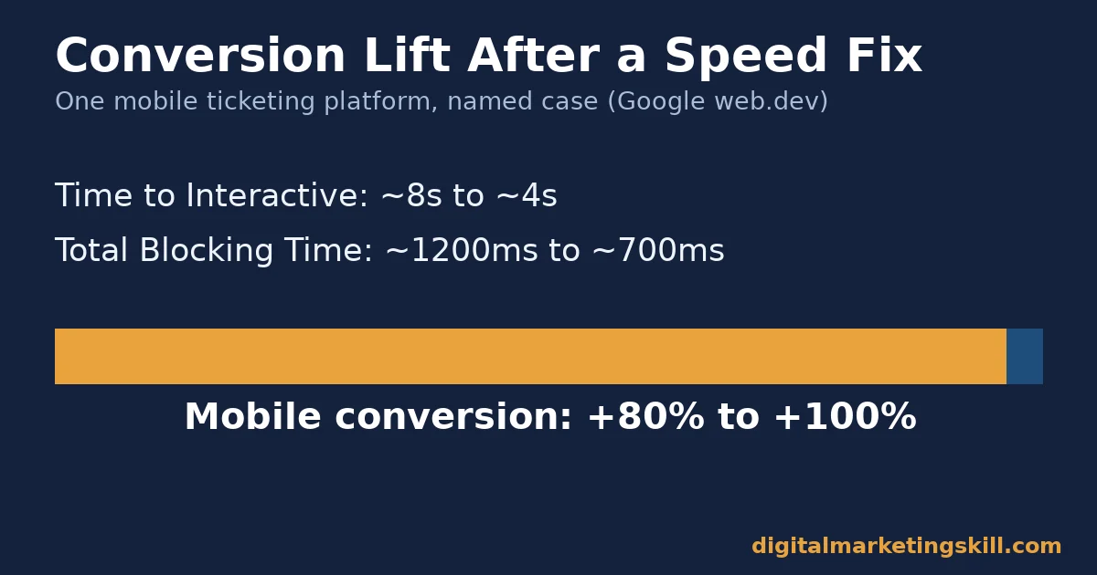
Redbus, a bus-ticketing platform, had a slow and unresponsive mobile checkout flow. According to Google’s own published case study roundup, the company cut Time to Interactive from roughly 8 seconds to roughly 4 seconds. It also cut Total Blocking Time from about 1,200 milliseconds to about 700 milliseconds.
The result: mobile conversion rose by a reported 80 to 100%, nearly doubling in some cases. The same roundup lists comparable, separately measured cases. Vodafone Italy saw an 8% sales increase after cutting LCP. Cdiscount saw a 6% revenue increase after improving all three Core Web Vitals together.
The Limits Worth Naming
These are self-reported case studies, published and selected by Google rather than independently audited. Each company likely made other changes alongside the ones highlighted here. Treat the direction as credible, since multiple unrelated companies report similar gains from similar fixes. But treat any single percentage as an illustration, not a guarantee for your own site.
Notice the pattern across all three cases: none of them redesigned their entire site. Each one targeted a specific, measured bottleneck, fixed it, and measured the result again. That is the same decision rule from the section above, applied by three different companies.
What to Expect From Your Own Fix
It is also worth noting what these cases have in common with the failure pattern described earlier in this guide. Each company could have spent its time on something more visible, like a full visual redesign. Instead, each one measured first, found the actual bottleneck, and fixed that specific thing. The lesson generalizes well beyond these three names.
It is tempting to read these numbers and assume a similar redesign will produce a similar lift for any site. That assumption usually fails, because the size of the gain tracks the size of the original problem. A site already close to Google’s Core Web Vitals thresholds has much less room to improve than a site starting from an 8-second load time. The honest takeaway from mobile SEO case studies like these is not a specific percentage to expect. It is the method: measure the real bottleneck, fix that one thing, then measure again before moving to the next problem.
Frequently Asked Questions About Mobile SEO
What is mobile SEO in simple terms?
It is the practice of making a website fast, usable, and complete on phones. Google now ranks sites primarily using the mobile version of each page, so mobile performance affects rankings everywhere.
Is mobile SEO different from regular SEO?
Not entirely. The same core SEO principles apply. Mobile SEO adds specific technical requirements: fast load and response times on phone hardware, readable text without zooming, tappable buttons, and content parity between mobile and desktop versions.
Does page speed really affect mobile rankings?
Yes. Google confirms Core Web Vitals are used by its ranking systems. Separately, slow pages measurably lose visitors and sales, based on the named case studies in this guide.
What is mobile-first indexing?
It means Google crawls, indexes, and ranks websites using the mobile version of each page by default, not the desktop version. This has been the default for newly discovered sites since Google completed the rollout.
How do I check my site’s mobile usability?
Use Search Console’s mobile usability report for site-wide issues. Use PageSpeed Insights or Lighthouse for a page-by-page breakdown of load speed, responsiveness, and layout stability. Pairing that with a broader look at website ranking factors helps you see whether mobile performance is the main constraint or just one of several.
What is the single biggest mobile SEO mistake?
Hiding primary content behind a tap or accordion that the mobile crawler never triggers. This quietly removes real content from what Google can index, even though a human visitor sees it fine.
Does voice search change mobile SEO?
It shifts some keyword targeting toward longer, more natural phrases, since voice queries tend to sound like spoken questions. The core technical requirements, speed, usability, and content parity, stay the same either way. For a deeper look at phrasing content for spoken queries, see this guide to voice search optimization.
How often should I re-check my mobile SEO numbers?
Check Core Web Vitals and mobile usability monthly at minimum, and immediately after any redesign, new script, or ad network change, since those are the most common causes of a sudden mobile performance drop. A broader content audit on the same schedule helps catch pages that have quietly drifted out of date alongside any technical issues.
Your Next Step in Mobile SEO
Getting mobile SEO right means treating speed, usability, and content parity as three separate jobs. Measure each one with real data instead of guessing from a desktop screen.
Want a structured path instead of piecing this together from tool reports? The Master Diploma in Digital & AI Marketing at Digital Marketing Skill Institute includes the AI-Powered WordPress and SEO Specialist track. It is one of four AI-powered tracks covering ten courses in total, built around exactly this kind of practical, technical SEO work. Students who want every track can take the Full Stack option. Everyone gets unlimited 1-on-1 coaching and mentoring, plus a U.S. Project Internship with a verified U.S. Work Reference Letter. The program is dual US and UK accredited, recognised in more than 100 countries, and 100% online, so you can study from anywhere in your country.
Explore the full program on the Master Diploma page. Browse more guides on the digital marketing blog. Read real outcomes on the reviews page. Or go straight to the application page when you are ready. Whether you manage one site or many, wherever you live, learn more at digitalmarketingskill.com. Support is available to site owners and marketers anywhere, including anywhere in your country, through digitalmarketingskill.com.
Every figure in this guide was checked against its original source before publication. Figures marked as illustrative are invented examples, not real results.