There are many examples of a landing page but if you don’t know the usefulness of one, you might not be able to recognize the perfect one for whatever digital marketing campaign you want to launch.
Do you know that a landing page can be used as sign-up forms for your business? And do you also know that the average conversion rate you will get with it is 9.7%?
You may not know about the facts I just shared or the advantage and benefits of having a landing page for your business. As a business owner, this should be one of the strategies that you can leverage for your business.
I’m sure you want to know more about this learning page that can be responsible for so much. This is why in this article, I will be sharing with you:
- The definitions
- The differences between a landing page and a website, I’m sure you don’t know they are different from each other.
- The different examples of a landing page
I will also share with you the benefits of having one. I want you to know that it is a tool in digital marketing and can be used to grow your business.
As a business owner or as someone interested in growing their knowledge on how to manage other people’s businesses, it is important that you have profound and sound knowledge of the tool you want to use to grow your business.
If you want results, you need to put in the effort using the right knowledge. This is why in our 90% practical digital marketing course, we teach our students how to create a landing page by themselves and other aspects of digital marketing that would aid their business growth.
You learn and you also get to practice what you learned with supervision from our seasoned coaches.
I’m sure, you want to know what exactly is a landing page, but before I show you the examples, I want you to know that according to Statista, 4.72 billion people around the world used the internet as of July 2024, by the time you are reading this, the numbers would have definitely gone up because of the rate of technological advancement.
Potential buyers and customers are no longer sticking to traditional means of communication or business transactions only, we are all moving as technology is moving.
Businesses are also devising ways to grow with technology and a landing page is one of the tools that can be used to achieve this.
To properly understand the examples of landing pages that exist, you must know the definition and why it is an important tool in digital marketing. Now let’s get started.
What is a Landing Page?
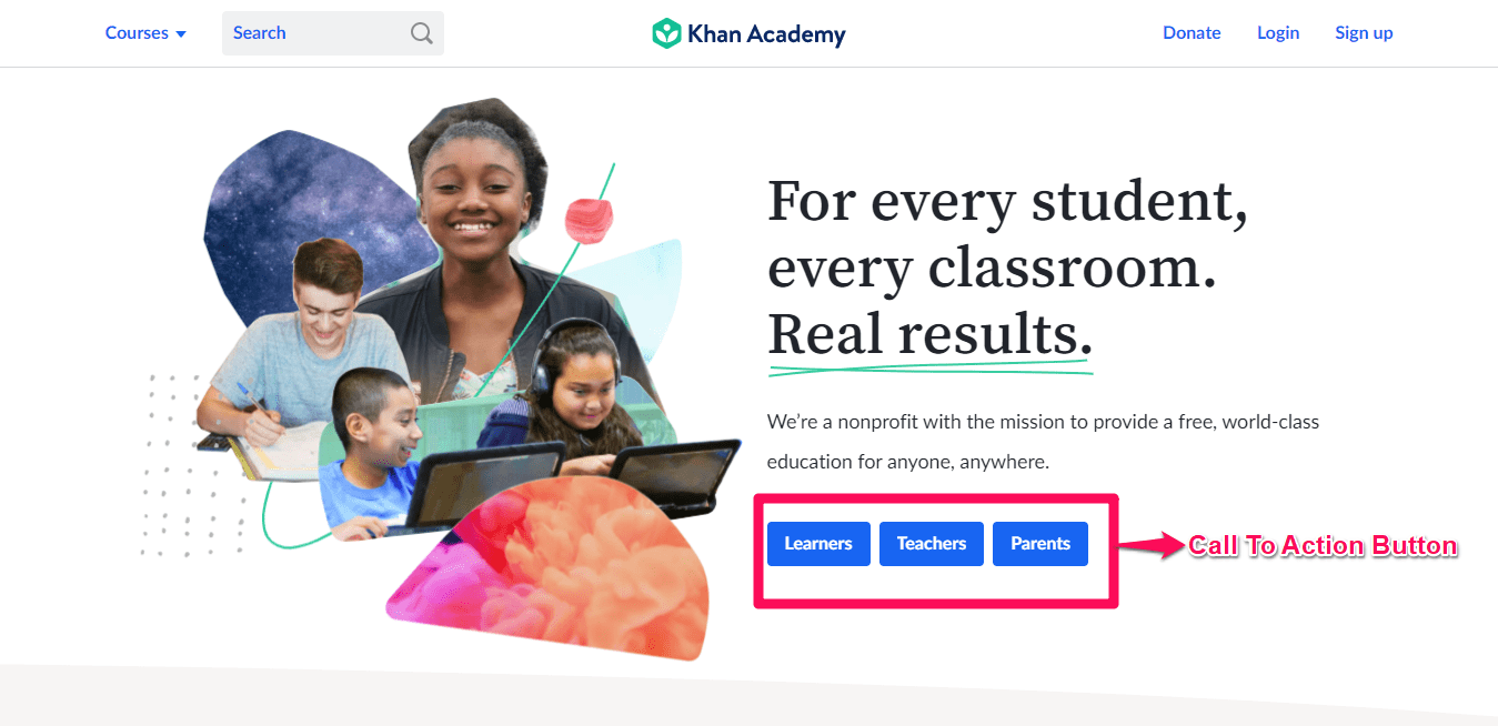
A landing page is a web page a prospective customer arrives at after clicking an ad or a link either on social media platforms or email marketing, It is different from the homepage of a business, it serves a single purpose, unlike the homepage where you have a different call to action buttons.
An example of a landing page. Source: Khanacademy
It can also be said to be a follow-up or an explanation in the form of a webpage to whatever promise you made on the content you shared either in your email marketing or advertising.
They are designed tailored for different themes and purpose to provide users with a quality experience and drive conversion with messages that resonates with a user’s need.
To be able to identify the needs of your potential customers, you need a customer avatar. This will help you to have a fictional representation or idea of your ideal customers and you will be able to not only design your product to meet their needs but also create content that would resonate with them enough for them to make the purchasing decisions.
If you want to know how to create a customer avatar, register for our 90% practical digital marketing course, where you will learn how to create one and also learn other strategies in digital marketing that will help you grow your business.
If you want to get the best out of paid advertising, you don’t direct them to your homepage, but to a landing page that explicitly gives further explanation on the content of the ad you run using social media advertising.
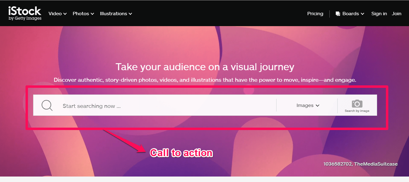
You don’t want them to just view the webpage, you want them to take action which is to click the call to action button and get them converted from being just a visitor to a paying customer.
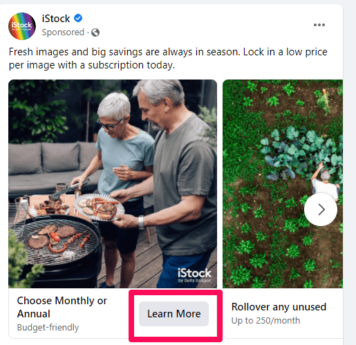
An example of an ad leading to the landing page is below.
From the images I shared above, you can see that an ad is directing visitors to a landing page where they get to click the call to action button that gets them converted from being visitors to paying customers.
There are many features of a landing page, I will be sharing with you in the next paragraph. Before I do that, I want you to see what one of our students has to say after registering for our 90% practical digital marketing course.
Why are Landing Pages Important?
Landing pages are an important part of any online marketing strategy, and you need to know that they can make a big difference in your business’s success. For instance, if you have a new product or service you want to launch. and you want to capture the attention of potential customers and guide them toward taking action whether that’s signing up for a newsletter, making a purchase, or downloading an eBook. You can use a landing page to do that.
A landing page is designed specifically for a single purpose, to convert visitors into leads or customers. Unlike your homepage, which has multiple links and distractions, a landing page focuses on one clear message. This simplicity helps visitors understand exactly what you want them to do. When you remove unnecessary clutter, you can create a stable experience that encourages action.
For example, let’s say you’re offering a digital marketing skills training session. A well-designed landing page will showcase the benefits of your training program, include testimonials from satisfied students, and feature a clear call-to-action button that says “View Course Package.” This approach helps get more people to take action and join your program.
I want you to remember that attention spans are short and competition is becoming more difficult, so having effective landing pages can set you apart. They not only help you capture leads but also build trust with potential customers. When visitors see that you’re dedicated to providing value and guiding them through their journey, they’re more likely to engage with your brand.
Webpage vs Landing Page
As much as they are both web pages, they are not the same and they don’t carry out the same functions and of course, they’re not designed for the same users.
These differences include:
Webpage
A webpage, like your homepage, serves as a hub for information about your business. It allows visitors to explore various aspects of your brand, such as services, contact details, and blog posts. It often contains detailed information, multiple links, and navigation options. The aim is to provide a comprehensive view of your business and the design of webpages is typically more complex, featuring various sections and links to other pages.
Landing page
In contrast, a landing page has a specific goal, which is to convert visitors into leads or customers. It focuses on one action, such as signing up for a newsletter or making a purchase. They deliver key information quickly and lead visitors directly to a call-to-action (CTA), like “Download Now” or “Get Started. They focus on visual elements that highlight the offer and CTA, ensuring visitors stay engaged with the primary goal.
While both web pages and landing pages are important for your online strategy, they serve different purposes.
Types of landing pages
Lead Generation Landing Pages
These landing pages are designed to capture visitor information, such as names and email addresses, in exchange for something valuable. This could be a free eBook, a webinar registration, or a discount on a product. The goal is to build a list of potential customers who have shown interest in your offerings.
These pages typically have a clear and catchy headline, short descriptions of the benefits of taking a particular action, and a simple form to fill out where you get customer information.
If you are a business owner, this is an important step in nurturing relationships with potential customers. Once you have their contact details, you can follow up with targeted marketing efforts like emails and calls to convert the lead to sales.
Click-through landing pages
These pages are designed to guide visitors toward taking a specific action, and it usually leads them to another page for a purchase or sign-up. Unlike lead generation pages that ask for information right away, click-through pages aim to warm up potential customers by providing more details about an offer.
On these pages, you will find information such as an engaging headline, persuasive content, and appealing visuals that show the benefits of the product or service. Also, you will find a clear call-to-action button, like “Learn More” or “Get Started,” encouraging visitors to take the next step.
By showing the value of what you’re offering, these landing pages can help turn strange visitors into committed customers.
Features of a Landing Page
For a webpage to qualify as a landing page, there are some features it should have and you should also look out for when you want to create one for your business.
1. Branding and logo
Any landing page you want to create must be a reflection of your website, remember I said a landing page is not your business website, so it should have your brand identity embellished on it so visitors can be able to identify where they are and who is providing them with the resources.
You want visitors to be able to connect your business with the landing page you create. If you don’t have a website for your business, you can register for our 90% practical digital marketing course where you learn how to build a website for your business and other digital marketing strategies.
2. Reduced navigation buttons
A regular landing page should not have too many navigation buttons, this can make a visitor abandon the page and not use the call-to-action button.
A visitor doesn’t have to go through a long journey or a couple of pages on your landing page, you need them to take action, so you help them to do that by giving them precise and clear information.
Make the actions and how to arrive at the actions clear enough for them, you don’t necessarily need to have a menu button on your landing page.
3. Matching page headlines
For your PPC(pay-per-click) ad, the headlines of the landing page you design must match with what you promised in the ad copy. You want to make sales and you also want to ensure that visitors will find you trustworthy enough to click the CTA button.
Beyond making sales and growing your business, you should be honest with your transactions with potential and existing customers. Your headline should also be clear, and direct and should explain what you are offering. It should also be compelling enough for a user to be persuaded to take action.
How to Create a Landing Page
Creating a landing page is a straightforward process that can improve your marketing efforts and help you connect with your audience more effectively. This will serve as a focused destination for visitors, guiding them toward a specific action.
So let’s explore how to create a landing page like this.
Define Your Goal
To create a landing page, you need to have a goal you want to achieve or an action you want the visitors to do when they arrive.
Your goal may be to collect email addresses for a newsletter, promote a new product, or encourage sign-ups for a webinar. Depending on the goal in mind, this will help to determine every aspect of your landing page and how it will look like.
For example, if you aim to gather leads, you can focus on creating an attractive offer, like a free eBook or discount. This will guide your content, design, and call-to-action. So when the lead comes to the page to register, they know what to expect and the value they will get after inputting their information.
When you know your goal, it becomes easier to craft a message that resonates with your audience and encourages them to take the desired action.
Choose a Landing Page Builder
With the use of nocode tools, you can build a Landing Page that can help you simplify the process, these tools allow you to design and publish your landing page without needing any coding skills.
There are several user-friendly options available, each has its features and benefits.
Examples of popular builders include:
- Wix,
- Elementor (WordPress)
- Unbounce
- Leadpages
The landing page builder offers a variety of templates that you can customize to fit your brand.
Also, these platforms usually have drag-and-drop functionality that will make it easy to add text, images, and buttons. Some even provide built-in analytics to help you track your page’s performance.
So when you are selecting a builder, you need to consider your specific needs. This will make the process smoother and more enjoyable for you to achieve the goal you have in mind.
Craft a Catchy Headline and Subheading
The headline and subheading of your landing page are vital elements that can make or break your visitor’s interest. A catchy headline grabs attention and encourages visitors to stay on the page. It should be clear, concise, and convey the main benefit of your offer.
For example, instead of saying “Sign Up for Our Newsletter,” you might say, “Become a certified digital marketer today” This approach highlights what visitors will gain by taking action.
Once you have a strong headline, follow it up with a strong subheading. This is your chance to provide a bit more detail about your offer. You should see it as a way to reinforce the message in your headline and persuade visitors to learn more.
For instance, you can write, “Join thousands of aspiring marketers who receive expert training tips and insights delivered straight to their inbox every week”
When you have a good headline and an engaging subheading, it creates an inviting introduction that encourages visitors to explore further and take the desired action.
Add Compelling Content
Once you have your headline and subheading in place, it’s time to add compelling content that captures your audience’s attention and encourages them to take action.
You can start by clearly explaining the benefits of your offer. What problem does it solve and how it will improve the visitor’s life or business?
When you are through with the benefit, make sure you use simple, and straightforward language to make your message easy to understand. You can use bullet points or short paragraphs to break up the text, for easy digestibility. This format helps visitors quickly grasp the information without feeling overwhelmed.
Also, some experts use testimonials or quotes from satisfied customers on their pages to build credibility and trust. When potential customers see that others have benefited from your product or service, they’re more likely to feel confident in their decision to engage with you.
Add a Form
When you want to add a form to your landing page, the form should be simple and easy to fill out, asking for only the essential details such as a name and email address. The fewer fields you have, the more likely visitors are to complete it.
Also, the position of the form matters on the page, so make sure it is near your call-to-action (CTA), for visitors to find it. To make the submit button stand out, you can consider using a contrasting colour and phrases like “Get Your Free Guide” or “Join Now” that can make the button more inviting and encourage clicking.
It’s also helpful to reassure visitors about their privacy. A short note stating that their information will be kept confidential can help build trust. If applicable, let them know what they can expect after submitting the form, such as receiving a welcome email or immediate access to a resource.
Publish and Promote
After you’ve designed your landing page and added all the useful elements, it’s time to publish and promote it. This is an exciting moment because your hard work is about to pay off.
Once you are through with the form, you can test it by filling the form with your details to make sure everything is working perfectly before it goes live.
After testing the form and it is okay, you can publish it and start sharing it on as many platforms as possible where your target audience can find the form and fill it out for you to get their details.
With consistent promotion, your landing page can become a valuable asset in achieving your marketing goals.
Landing Page Best Practices
Creating an effective landing page is essential for converting visitors into leads or customers. Below are some best practices to help you design a landing page that captures attention and drives action.
Perform A/B Testing
A/B testing involves creating two versions of your landing page to see which one performs better. Sometimes it involves changing elements like headlines, images, or call-to-action buttons, to help you gather data on your visitor behavior. This process helps you understand what resonates with your audience, allowing you to optimize your landing page for higher conversions.
Focus on the Consumer
When creating a landing page, always keep the consumer in mind. You need to understand their needs, pain points, and desires. This will help you tailor your content to address these aspects, highlighting how your offer can provide solutions. When you focus on what matters to your audience, you create a more engaging experience that encourages them to take action
Strong Call-to-Action (CTA)
Your CTA is one of the most critical elements of your landing page. So make it bold and clear, use contrasting colours to ensure it stands out and use action-oriented language that tells visitors exactly what to do next, such as “Get Your Free Trial” or “Sign Up Now.”
Optimize for Mobile
With many users accessing websites from mobile devices, ensure your landing page is responsive and looks great on all screen sizes. A seamless mobile experience can significantly impact engagement and conversion rates.
Use Landing Page Templates
A landing page template can save you time and effort while ensuring a professional look. These pre-designed layouts often follow best practices, making it easier to create an effective page. So you need to customize the template to fit your brand and message while maintaining a polished appearance.
Optimize Your Landing Page for Search Engines
To attract more visitors, you need to make sure you optimize your landing page for search engines. One of the best ways to do that is to use relevant keywords in your headline, content, and meta tags to improve visibility. These practices will help boost your chances of ranking higher in search results, driving more traffic to your page.
If you read till the end, I will show you more examples of a landing page, but before then I want you to see the differences between a landing page and a website.
Examples of Landing page
Digital Marketing Skill Institute
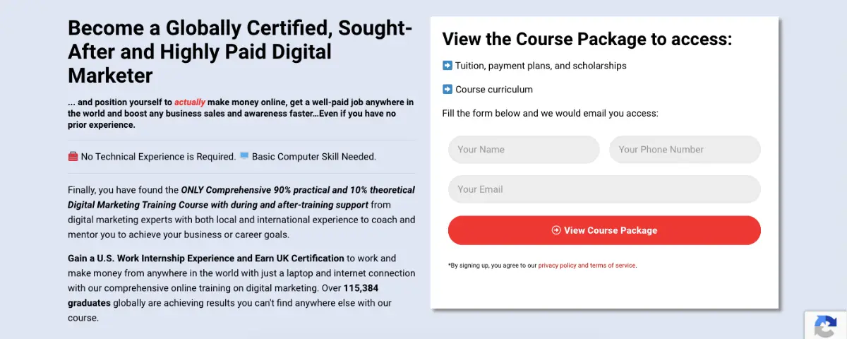
At DMSI, we showcase an effective landing page that highlights our commitment to empowering individuals with the necessary digital marketing skills. The page features a clear, engaging headline that communicates its value proposition, such as “Become a Globally Certified, Sought-After and Highly Paid Digital Marketer”
With vibrant visuals and testimonials from successful alumni, this helps us build trust and credibility. Our prominent call-to-action button also invites visitors to “View Course Package” making it easy for them to take the next step.
Slack
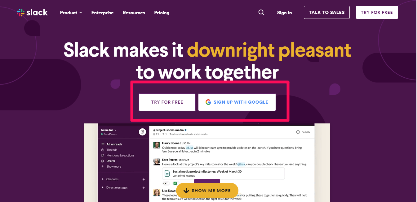
As you must have seen in the image above, the call to action is visible, it has fewer navigation buttons and there is premium negative space.
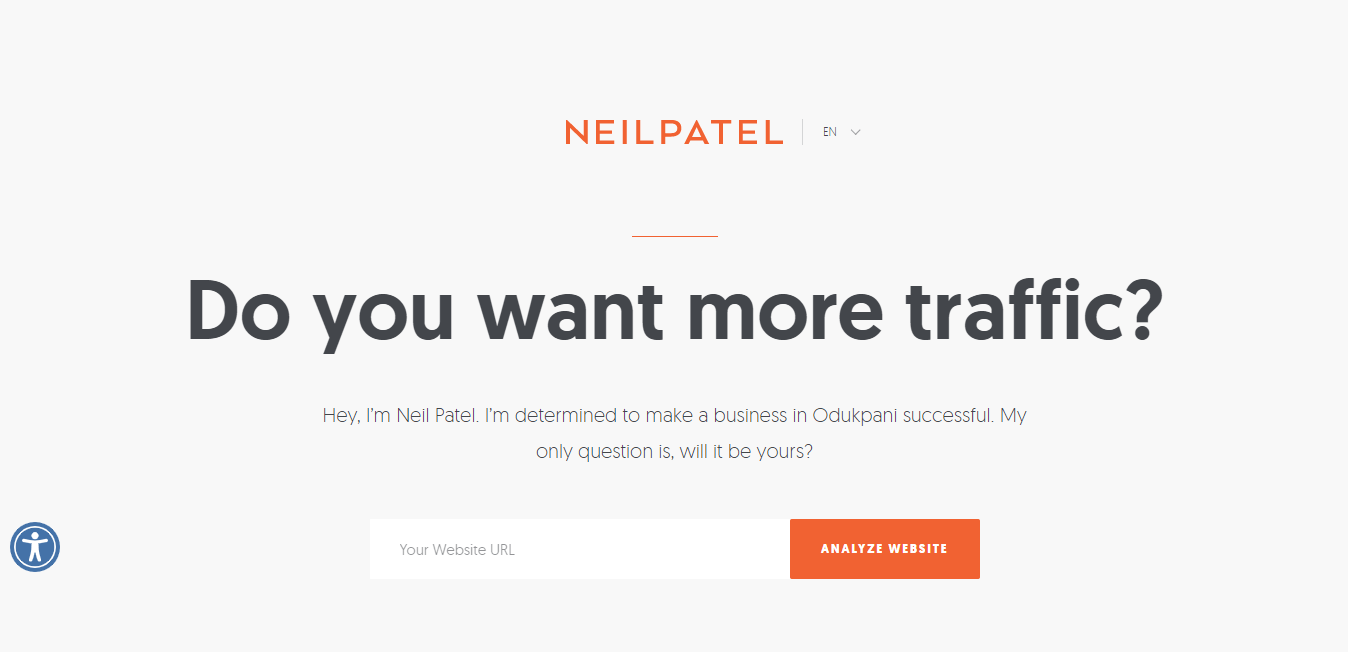
Neil Patel
Conclusion
In this article, I shared with you the definition of a landing page, the differences between a webpage and a landing page, and the examples as well.
If you want to grow your business with digital marketing, it is important that you have sound knowledge of the tools available and also know how to use them.
This is why in our 90% practical digital marketing course, we teach our students how to create a landing page for whatever advertising campaign they want to do to promote and grow their business.
We also teach them how to use other digital marketing tools and the strategies that will help them achieve their desired result.
FAQs
How to get traffic to your landing pages?
To get traffic to your landing pages, you can use several methods. First, you can share the link on social media platforms to reach your followers. Second, consider running paid ads on Google or Facebook to target specific audiences. Third, you can use email marketing to send newsletters that include your landing page link. Finally, optimize your page for search engines so it appears in relevant search results.
What’s the purpose of a landing page?
The purpose of a landing page is to encourage visitors to take a specific action, such as signing up for a newsletter or making a purchase. Unlike regular web pages that provide general information, landing pages are designed with a single focus to convert visitors into leads or customers.
What is another name for a landing page?
Another name for a landing page is a “lead capture page.” This term emphasizes its role in capturing visitor information, such as names and email addresses, often in exchange for something valuable like an eBook or discount.
Are landing pages free?
Landing pages can be free or paid, depending on how you create them. Some website builders offer free plans that allow you to create basic landing pages. However, if you want advanced features or custom designs, you may need to pay for premium services or templates.
More articles for you to read
Conversion Rate Optimization (CRO) – Guide, Importance, And Best Tips
Instapage Review | A Powerful Landing Page Builder for Online Marketing
5 Easy Ways To Build Backlinks For SEO To Your Website
Make Money On Facebook – The 9 Smart Ways To Earn Money From Facebook
