Landing page design decides whether a visitor converts, often before they read a word of copy. Unbounce’s analysis of 57 million landing page conversions found a median conversion rate of 6.6% across industries. The gap between that median and the top pages usually comes down to a few structural choices: load speed, link count and form length.
Key Takeaways
- Conversion rates vary sharply by vertical. Unbounce’s analysis of 57 million landing page conversions found a 6.6% median across industries. SaaS pages converted lower, at 3.8%.
- Speed moves the needle fast. Google and Deloitte’s “Milliseconds Make Millions” study tracked 37 brand sites and 30 million mobile sessions. A 0.1-second faster load lifted retail conversion rate by 8.4%.
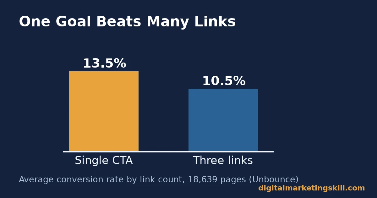
- One goal beats many links. Unbounce’s analysis of 18,639 landing pages found single-CTA pages converted at 13.5% on average. Pages carrying three links converted at 10.5%.
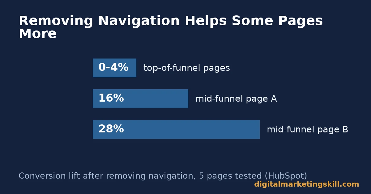
- Removing navigation helps some pages more than others. HubSpot’s own A/B test across five high-traffic pages found a 0-4% lift from removing navigation on top-of-funnel pages, and a 16-28% lift on mid-funnel pages.
- Shorter forms rarely hurt. HubSpot’s analysis of over 40,000 landing pages found conversion rates decline as form fields increase. A short form is a safe starting point.
In this guide
- Why Most Landing Page Design Advice Misses the Point
- How a Landing Page Actually Earns a Conversion
- Landing Page Design Choices Compared by Funnel Stage
- How to Fix Each Lever
- How to Measure Whether Your Landing Page Design Is Working
- The Most Useful Rule: Fix Speed and Focus Before You Touch Copy
- A Real Case: What Removing Navigation Actually Returned
- Frequently Asked Questions About Landing Page Design
- Fix the Structure, Then Refine the Copy
Why Most Landing Page Design Advice Misses the Point
Most landing page design advice is a list of tricks. Add urgency. Use a red button. Write a bolder headline. None of that matters if the page loads slowly or sends visitors away before they decide. Fix structure first. Polish copy second.
That order matters because structural problems hide behind small conversion numbers. A page that converts at 2% could be losing visitors to a three-second load time, a cluttered header, or an eight-field form, long before anyone reads the headline. Rewriting that headline ten times will not fix a problem the visitor never lived long enough to see.
A quick way to spot which category your problem falls into is to watch a handful of real session recordings, if your analytics tool offers them. A visitor who bounces within two seconds likely never saw a rendered page. One who scrolls the whole way down and leaves without clicking saw the page fine, but was not convinced by what it said or showed. Those are two very different fixes, landing page design fixes that start from opposite ends of the same page.
Two ground rules keep this guide honest. First, a benchmark conversion rate is a snapshot, not a permanent ranking. Your own traffic mix changes the number that matters for you. Second, a design change that helps one funnel stage can do nothing, or even hurt, at another. HubSpot’s own navigation test found exactly that split, so match each tactic to the stage your page actually serves.
How a Landing Page Actually Earns a Conversion
A landing page converts when three things line up. The page matches what the visitor expected. It loads before they lose patience. And the next step stays obvious throughout. Break any one of those and the other two cannot save the page.
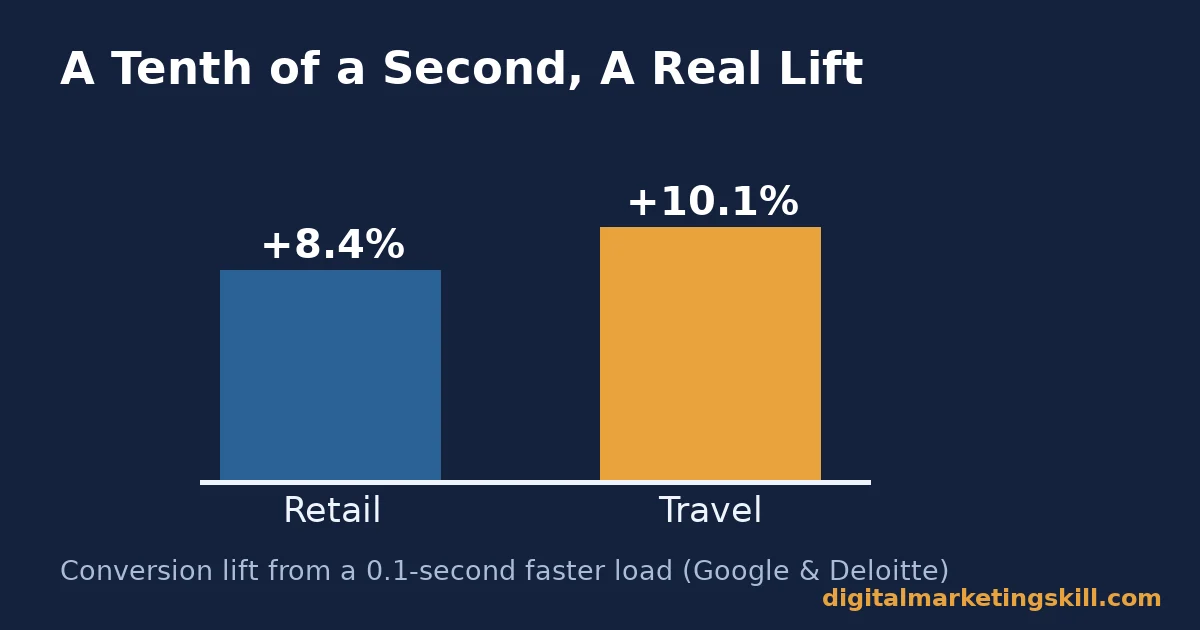
Speed sets the ceiling for everything else. A visitor who leaves before the page renders never sees your headline, your offer or your form. The Google and Deloitte “Milliseconds Make Millions” study tracked over 30 million mobile sessions across 37 brand sites. A 0.1-second improvement in load time raised retail conversion rate by 8.4% and travel conversion rate by 10.1%.
Once a page loads fast enough, attention becomes the scarce resource. Every link that is not the one conversion goal competes for that attention. Unbounce calls this the attention ratio: the number of links on a page compared with the number of campaign goals. Its analysis of 18,639 pages found single-CTA pages averaged 13.5% conversion. Pages carrying three links averaged 10.5%.
Landing Page Design Choices Compared by Funnel Stage
Three design levers show up in almost every credible study: navigation, form length and visual hierarchy. Each one behaves differently depending on where the visitor sits in the funnel, which is why a single landing page design playbook never fits every page on a site.
Navigation: Built to Help Early, Hurt Later
Top-of-funnel pages, the ones a visitor reaches from a blog post or a cold ad, often still benefit from a little navigation. HubSpot’s A/B test found removing navigation lifted conversion only 0-4% on these pages. Many visitors were not ready to act, so the extra links did little harm.
Mid-funnel pages behave very differently. The same HubSpot test found a 16% lift on one mid-funnel page and a 28% lift on another, once navigation was removed. Visitors reaching those pages already intend to convert, so any exit link is pure cost.
A simple way to tell the two stages apart is to ask how the visitor arrived. Someone who clicked a blog link or a cold social ad is usually top-of-funnel, still deciding whether your topic is even relevant to them. Someone who clicked “start free trial” or “book a demo” from an email, a pricing page or a retargeting ad has already decided, and only needs a clear next step.
Form Length: Built to Match the Offer’s Weight
A short form suits a low-commitment offer, like a free guide. A longer form can suit a high-value offer, like a custom demo, where a visitor expects to share more to get something worth more. HubSpot’s analysis of over 40,000 landing pages found conversion rates decline as form fields increase. Length should earn its keep, not just happen by default.
The common mistake is copying a long form from a high-value offer onto a low-commitment one. That mismatch loses visitors who were ready to convert, but balked at a form asking more than the offer justified. The reverse mistake happens too: a two-field form on a page selling a genuinely expensive commitment can send unqualified leads to a sales team that then wastes time filtering them out manually.
Visual Hierarchy: Built to Point at One Action
Visual hierarchy means using size, contrast and position to show a visitor where to look first, second and third. A page with five equally bold elements leaves the visitor to guess. Guessing visitors leave. Good landing page design treats hierarchy as a path, not a collection of nice-looking blocks: headline, proof, then the one action you want.
This is the design version of the attention ratio. One primary call to action should outweigh every other element on the page, including secondary links, so the eye has nowhere else useful to land.
How to Fix Each Lever
Once you know which lever applies to your page’s funnel stage, execution gets simple. The sections below mirror the three levers above.
Navigation: Lead With the Funnel Stage, Not a Rule
Test navigation removal on mid-funnel and bottom-funnel pages first, where HubSpot’s data shows the larger gains. Leave light navigation on true top-of-funnel pages until you have your own test data, since blanket removal is not supported by the same evidence there.
When you do remove navigation, remove the whole header, not just the menu links. A visible logo that still links home gives a visitor a disguised exit.
Form Length: Lead With the Minimum Viable Ask
List every field your sales or fulfilment process genuinely needs on day one. Cut everything else. You can always ask for more information after the first conversion, through a follow-up email or a second step. Treat every extra field as a toll the visitor pays, and only charge that toll when the data is worth collecting at that exact moment.
If you truly need a long form for a high-value offer, split it into steps instead of one long scroll. A multi-step form that shows progress tends to feel shorter than it is, even when the total field count stays the same.
Visual Hierarchy: Lead With Contrast, Not Just Size
Make the primary call to action the highest-contrast element on the page, not simply the largest. A medium button in a bold colour against a muted background often outperforms a huge button that blends into a busy layout.
Shrink or remove every element competing with that button. Secondary links, extra images and long paragraphs the visitor has to scroll past all cost you attention the button needs. A simple test is to squint at the page from a distance: whatever still stands out clearly is what your landing page design is actually prioritising, whether you planned it or not.
How to Measure Whether Your Landing Page Design Is Working
Judge landing page design by conversion rate for the specific traffic source you are optimising, not one site-wide number. A single average hides more than it shows, since paid, organic and email traffic rarely behave the same way. Each metric below gets one defining sentence, with a note on how to read it.
Set a baseline before you change anything. Record each metric for at least two weeks on the current version of the page, so later comparisons measure a real change rather than normal day-to-day noise. Good landing page design work is a series of small, measured steps, not one redesign followed by guesswork.
Five Metrics That Show Real Progress
- Conversion rate by traffic source. The share of visitors from a given channel who complete the goal action. Compare paid, organic and email traffic separately, since they convert at very different rates on the same page.
- Page load time. How long the page takes to become interactive, measured with a tool like Google’s PageSpeed Insights against Google’s own Core Web Vitals thresholds. Given the “Milliseconds Make Millions” findings, even small gains here are worth chasing.
- Attention ratio. The number of clickable links on the page, divided by the number of conversion goals. Aim for as close to 1:1 as your page design allows.
- Form completion rate. The share of visitors who start the form and actually submit it, not just the share who land on the page. A big gap between page visits and form starts points to a different problem than a gap between starts and completions.
- Scroll depth to the call to action. How far a visitor scrolls before reaching the primary button. If most visitors never reach it, move the button higher or shorten the content above it.
How to Read These Numbers Together
Start with load time, since a slow page caps every other number below it. If load time is fine but conversion rate still lags the 6.6% all-industry median, check attention ratio next. Too many competing links is the most common hidden cause, and it is also the cheapest one to fix: removing a link costs nothing but a few minutes of editing.
If attention ratio is already close to 1:1 and conversion still lags, look at form completion specifically. A low completion rate with decent page traffic usually points to the form itself, not the page around it.
Finally, check scroll depth against form starts. If most visitors scroll past the button entirely without clicking, the problem may not be the form at all. It may be that the headline or hero image above it never convinced them the offer was worth the next click, which points you back toward copy and visual hierarchy rather than the form fields themselves.
The Most Useful Rule: Fix Speed and Focus Before You Touch Copy
If you remember one decision rule from this guide, make it this one. Before testing a single headline or button colour, confirm your page loads fast and carries only one real call to action. Copy changes on a slow, cluttered page rarely move the number that matters.
Here is an illustrative example, with invented numbers. A services company’s landing page converts at 2.1%, well under its industry’s benchmark. Instead of rewriting the headline, the team cuts the page’s load time by a third and removes four secondary navigation links. Conversion rises to 4.4% over the next month, before a single word of copy changes.
The lesson is about sequencing. Speed and focus are structural. Copy and design polish are cosmetic. Fix the structural issues first, because they set the ceiling every cosmetic change has to work under. Teams that skip this order often run a dozen headline tests over months and see nothing move, simply because the ceiling was never raised.
A Real Case: What Removing Navigation Actually Returned
HubSpot ran its own navigation test rather than relying on a third-party claim, which makes it unusually easy to verify. The team tested five of its own highest-traffic landing pages, with and without the site’s standard navigation menu.
According to HubSpot’s write-up, top-of-funnel pages saw only a 0-4% lift from removing navigation. Two mid-funnel pages saw 16% and 28% lifts. On a page getting 50,000 views, HubSpot noted that even a 2% lift adds up to roughly 1,000 extra leads.
Treat the case as a guide for where to test first, not a guarantee of the same percentage everywhere. It reflects HubSpot’s own traffic and offers. A page at a very different funnel stage should run its own test before committing to the change permanently.
Run the test for at least two full weeks before reading the result, and longer if your traffic is seasonal or low-volume. A three-day spike or dip in either direction can make a flat result look like a win, or a real win look flat, so give the data time to settle before you decide.
Frequently Asked Questions About Landing Page Design
What is the average landing page conversion rate?
Unbounce’s analysis of 57 million landing page conversions puts the median at 6.6% across industries. This varies widely by vertical: SaaS pages converted lower, at 3.8%. Compare your page against your own industry’s benchmark rather than the all-industry average.
Should a landing page have navigation?
It depends on the funnel stage. HubSpot’s test found removing navigation barely moved top-of-funnel pages, but lifted mid-funnel pages by 16-28%. Test removal on mid-funnel and bottom-funnel pages first.
How many form fields should a landing page have?
As few as your process genuinely requires. HubSpot’s analysis of over 40,000 landing pages found conversion rates fall as form fields increase. Match the form’s length to how much value the offer provides in return.
How much does page speed affect landing page conversion?
More than most marketers expect. The Google and Deloitte “Milliseconds Make Millions” study found a 0.1-second improvement in load time lifted retail conversion rate by 8.4%, based on over 30 million mobile sessions.
What is a good attention ratio for a landing page?
As close to 1:1 as possible: one call to action for the page’s one goal. Unbounce’s analysis of 18,639 pages found single-CTA pages converted at 13.5%, against 10.5% for pages with three links.
Should I test headlines or structure first?
Structure first. A slow page, or one cluttered with competing links, caps what a better headline can achieve. Fix load time and attention ratio, then move on to headline and copy tests.
Does landing page design matter more for paid or organic traffic?
Both, but paid traffic punishes a weak page faster, since every visit costs money whether it converts or not. Fix structural issues before scaling paid spend to a page, so you are not paying to send visitors to a leaky design.
How long should I run a landing page design test before trusting it?
At least two full weeks, longer for low-traffic or seasonal pages. A short test window can make a real improvement look flat, or a random spike look like a win, so give the data enough time to average out.
Can a landing page have more than one call to action?
It can, but each additional link lowers the attention ratio and, in Unbounce’s data, lowers average conversion too. If you must include a secondary link, make it visually smaller and clearly secondary to the primary action.
Fix the Structure, Then Refine the Copy
Landing page design succeeds when speed, focus and form length line up before you touch a single word of copy. Start by timing your page’s load speed, counting its links against its goals, and trimming your form to the minimum your process needs.
If you want guided practice, Digital Marketing Skill Institute teaches these skills hands-on. The Master Diploma in Digital & AI Marketing is built from four AI-powered tracks: AI-Powered Social Media Management and Advertising, AI-Powered Lead Generation and Email Automation, AI-Powered Google Specialist, and AI-Powered WordPress and SEO Specialist. Together they total ten courses, with a Full Stack option to complete all four. The diploma includes unlimited 1-on-1 coaching and mentoring and a U.S. Project Internship with a verified U.S. Work Reference Letter. It is dual US and UK accredited, and recognised in more than 100 countries.
The programme runs 100% online, so you can study wherever you live in your country. For a step-by-step process once your structure is solid, see our landing page optimization checklist, and for more ways to lift results across your site, read our guide to increasing website conversion rates. Browse more guides on the Digital Marketing Skill Institute blog, and when you are ready, apply for the Master Diploma or start from the Digital Marketing Skill Institute homepage.
Every figure in this guide was checked against its original source before publication. Figures marked as illustrative are invented examples, not real results.
![9 Amazing Digital Marketing Skills to Make Money Online [With Proof]](https://digitalmarketingskill.com/wp-content/uploads/2019/07/9-Amazing-Digital-Marketing-Skills-to-Make-Money-Online-With-Proof-17.png)