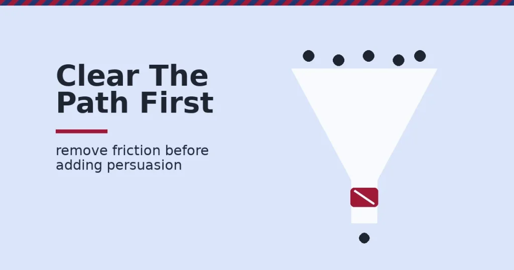
Website enquiries rise when you remove friction before you add persuasion. Cut load time. Shorten the contact form. Give visitors one clear action. Only then test trust elements like reviews. Most sites do the opposite. They add badges and videos to a slow, cluttered page, and wonder why website enquiries stay flat.
Key Takeaways
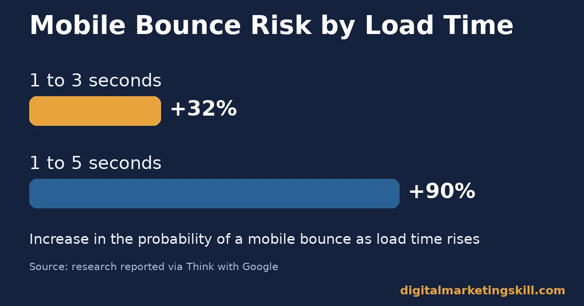
- Speed decides who stays. Research reported via Think with Google found the probability of a mobile visitor bouncing rises 32% as load time goes from one to three seconds, and 90% by five seconds.
- Shorter forms convert better. Hubspot’s analysis of more than 40,000 customer landing pages found conversion rates fall as the number of form fields rises.
- Video is not automatic. Unbounce’s analysis of about 35,000 landing pages found video does not reliably lift conversion rates, and can slightly reduce them on click-through pages and on mobile.
- Reviews still move people. BrightLocal’s Local Consumer Review Survey of 1,002 US adults found 97% read reviews before a purchase decision, and 85% say positive reviews make them more likely to use a business.
- Friction removal usually beats persuasion first. Fixing speed and form length is a one-time technical job. Adding trust elements only pays off once visitors can actually reach the form quickly.
In this guide
- Why Generic Website Enquiry Advice Falls Short
- How Visitors Actually Decide to Make an Enquiry
- What Differs by Page Type
- How to Lead With Each Page Type
- How to Measure Website Enquiries
- The One Decision Rule: Fix Speed and Friction Before You Add Persuasion
- A Real Case: A Website Built From Scratch, Paid Back in Weeks
- Frequently Asked Questions About Website Enquiries
- Turning More Visitors Into Website Enquiries
Why Generic Website Enquiry Advice Falls Short
Most checklists for website enquiries list the same ten tips: add a phone number, add a video, add reviews, add live chat. None of those tips are wrong on their own, but stacking them onto a slow, cluttered page rarely moves the number that matters.
The real gap is sequencing, not the list of tactics itself, and sequencing is the part most checklists skip entirely. Unbounce’s large landing page analysis is a useful warning here. It found that video, a tip nearly every checklist repeats, does not reliably increase conversions, and can quietly reduce them.
Treat every benchmark in this guide as an informed snapshot, not a universal rule. What works depends on your traffic, your offer and your current page speed. Test any change on your own numbers before trusting it fully.
None of the fixes in this guide require a developer team or a paid tool budget to start. Most of the work below can be done by one person in an afternoon. A free page-speed test and a shorter contact form are within reach for almost any small business website. Both tend to move website enquiries more than a third badge or testimonial ever will.
How Visitors Actually Decide to Make an Enquiry
A visitor who lands on a business website moves through three quick checks before reaching for a form or a phone. Can I use this page? Do I trust what it is telling me? Is contacting you worth the effort? Website enquiries drop at whichever check fails first, the same way a conversion funnel leaks at its weakest stage.
These checks matter most on a phone screen, where patience runs out fastest. StatCounter’s global traffic data puts mobile devices at close to 59% of all web traffic worldwide, ahead of desktop. A page that only feels fast and simple on a laptop is failing the speed check for most of its actual visitors.
The Speed Check Happens First
If a page loads slowly, the trust and effort checks never get a chance. Research reported via Think with Google found that as mobile load time rises from one second to three seconds, the probability of a bounce increases by 32%. By five seconds, that probability rises by 90%.
A visitor who bounces in the first few seconds was never going to fill in a form, no matter how good the form is. Our guide to reducing bounce rate covers the technical side of this fix in more depth.
This is why page speed work usually produces the biggest jump in website enquiries for the least ongoing effort. It is a one-time technical fix, not a recurring content task. Once it is done, it keeps paying off on every future visit without any extra work.
The Friction Check Happens Next
Once a page loads fast enough to keep a visitor, the next barrier is effort. Hubspot’s analysis of more than 40,000 customer landing pages found that conversion rates fall as the number of form fields increases. Every extra field is one more reason to abandon the form before finishing it.
Friction is not only about fields on a form. A hidden contact form raises the same kind of resistance in a visitor’s mind. So does a phone number buried in a footer, or a page that forces several clicks before an enquiry can start. Each one asks a visitor to work harder for the same outcome.
What Differs by Page Type
Many small business owners treat their whole website as one page with one job: get the enquiry. In practice, visitors land on different pages for different reasons, through search, social links, or a direct visit to the homepage, and each entry point carries a different level of intent. Website enquiries improve when the page matches what that specific visitor already came looking for, rather than repeating the same pitch everywhere.
Not every page on a website carries the same job. Treating them all the same is one of the quietest ways a redesign wastes effort.
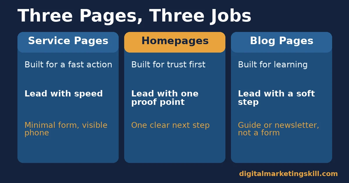
A service or pricing page meets visitors who already want to buy. By contrast, a homepage or about page meets visitors who are still deciding. A blog post meets a different visitor again: one who came to learn, not to buy yet. Website enquiries improve fastest when each page type is optimised for the stage of visitor it actually attracts.
Service and Pricing Pages: Built for a Fast, Single Action
Visitors on a service or pricing page are usually close to a decision. They already know roughly what they want, so the job of the page is to remove every obstacle between arrival and contact. A short form, a visible phone number and one dominant call-to-action button do most of the work here.
Adding persuasion content in front of the contact method can slow down a visitor who was ready to act. That includes a long explainer video or a wall of testimonials placed above the form. Keep the page fast and the action obvious, the same discipline behind most landing page optimization work.
Homepages and About Pages: Built for Trust Before the Ask
Visitors on a homepage or about page are often still deciding whether your business is credible, not just whether your offer is good. This is where BrightLocal’s review statistic earns its place: 97% of consumers read reviews before a purchase decision. A visible customer review or two does more work on a page like this than it would once a visitor is already convinced.
A single clear call-to-action still matters here too. But it can sit alongside more context than a pricing page would carry, since the visitor has not yet decided to act.
Blog and Guide Pages: Built for Low-Pressure Next Steps
Visitors on a blog post or guide came for information, not a sales pitch. Pushing a hard contact form here usually hurts more than it helps, because it mismatches the visitor’s intent. A lighter next step, such as a related guide or a simple newsletter sign-up, keeps the relationship moving without demanding an enquiry too early.
How to Lead With Each Page Type
Matching the fix to the page type is what separates a redesign that lifts website enquiries from one that just looks better. The goal on every page type is the same: remove the specific obstacle that is stopping its own kind of visitor from reaching out.
Service Pages: Lead With Speed and a Visible Contact Method
Put your phone number and a short enquiry form above the fold, where a visitor sees it without needing to scroll down the page first. Strip the form down to the fields the first conversation actually needs, usually a name, a contact method, and one line about what the visitor wants. Anything else can be collected after the first reply.
Test the page’s load time with a free tool before changing anything else. A slow pricing page will undercut every other improvement you make to it, no matter how good the form or the offer looks.
Live chat can help once the basics are solid. One documented case from Inflow’s own analysis reported a 3.84% conversion lift for a specialty retailer after adding it. Most other published live chat figures vary widely and are not independently verified, so treat them with caution.
If you do add live chat, staff it during the hours your actual enquiries arrive, not around the clock by default. An unanswered chat window sitting on a page can do more damage to trust than no chat option at all, since it signals that nobody is actually watching.
Homepages: Lead With One Proof Point and One Clear Path
Choose a single piece of proof, such as a short review or a client result. Place it near the top rather than scattering testimonials across the page. Then give the visitor one obvious next step, instead of five competing buttons. That path might be a service page, a contact form or a phone number.
Resist adding a video here by default. Unbounce’s analysis found video tends to correlate with flat or lower conversion rates across industries and traffic sources. Treat it as something to test, not something to assume.
Blog Pages: Lead With a Low-Commitment Next Step
Offer a related guide, a free resource, or a short newsletter sign-up rather than a full enquiry form. Save the direct contact push for a reader who has shown more intent, such as someone who has read several posts on the same topic. That reader is closer to the service or pricing page than a first-time visitor, and can be treated more like one.
How to Measure Website Enquiries
A handful of numbers show whether a page is actually driving more website enquiries, not just looking better after a redesign. Track them before and after each change, so credit goes to the fix that actually earned it rather than to whichever change happened most recently.
Five Numbers Worth Tracking
- Enquiry conversion rate. The share of visitors who complete a form, call, or chat. This is the core website conversion rate number every other metric should explain.
- Form abandonment rate. The share of visitors who start a form but never submit it. A high rate usually points straight back to form length or confusing fields.
- Bounce rate by device. Checked separately for mobile and desktop, since a slow mobile experience can hide behind a healthy desktop number.
- Time to first response. How long an enquiry waits before someone replies. A fast page that leads to a slow reply still loses the visitor’s interest.
- Enquiry quality. The share of enquiries that turn into real conversations or sales, not just form submissions. A page that produces more enquiries but worse ones has not actually improved.
How to Read Them Together
Start with bounce rate by device. If mobile bounce is high, fix speed before anything else, since no later metric can improve on a page nobody stays on. If bounce is healthy but conversion rate is low, look at form abandonment next. That usually points to friction rather than trust.
Only once speed and friction are handled does enquiry quality become the most useful number to watch. By then, the page is already capturing the visitors it can reasonably capture, so the remaining question is whether those enquiries are worth having.
Check these numbers monthly rather than daily, since small samples swing around too much to read anything useful day to day. A month of data smooths out the noise. It shows whether a change actually helped, rather than reacting to a single unusually good or bad week.
The One Decision Rule: Fix Speed and Friction Before You Add Persuasion
Take one rule from this guide and make it this one. Fix page speed and shorten the contact form before adding any new persuasion element, whether that is a video, a badge, or a longer testimonial section. Persuasion content can only convert visitors who are still on the page.
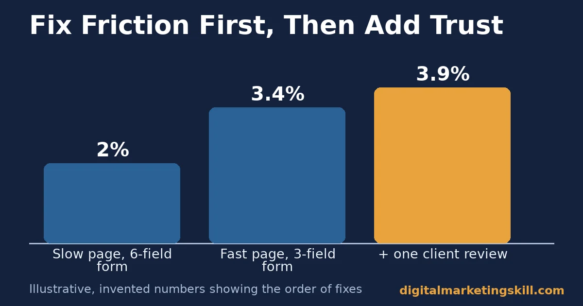
Here is an illustrative example, with invented numbers. A service page converts at 2% with a six-field form and a four-second mobile load time. The owner first cuts the form to three fields and improves load time to under two seconds, with no other changes.
Conversion rises to 3.4% from that change alone.
Only after that does the owner add one short client review near the top, which lifts conversion further to 3.9%. The order mattered.
Adding the review first, on the slow six-field version of the page, would have reached far fewer visitors in a state to notice it. The review did not create the lift on its own. It simply added a smaller gain on top of a page that could finally hold a visitor’s attention long enough to read it.
A Real Case: A Website Built From Scratch, Paid Back in Weeks
According to a story published on the Digital Marketing Skill Institute’s own reviews page, one graduate, Eunice Bolaji, built a full e-commerce website from scratch while still learning. That website earned back her course fees. The payback came from one client, within weeks of launching.
Treat this as one published account, not a formula. The story does not break down which specific page elements drove the result. It could have been speed, the short form, or something about the offer itself.
What the story does confirm is the underlying direction of this guide: a website that makes contact easy can start generating real enquiries almost immediately, well before it accumulates reviews, a large content library, or a polished brand.
Outcomes like this depend on the client, the market and the offer in ways a single case cannot fully prove. DMSI’s own earnings disclaimer applies here too: individual results vary, and no income or outcome is promised.
The useful lesson is still clear, even without a breakdown of every page element. A website built around a clear, fast path to contact can pay for the work that built it faster than a slower, more decorated site would.
Frequently Asked Questions About Website Enquiries
These are the questions that come up most often once the speed and friction fixes above are in place.
How do I get more enquiries from my website?
Start with page speed and a shorter contact form, since both remove the friction stopping visitors who already want to contact you. Only after that work is done should you test persuasion elements like reviews or video.
How many fields should a contact form have?
As few as the first conversation genuinely needs, usually a name, a contact method, and one line describing the enquiry. Hubspot’s analysis of over 40,000 landing pages found that conversion rates fall as form fields increase.
Does adding a video to my website increase enquiries?
Not reliably. Unbounce’s analysis of about 35,000 landing pages found that video does not consistently lift conversion rates. It can slightly reduce them on click-through pages and on mobile. Test it on your own page rather than assuming it will help.
Where should I put my phone number on my website?
Somewhere visible without scrolling, typically in the header. This matters most on pages that meet visitors who are already close to a decision, such as service or pricing pages, where every extra tap or scroll costs you a share of otherwise willing visitors.
Do customer reviews actually increase website enquiries?
They can, particularly on pages where visitors are still deciding whether to trust you. BrightLocal’s survey of US consumers found 97% read reviews before a purchase decision, though the figure is self-reported and US-specific.
Should every page on my website have a contact form?
No. Blog posts and guides usually convert better with a lighter next step, such as a related article or a newsletter sign-up. A hard contact form mismatches a reader who came to learn, not to buy. It tends to feel out of place on that kind of page.
What is a realistic first step if my website gets almost no enquiries?
Run a free mobile page-speed test on your most important page before changing anything else. A slow page hides every other problem. Fixing speed first tells you how much of the shortfall was never about the form or the copy at all.
Turning More Visitors Into Website Enquiries
Website enquiries improve fastest when the basics come first. Fix mobile load time. Cut the contact form down to what the first conversation needs. Then test trust elements like reviews once visitors can actually reach the form quickly.
Measure bounce rate, form abandonment and enquiry quality in that order, so you always know which layer to fix next. A single afternoon spent on speed and form length will usually outperform weeks spent adding new content.
This skill sits alongside the wider discipline of lead generation and conversion, and Digital Marketing Skill Institute teaches it hands-on. It is taught inside the Master Diploma in Digital & AI Marketing. The programme includes nine practical courses, among them AI-powered WordPress website and e-commerce development, AI-powered lead generation, and AI-powered SEO and content marketing.
It comes with unlimited 1-on-1 coaching and mentoring, and real project work inside a U.S. partner company. It is dual US and UK accredited, and recognised in more than 100 countries.
The programme is fully online, so you can study from anywhere in your country. Browse more guides on the Digital Marketing Skill Institute blog, or read more student outcomes on the reviews page. When you are ready, apply for the Master Diploma or start from the Digital Marketing Skill Institute homepage.
Every figure in this guide was checked against its original source before publication. Figures marked as illustrative are invented examples, not real results.
![9 Amazing Digital Marketing Skills to Make Money Online [With Proof]](https://digitalmarketingskill.com/wp-content/uploads/2019/07/9-Amazing-Digital-Marketing-Skills-to-Make-Money-Online-With-Proof-17.png)