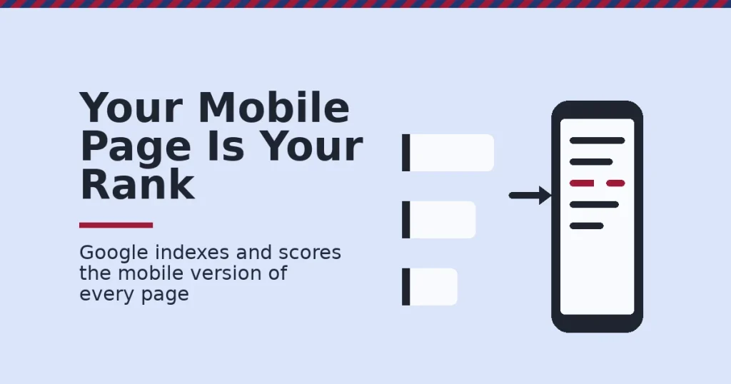
Mobile-first indexing means Google uses the mobile version of a page to decide how it ranks. Googlebot’s smartphone crawler builds that version. This happens even for desktop searchers. If your mobile pages are missing content, links or structured data that only live on desktop, Google is ranking you on the weaker version. This guide shows what mobile-first indexing changes and how to audit it.
Key Takeaways
- Google ranks everyone on the mobile version now. Google’s own documentation states it uses the mobile version of a site’s content, crawled with the smartphone agent, for indexing and ranking.
- Content gaps are invisible until you check. That same Google guidance says to make sure the mobile site contains the same content, the same structured data and the same alt text for images as the desktop site.
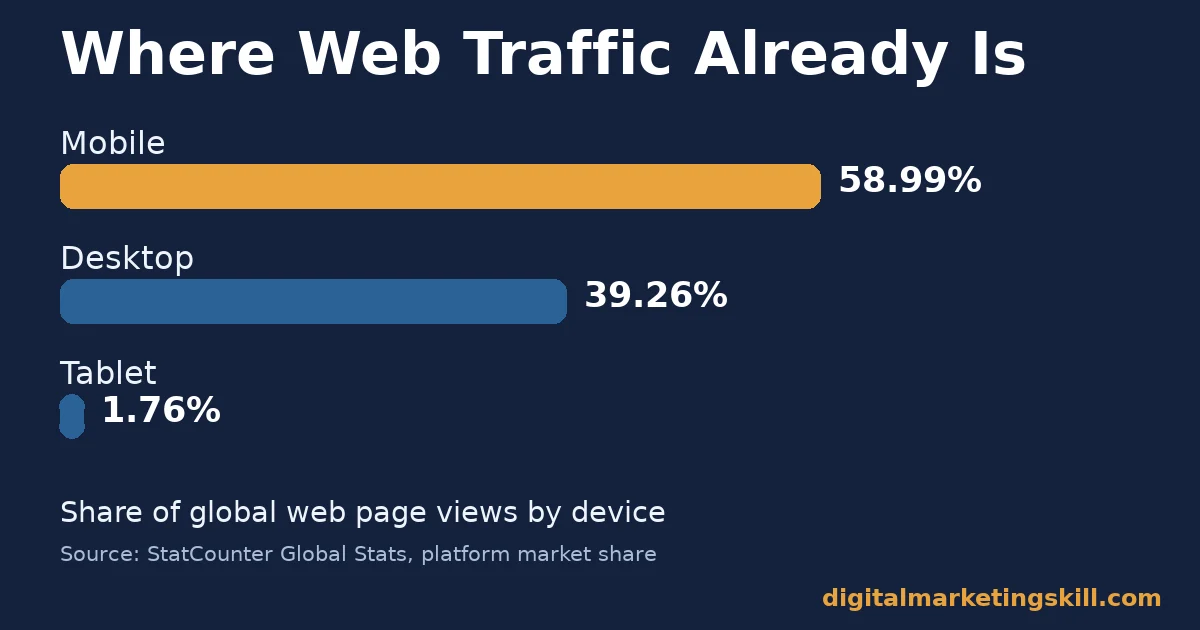
- Mobile is most of the web’s traffic. StatCounter’s global tracking puts mobile at 58.99% of worldwide page views against 39.26% for desktop and 1.76% for tablet.
- Speed still decides who stays. Google’s “Milliseconds Make Millions” research found bounce probability rises by about 32% as mobile page load time goes from one second to three seconds.
- Google recommends one build, not two. Google’s documentation says it recommends responsive web design because it is the easiest design pattern to implement and maintain.
In this guide
- What Most Mobile SEO Advice Still Gets Wrong
- How Mobile-First Indexing Actually Works
- What Differs by Site Setup
- How to Fix Each Setup
- How to Measure Mobile-First Indexing Readiness
- The One Decision Rule: Fix Parity Before You Chase Speed
- A Real Case: How Google Rolled Out Mobile-First Indexing
- Frequently Asked Questions About Mobile-First Indexing
- Start With a Parity Audit, Then Chase Speed
What Most Mobile SEO Advice Still Gets Wrong
Most mobile SEO checklists talk as if desktop and mobile were two separate audiences to please. That framing is outdated now. Mobile-first indexing means there is one index. It is built from the mobile crawl. Your desktop visitors see rankings built on that same mobile view.
This guide treats mobile-first indexing as a parity problem, not a design problem. Being responsive helps, but it is not enough on its own. A responsive theme can still hide content behind accordions that never load. It can drop structured data on smaller breakpoints. It can serve thin alt text on compressed mobile images.
For the fundamentals this guide assumes, see our overview of what search engine optimization actually covers. Read the figures here as current signals, not permanent rankings. Treat the smartphone-agent language as Google’s own description of its crawler, not an independent audit of every site.
How Mobile-First Indexing Actually Works
Googlebot Smartphone crawls your pages the way a phone browser would render them. That rendered version is what gets indexed. It is also what gets scored for ranking. This applies to every searcher, on every device. A desktop-only visitor’s results are still built from the mobile crawl of your site.
This replaced an older model. Google used to index the desktop version by default. It only checked a separate mobile version for a “mobile-friendly” label in search snippets. Mobile-first indexing removed that split. There is now one index, and it is the mobile one.
Why Rendering Budget Matters for JavaScript Sites
Googlebot has to render your page before it can read it, much like a browser does. Heavy JavaScript frameworks can delay that rendering step. If a mobile device takes longer to execute your scripts than a desktop machine does, content that depends on those scripts can load after the crawler has already moved on.
The fix is not to avoid JavaScript. It is to test rendering on the same constrained conditions Googlebot assumes, rather than on a fast developer machine. Server-side rendering or pre-rendering critical content removes this risk entirely, because the content exists in the HTML before any script runs.
What Breaks When Parity Slips
Parity breaks quietly. A theme might lazy-load body text behind a “read more” tap. It might trim a sidebar’s internal links on small screens. It might drop a FAQ schema block that only the desktop template outputs. None of this throws an error. It simply means Googlebot’s smartphone crawl sees less than a human desktop visitor does.
Google’s own guidance is specific about what has to match. The content must match. The structured data must match. Alt text for images must match too, on both versions. Google also warns against lazy-loading primary content behind a user interaction, because the crawler will not perform that interaction to reveal it.
Why Responsive Design Is Still the Easiest Fix
Google’s documentation recommends responsive web design for a simple reason. It is the easiest pattern to implement and maintain. A single URL carries one HTML document, one set of links and one structured-data block. There is nothing for mobile and desktop versions to drift apart from, because there is only one version to begin with.
Separate mobile URLs or dynamically-served HTML can still pass mobile-first indexing. But each adds a parity check that responsive design does not need. If you run WordPress, our WordPress SEO guide covers the theme and plugin checks that keep a responsive build from drifting on its own.
A Related Risk: International and Multi-Language Sites
Sites that serve different languages or regions face an extra layer of parity risk. Each language version needs its own complete mobile build, with its own matching structured data and its own correct hreflang annotations pointing between versions. A missing hreflang tag on just the mobile template can send the wrong language version into search results for a given country, even when the desktop template is set up correctly.
Audit each language version separately rather than assuming a fix on one language carries over to the rest. Template-level bugs often do carry over, but content gaps usually do not, since translators and editors frequently update one language before another. Keep a simple spreadsheet listing each language, its mobile URL, and the date you last checked it, so gaps are caught on a schedule rather than by accident.
What Differs by Site Setup
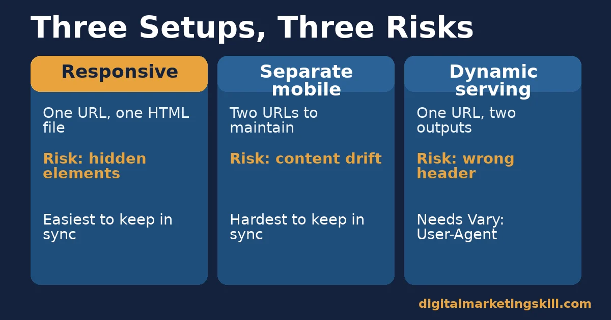
How much work mobile-first indexing creates depends on how your site already serves mobile visitors. The three common setups below face different risks. Each one needs a different fix.
Responsive Sites: Built for Parity by Default
A genuinely responsive site serves the same HTML to every device. It uses CSS to change the layout, not the content. Content, links and structured data cannot fall out of sync between “desktop” and “mobile” versions, because there is only one version.
The risk here is subtler. Elements hidden with display:none for small screens can still count as missing mobile content in some audits. Content that only renders after a click carries the same risk. The HTML exists, but Googlebot’s smartphone crawl may treat it as unavailable at first render.
Separate Mobile Sites: Built for Drift
An m-dot or separate mobile subdomain serves different HTML at a different URL. Every piece of content has to be maintained twice. So does every internal link, and every structured-data block. Small teams rarely keep both versions updated at the same pace.
Under mobile-first indexing, whatever is missing from the mobile URL is what Google ranks on. It does not matter how complete the desktop version is. The gap only shows up when someone compares the two pages directly, which most teams never do until rankings slip.
Dynamic Serving: Built for a Single Hidden Risk
Dynamic serving returns different HTML from the same URL, based on the visitor’s user agent. It avoids duplicate URLs, which is an advantage over a separate mobile site. But it depends entirely on the server correctly detecting Googlebot Smartphone.
The server must also return the full mobile markup to that crawler, including a correct Vary: User-Agent HTTP header. Without that header, a shared cache or CDN can serve the wrong version to the crawler on a later visit, even if the first response was correct.
How to Fix Each Setup
These fixes mirror the three setups above. Start with whichever one matches your site today. Each fix takes a different amount of time, but all three follow the same underlying logic: find the gap, then close it.
Responsive Sites: Audit What Is Actually Hidden
Open your most important page with Chrome DevTools in mobile emulation. Compare the rendered DOM against the desktop view. Check every accordion, tab and “read more” panel. If the text only appears after a tap, treat it as missing until you prove otherwise.
Load critical content in the page’s initial HTML rather than behind an interaction. This single change removes most of the hidden-content risk that responsive sites carry. It also tends to improve the Largest Contentful Paint metric, because less JavaScript has to run before the content appears.
Separate Mobile Sites: Close the Content Gap First
List every piece of body content on your top ten desktop pages. Add every internal link, and every structured-data type, to that same list. Then check the matching mobile URL against the list, line by line.
Add whatever is missing to the mobile template before touching anything else. A faster page with thinner content is still a worse mobile-first indexing result than a complete one. Speed only helps once the content is no longer the weak point.
Dynamic Serving: Verify the Server Response Directly
Fetch your page’s URL with a smartphone-agent header, through a server-side testing tool. Inspect the raw HTML it returns. Do not trust what a regular browser shows you, because a browser may apply its own rendering shortcuts that a crawler does not.
Confirm the response includes a Vary: User-Agent header. This stops shared caches and CDNs from accidentally serving a desktop-rendered page to Googlebot Smartphone. This matters most for pages built around nearby-intent searches. Our local SEO guide covers how those mobile “near me” queries are matched to a result.
How to Measure Mobile-First Indexing Readiness
Google retired its dedicated Mobile Usability report and Mobile-Friendly Test tool in its page-experience update. That signal now lives inside broader performance tooling. These are the metrics worth tracking instead, each defined in one sentence. Our guide on increasing website page speed covers the fixes behind each one in more depth.
Four Metrics That Show Real Readiness
- Largest Contentful Paint (LCP). The time until the largest visible element finishes rendering. Google’s web.dev documentation sets the “good” threshold at 2.5 seconds or less.
- Interaction to Next Paint (INP). The responsiveness of the page to a click, tap or key press. The recommended threshold is 200 milliseconds or less.
- Cumulative Layout Shift (CLS). How much visible content moves unexpectedly while loading. The recommended threshold is 0.1 or less.
- Crawled-page parity rate. The share of your checked pages where the mobile-rendered HTML matches the desktop content, links and structured data exactly. There is no official benchmark, so the useful target on your highest-traffic pages is 100%.
Google’s own guidance is to measure Core Web Vitals at the 75th percentile of page loads, segmented by device. Do not average every visit together. An average hides the slowest real sessions, and those are the sessions most likely to bounce.
How to Read These Numbers Together
Start with parity rate, because it is the most direct measure of mobile-first indexing itself. If content, links or structured data are missing on mobile, no amount of speed work fixes the underlying problem. Fix that gap first.
Once parity is confirmed, move to LCP, then INP, then CLS, in that order. Each one affects a different stage of how a visitor experiences the page: first the wait, then the responsiveness, then the stability of what they see.
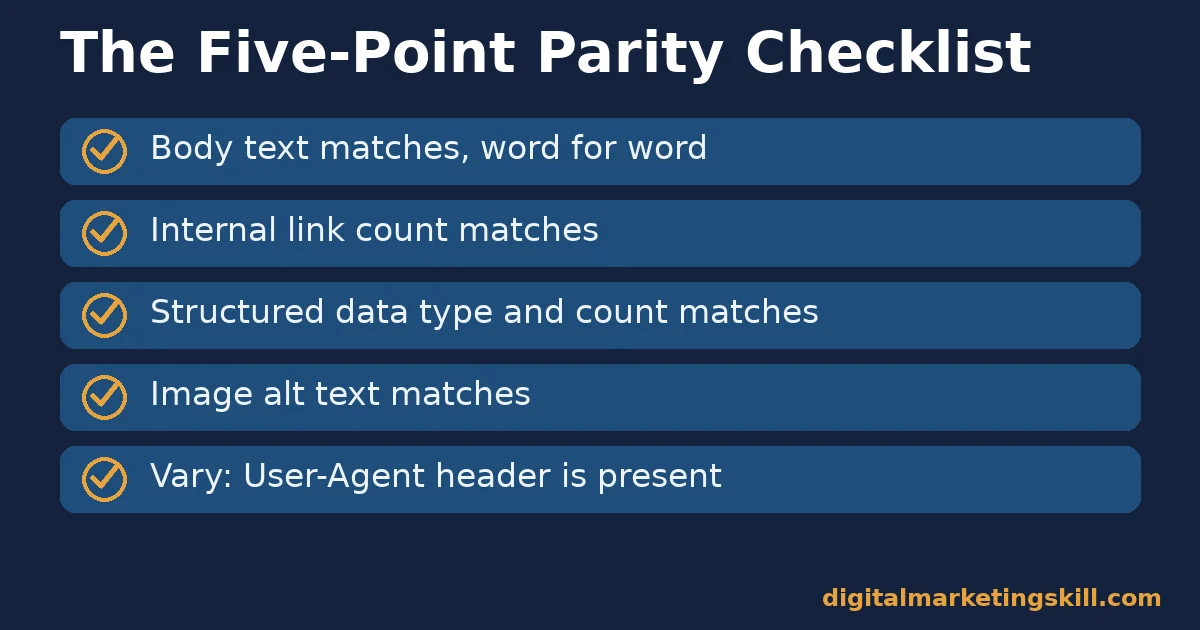
A Five-Point Parity Checklist
Run this short checklist on your top pages before you trust any speed number. It takes a few minutes per page once you know where to look.
- Word-for-word body text. Copy the rendered mobile text and compare it against the desktop text for the same page.
- Internal link count. Count outbound internal links on both versions; a large gap usually means a navigation menu or related-posts block is missing on mobile.
- Structured data type and count. Check that every schema type present on desktop, such as FAQPage or Article, also appears in the mobile-rendered HTML.
- Image alt text. Spot-check a handful of images; mobile themes sometimes swap in a smaller image with blank or generic alt text.
- Response headers. For dynamic serving, confirm the
Vary: User-Agentheader is present on every page template, not only the homepage.
The One Decision Rule: Fix Parity Before You Chase Speed
If you only take one rule from this guide, make it this one. Confirm mobile and desktop parity before spending a single hour on speed optimisation. A fast page that is missing content, links or structured data on mobile still loses to a slightly slower page that mobile-first indexing can fully read.
Here is an illustrative example, with invented numbers. A site runs a legacy m-dot mobile subdomain. It is missing half its internal links on mobile, and three of its five FAQ questions, compared with desktop.
The team rebuilds the page as fully responsive. Every link and all five FAQ questions now live in the single shared template. The page’s FAQPage-eligible content regains rich-result eligibility. Organic clicks to those pages rise by roughly 18% over the following month. Treat that figure as one illustrative scenario, not a guaranteed outcome for every site.
A Real Case: How Google Rolled Out Mobile-First Indexing
Google did not switch every site over in one move. According to its own Search Central blog, it began testing mobile-first indexing on a small number of sites. It expanded gradually as more sites were ready.
Google only enabled mobile-first indexing by default for newly discovered domains once the system had been proven at scale. It moved the remaining existing sites over afterward, in further batches, rather than switching the whole web at once.
The rollout’s own stated logic is the lesson here. Google checked that a site’s mobile version was substantially equivalent to its desktop version before switching that specific site over. The gradual, site-by-site approach shows that parity, not speed or design trends, was always the gating requirement. Treat this as Google’s own account of its rollout process, not an independent audit of every outcome along the way.
The practical takeaway runs the opposite direction too. If Google itself waited for proven parity before moving a single site to mobile-first indexing, a site owner has even less reason to assume their own mobile build is equivalent without checking. The rollout was cautious because the risk of ranking a thinner page was real, not theoretical, and that risk has not gone away just because the rollout finished.
Frequently Asked Questions About Mobile-First Indexing
What does mobile-first indexing actually mean?
It means Google uses the mobile, smartphone-crawled version of your page to index and rank it. This applies for every searcher, regardless of the device they use. If content only exists on desktop, Google is effectively ranking you without it.
Do I need a separate mobile website for mobile-first indexing?
No. Google’s own documentation recommends responsive web design specifically because a single responsive template cannot develop the content and structured-data gaps that separate mobile sites are prone to.
Can I lazy-load content and still pass mobile-first indexing?
You can lazy-load as the user scrolls down the page. Google’s guidance warns against lazy-loading primary content behind a user interaction, such as a tap or click, since the crawler will not perform that interaction to reveal it.
Does mobile-first indexing affect desktop rankings too?
Yes. There is one index, built from the mobile crawl. A desktop searcher’s results are still shaped by what Googlebot Smartphone found on your mobile pages, not by a separate desktop crawl.
How do I check if my structured data matches on mobile and desktop?
Fetch the live HTML of both versions with a server-side testing tool. Compare the structured-data blocks directly, rather than relying on how a browser renders the page, since rendering can mask what the crawler actually receives.
Is the old Mobile-Friendly Test tool still available?
No. Google retired the Mobile-Friendly Test tool, its API and the Mobile Usability report in Search Console. That signal is now folded into Core Web Vitals and broader page-experience data.
What is a good Largest Contentful Paint score for mobile?
Google’s web.dev documentation sets the “good” threshold at 2.5 seconds or less. That figure is measured at the 75th percentile of real page loads on mobile devices specifically, not as a simple average.
Does mobile-first indexing mean mobile pages rank higher than desktop pages?
No. Mobile-first indexing is about which version of your content Google reads, not a preference for mobile over desktop URLs. A single responsive page serves both, so this distinction rarely matters once parity is fixed.
How often should I re-check mobile-first indexing parity?
Check your highest-traffic pages whenever you change a theme, a plugin or a page template, since those are the moments most likely to introduce a gap. Outside of changes, a quarterly spot-check of your top ten pages catches most drift before it affects rankings.
Start With a Parity Audit, Then Chase Speed
Mobile-first indexing rewards sites where the mobile version is the complete version, not the lighter one. Pick your five highest-traffic pages. Compare their mobile-rendered content, links and structured data against desktop, line by line. Fix any gap before you spend time elsewhere.
If you want to build this kind of SEO audit skill properly, Digital Marketing Skill Institute teaches it hands-on inside the Master Diploma in Digital & AI Marketing. The diploma runs across four AI-powered tracks totalling ten courses, including the AI-Powered WordPress and SEO Specialist track, with a Full Stack option for completing all four.
Every student gets unlimited 1-on-1 coaching and mentoring. Every student also completes a U.S. Project Internship with a verified U.S. Work Reference Letter. The diploma is dual US and UK accredited, and it is recognised in more than 100 countries.
The programme is 100% online, so you can study and apply this audit anywhere in your country. Browse more guides on the Digital Marketing Skill Institute blog. When you are ready, apply for the Master Diploma from Digital Marketing Skill Institute.
Every figure in this guide was checked against its original source before publication. Figures marked as illustrative are invented examples, not real results.
![9 Amazing Digital Marketing Skills to Make Money Online [With Proof]](https://digitalmarketingskill.com/wp-content/uploads/2019/07/9-Amazing-Digital-Marketing-Skills-to-Make-Money-Online-With-Proof-17.png)