

A mobile-friendly website is one Google can crawl, read and rank using its phone version of your pages. Google now indexes the mobile version of almost every site by default. Most sites pass the basic test but still lose visitors to small, fixable friction. This guide covers what Google actually checks, the three ways to build for mobile, and how to measure whether yours works.
Key Takeaways
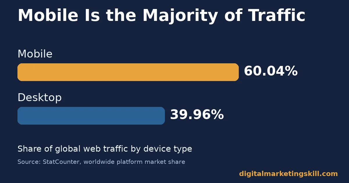
- Mobile is the majority of traffic. StatCounter’s global data puts mobile at 60.04% of web traffic worldwide, against 39.96% for desktop.
- Google reads your phone version first. Google uses mobile-first indexing, crawling the mobile version of a site’s content for indexing and ranking.
- Google has a clear preference. Of the three setups Google documents, it states plainly that “Google recommends Responsive Web Design because it’s the easiest design pattern to implement and maintain.”
- Tap targets have a real minimum. Google’s own guidance recommends touch targets of around 48 device-independent pixels, spaced about 8 pixels apart.
- Mobile speed fixes move real revenue. In a month-long A/B test, Rakuten 24 saw a 53.37% increase in revenue per visitor after optimizing one landing page’s Core Web Vitals.
In this guide
- What Most Mobile-Friendly Website Advice Gets Wrong
- How Google Actually Judges a Mobile-Friendly Website
- What Differs by Mobile Configuration
- How to Choose and Fix Each Configuration
- A Mobile-Friendly Website Checklist, in Priority Order
- Why Mobile Speed Gets Its Own Priority
- Testing a Mobile-Friendly Website the Right Way
- Common Mistakes With a Mobile-Friendly Website
- How to Measure a Mobile-Friendly Website
- The One Rule: Default to Responsive Unless You Have a Specific Reason Not To
- A Real Case: What Rakuten 24 Found When It Tested Mobile Speed
- Frequently Asked Questions About Mobile-Friendly Websites
- Start With Your Highest-Traffic Mobile Page
What Most Mobile-Friendly Website Advice Gets Wrong
Most advice on building a mobile-friendly website stops at “pass Google’s mobile-friendly test.” That test catches the worst problems. It does not catch a page that passes but still frustrates real visitors with cramped buttons or a slow load.
This guide goes past the pass-or-fail test. It covers how Google actually evaluates mobile pages, the three technical ways to serve them, and the metrics that show whether visitors, not just a crawler, find your site usable.
Here are the ground rules. The Rakuten 24 case later in this guide covers one landing page over one month, not a site-wide guarantee. StatCounter’s traffic split is a global snapshot that varies by country and audience. Treat every figure here as a snapshot, not a fixed rule for your exact site.
How Google Actually Judges a Mobile-Friendly Website
Google’s evaluation runs in two stages. First, its crawler visits your site using a smartphone user agent. It indexes what it finds there, under what it calls mobile-first indexing. Whatever content, links and structured data exist on that mobile version are what Google actually uses for ranking.
Second, Google checks specific usability signals on that mobile version. Two of the most basic are a correct viewport setup and tap targets sized for a real finger, not a mouse pointer. A page can have great content and still fail visitors if these two technical details are wrong.
These two checks matter because they sit upstream of everything else. A visitor who cannot read the text without zooming never gets far enough to judge your actual content. Neither does one who keeps mis-tapping the wrong link. Fixing both first tends to produce the largest, fastest improvement in how a mobile-friendly website performs for real people, not just for a crawler.
The viewport tag tells the browser how to scale the page. Google’s own guidance recommends the value width=device-width, initial-scale=1. That matches the page’s width to the screen and sets a 1:1 pixel relationship. Without it, pages load zoomed out, forcing visitors to pinch and zoom just to read a sentence.
What Differs by Mobile Configuration
Google documents three distinct ways to configure a site for mobile. They are not equally easy to maintain. The differences explain why most sites that struggle with mobile usability picked the harder option, often long before anyone on the current team made that choice.
Responsive Design: Built on One URL
Responsive design serves the same HTML code on the same URL to every device. Only the display changes, based on screen size, using CSS. There is one page to maintain, one URL to rank and one set of links to earn.
Dynamic Serving: Built on One URL, Different HTML
Dynamic serving also keeps one URL. But it sends different HTML to different devices. It relies on reading the visitor’s user agent and a Vary: User-Agent HTTP header to decide what to serve. That extra moving part is where this approach tends to break.
Separate URLs: Built on Two Sites
Separate URLs, such as an “m.” subdomain, serve different HTML on different URLs entirely. This was once common. But it means maintaining two sites, keeping their content in sync, and managing redirects correctly between them.
Every new page, price change or product update has to be applied twice. Every missed update becomes a visible inconsistency between what desktop and mobile visitors see.
How to Choose and Fix Each Configuration
The fixes below mirror the three setups above. If you are starting a new build, the first section applies to you no matter what you run today.
Responsive Design: Lead With a Correct Viewport
Confirm the viewport meta tag is present and correct on every template, not just your homepage. Then check tap targets across your real navigation, buttons and form fields. Google’s guidance on tap target sizing calls for roughly 48 pixels with 8 pixels of spacing.
Dynamic Serving: Lead With Correct User-Agent Detection
Audit your user-agent detection regularly. Device strings change, and a missed pattern silently serves the wrong version to real visitors. Confirm the Vary: User-Agent header is actually present, so caching layers do not serve the desktop HTML to a mobile crawler or visitor.
Separate URLs: Lead With a Migration Plan
If you still run a separate mobile site, plan a move to responsive design rather than patching redirects forever. Google itself recommends responsive design for exactly this reason. It removes the ongoing cost of keeping two sites and their redirects in sync.
A Mobile-Friendly Website Checklist, in Priority Order
Work through these in order. Each one affects more of your mobile traffic than the item after it.
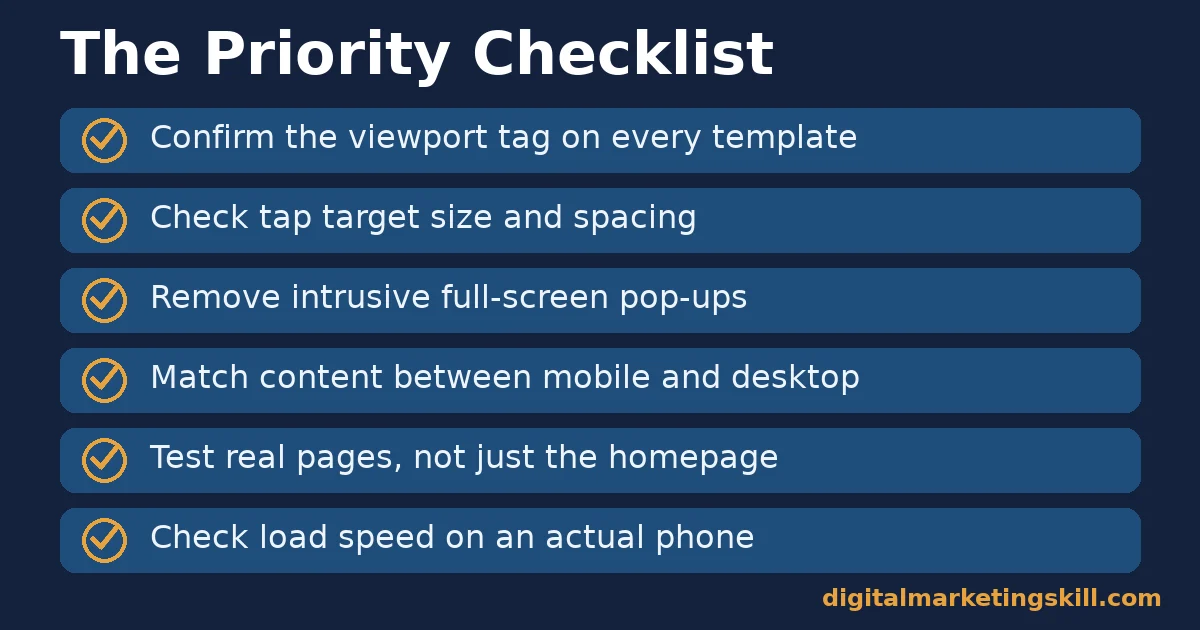
- Confirm the viewport tag. Every template needs
width=device-width, initial-scale=1, not just the homepage. - Check tap target size. Buttons, links and form fields need roughly 48 pixels with 8 pixels of spacing between them.
- Remove intrusive interstitials. A pop-up that covers the content on arrival frustrates mobile visitors more than desktop ones, since there is no easy way to shrink it offscreen.
- Match content between mobile and desktop. Hidden sections or stripped-down mobile content can quietly cost you ranking signals under mobile-first indexing.
- Test real pages, not just the homepage. Product pages, forms and checkout flows often fail where a homepage passes.
- Check load speed on an actual phone connection. A page that loads fast on office wifi can crawl on mobile data.
For the page-speed half of this checklist, our guide to landing page optimization covers why load time is treated as a gate, not a nice-to-have.
Why Mobile Speed Gets Its Own Priority
Desktop and mobile visitors experience your site’s speed very differently, even on identical pages. A desktop visitor usually has a fast, stable connection and a powerful processor. A mobile visitor might be on a crowded cellular network, an older phone, or both at once.
That gap means a site that feels instant on an office desktop can feel sluggish on a commuter’s phone. Core Web Vitals measure this directly. Largest Contentful Paint tracks how long the main content takes to become visible. Cumulative Layout Shift tracks how much the page jumps around as it loads.
Treat mobile speed as a separate problem from desktop speed, not a smaller version of the same one. A fix that helps desktop load time can actively hurt mobile load time. A larger hero image optimized for a big screen is a common example, if it is not also served at a smaller size for phones.
A genuinely mobile-friendly website serves images, fonts and scripts sized for the device that actually requested them, not a single one-size-fits-all file.
Testing a Mobile-Friendly Website the Right Way
Automated tools catch the basics. But they cannot tell you whether a real thumb can comfortably tap your navigation. Combine both kinds of testing rather than relying on either alone.
Run an automated audit first, since it finds structural problems fast: a missing viewport tag, undersized tap targets, or render-blocking scripts. Then physically test on at least two real devices, an older budget phone and a newer flagship. Performance and screen size both vary enough between them to surface different problems.
Pay particular attention to forms, checkout flows and anything involving typing. These are where small mobile friction costs the most. A visitor who struggles to tap the right field or zoom in on a label is far more likely to abandon a purchase than to abandon a simple article page.
Common Mistakes With a Mobile-Friendly Website
These mistakes recur across business sizes. Most of them pass a basic mobile-friendly test while still costing real visitors.
Hiding Content on Mobile That Exists on Desktop
Under mobile-first indexing, Google mostly sees what the mobile version shows. Content hidden from mobile visitors to save space, such as an FAQ section or internal links, is effectively invisible to the version of your site Google actually indexes.
Shrinking Buttons to Fit More on the Screen
Cramming extra navigation items onto a small screen means shrinking each tap target. Going below Google’s roughly 48-pixel guidance leads directly to mis-taps. Fewer, larger targets usually convert better than more, smaller ones.
Showing a Full-Screen Pop-Up Immediately on Arrival
A pop-up that covers the whole screen before a visitor has read anything is harder to dismiss on mobile than on desktop. A mouse can quickly find a small close button; a thumb often cannot. This is one of the clearest ways to turn a technically mobile-friendly website into a frustrating one.
Treating the Mobile Test as a One-Time Check
A redesign, a new plugin or a theme update can quietly break viewport settings or tap targets months after launch. A mobile-friendly website needs periodic re-checks, not a single pass-or-fail test at launch.
Running Ads or Scripts That Were Never Tested on Mobile
A third-party ad script, chat widget or tracking pixel is often only ever tested on desktop. It can quietly break mobile layout, shift content as it loads, or add enough weight to slow the page a lot. Test every new script on an actual phone before it goes live site-wide, not just on a desktop browser resized to look smaller.
How to Measure a Mobile-Friendly Website
These metrics, read together, show whether your site is mobile-friendly for Google and for real visitors. Each is defined in one sentence, with a note on how to read it.
Five Metrics That Show Real Mobile Usability
- Mobile usability issues. Google Search Console’s Mobile Usability report lists specific pages and problems, such as text too small to read or clickable elements too close together.
- Core Web Vitals on mobile. Mobile and desktop scores often differ sharply, since mobile connections and processors are usually slower. Check them separately, not as one blended number.
- Mobile share of traffic and conversions. Compare your own mobile traffic share against your mobile conversion share. A large gap between the two usually points to a mobile-specific friction point.
- Tap target failures. Found through manual testing or Lighthouse audits, this shows exactly which elements are too small or too close together.
- Mobile bounce or engagement rate. Compared against your desktop number for the same pages, a mobile-specific gap points to a usability problem rather than a content problem.
Reading These Numbers Together
Start with Search Console’s Mobile Usability report, since it flags concrete, fixable problems first. If that report is clean but mobile conversion still trails mobile traffic share, move to Core Web Vitals on mobile specifically. If both of those look fine, the remaining gap is more likely a content or offer problem than a technical mobile-friendliness problem.
The One Rule: Default to Responsive Unless You Have a Specific Reason Not To
If you take one decision rule from this guide, make it this one. Unless you have a documented, specific reason to run dynamic serving or separate URLs, build or rebuild on responsive design. Google states its own preference plainly, and the maintenance cost of the other two options compounds over time.
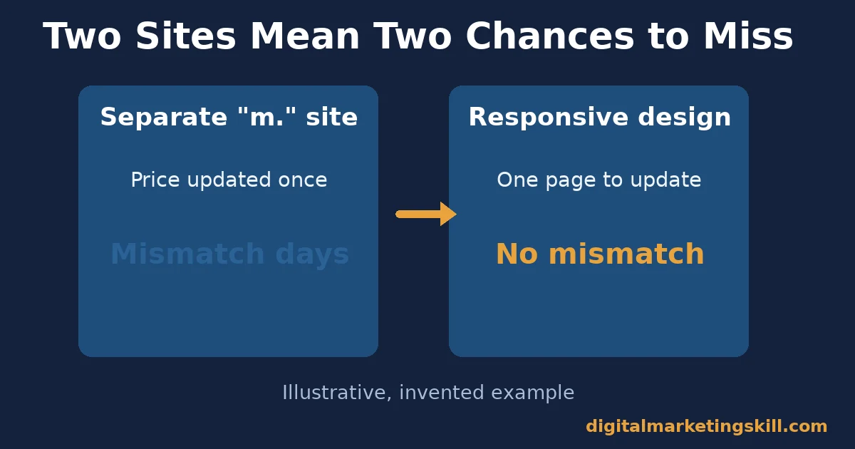
Here is an illustrative example, with invented numbers. A small retailer runs a separate “m.” mobile site alongside its main domain. Product updates get applied to the main site but forgotten on the mobile version three times in one quarter. Each time, it shows outdated prices to mobile shoppers for days before anyone notices.
After migrating to a single responsive site, that class of error becomes structurally impossible, since there is only one page to update. The business does not gain a new feature. It simply removes a recurring failure mode that responsive design does not allow in the first place.
That kind of quiet, compounding risk rarely shows up in a single audit. That is exactly why it tends to go unnoticed until a customer complains.
A Real Case: What Rakuten 24 Found When It Tested Mobile Speed
Rakuten 24, the online retailer, ran a direct A/B test rather than guessing at the impact of mobile page speed. Over one month, it split traffic evenly between its original landing page and a version optimized for Core Web Vitals, with no other functional or visual differences between the two.
According to web.dev’s write-up of the test, the optimized version produced a 53.37% increase in revenue per visitor and a 33.13% increase in conversion rate, alongside a 35.12% reduction in exit rate.
The team on purpose chose a high-traffic, high-conversion landing page so the test could reach a meaningful result quickly. That is a sensible testing choice. But it also means the exact percentages are specific to that page, not a guaranteed site-wide outcome. The broader lesson is still clear: mobile speed is not a cosmetic concern. It is tied directly to revenue on pages that already convert.
What makes this case worth citing is the method as much as the result. An A/B test with an even traffic split removes most of the usual objections to a before-and-after comparison, such as seasonality or a concurrent marketing push.
The drop in exit rate alongside the revenue gain also suggests the improvement came from visitors actually staying and engaging. It does not look like some unrelated shift in traffic quality during the test month.
Frequently Asked Questions About Mobile-Friendly Websites
What makes a website mobile-friendly?
A mobile-friendly website loads correctly on a phone screen, with a working viewport tag, tap targets sized for a finger rather than a mouse, readable text without zooming, and content that matches its desktop version.
What is mobile-first indexing?
It is Google’s practice of crawling and indexing the mobile version of your site’s content for ranking purposes, rather than the desktop version. Content missing from your mobile pages is effectively invisible to this process.
Should I use responsive design or a separate mobile site?
Google explicitly recommends responsive design because it is easier to implement and maintain. A separate mobile site means keeping two versions of your content in sync forever.
How big should tap targets be on mobile?
Google’s own guidance recommends around 48 device-independent pixels, with about 8 pixels of spacing between targets, to reduce accidental taps on the wrong element.
Does page speed really affect mobile conversions?
Yes. In a documented A/B test, Rakuten 24 saw a 53.37% increase in revenue per visitor after optimizing one landing page’s Core Web Vitals for mobile. That figure applies to one high-traffic page, not a universal guarantee.
Can a site pass Google’s mobile-friendly test and still have problems?
Yes. The basic test catches major failures, not smaller frustrations like a slow load, a confusing pop-up, or tap targets just under the recommended size. Treat it as a floor, not a finish line.
How often should I re-check mobile usability?
After any redesign, theme update or new plugin, and on a regular schedule otherwise. These changes can quietly break viewport settings or tap targets without an obvious visual sign.
Does mobile page speed affect search ranking?
Core Web Vitals, measured on mobile, are part of how Google evaluates page experience. More directly, a slow mobile page loses visitors before ranking even becomes relevant, since many leave before the content finishes loading.
What is the single most common mobile usability failure?
Tap targets sized for a mouse pointer rather than a finger. It is an easy mistake to make. The problem is often invisible on a desktop browser resized to simulate a phone screen, and only shows up when tested on an actual device.
Start With Your Highest-Traffic Mobile Page
A mobile-friendly website delivers the most value when you start with the page that already gets the most mobile traffic. Run it through the priority checklist above, check Search Console’s Mobile Usability report for it specifically, and compare its mobile and desktop conversion rates before changing anything else.
Once that page is solid, repeat the same checklist for the next-highest-traffic page, rather than trying to audit the whole site in one pass.
Digital Marketing Skill Institute teaches this hands-on inside the Master Diploma in Digital & AI Marketing. Its AI-Powered WordPress and SEO Specialist track covers mobile usability and technical SEO directly, as one of four AI-powered tracks totalling ten courses, with a Full Stack option for all four.
It comes with unlimited 1-on-1 coaching and mentoring, plus a U.S. Project Internship with a verified U.S. Work Reference Letter. The diploma is dual US and UK accredited, and recognised in more than 100 countries.
The programme is 100% online, so you can study and apply these skills from anywhere in your country. Browse more guides on the Digital Marketing Skill Institute blog. When you are ready, apply for the Master Diploma or start from the Digital Marketing Skill Institute homepage.
Every figure in this guide was checked against its original source before publication. Figures marked as illustrative are invented examples, not real results.
![9 Amazing Digital Marketing Skills to Make Money Online [With Proof]](https://digitalmarketingskill.com/wp-content/uploads/2019/07/9-Amazing-Digital-Marketing-Skills-to-Make-Money-Online-With-Proof-17.png)