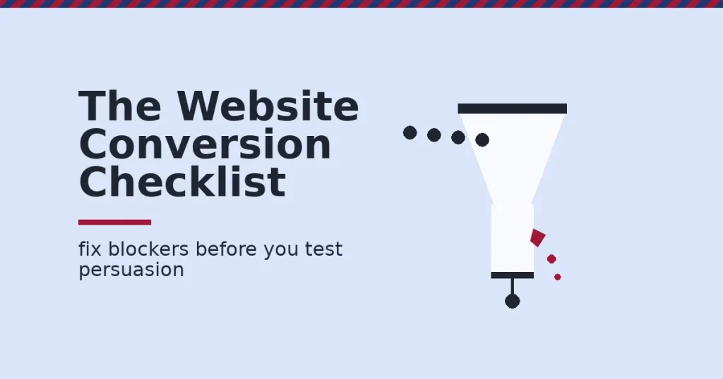
A page that looks good is not the same as a page that converts. This website conversion checklist ranks what actually moves visitors to act. Fix load speed first. One clear call to action comes second. Trust signals near the decision come third. A shorter form comes fourth. Test persuasion only once those blockers are gone.
Key Takeaways
- Nielsen Norman Group’s response-time research puts 10 seconds as the attention limit. Past that point, people stop focusing on your page (Nielsen Norman Group).
- Google defines a “good” Largest Contentful Paint as 2.5 seconds or less. A slower load is a common, fixable reason a page loses visitors before they read the offer (web.dev).
- Baymard Institute’s checkout-flow benchmark puts the average checkout at roughly 11 form fields. 17% of shoppers say they have abandoned a checkout purely because it felt too complex (Baymard Institute).
- Unbounce’s Conversion Benchmark Report, built from more than 41,000 landing pages and 464 million visitors, found a median landing page conversion rate of 6.6% across industries (Unbounce).
- In Nielsen Norman Group usability tests, 79% of visitors scanned a new page instead of reading it line by line. Only 16% read word for word (Nielsen Norman Group).
In this guide
- Why “Conversion Tips” Lists Are Not A Real Website Conversion Checklist
- How A Page Actually Loses A Conversion
- What Differs By Page Type In A Website Conversion Checklist
- How To Lead With Clarity On Each Page Type
- Measuring The Website Conversion Checklist: KPIs And How To Read Them
- The One Decision Rule Behind Every Website Conversion Checklist
- A Real Case: Clarity Changed What A Visitor Did Next
- Frequently Asked Questions About Website Conversion
- Turn What You Have Learned Into A Skill You Can Use Anywhere
Why “Conversion Tips” Lists Are Not A Real Website Conversion Checklist
Search for conversion advice. You will find the same five tips everywhere: write better copy, add a testimonial, use a “better” button. None of that is wrong. But it is not a real website conversion checklist, because a checklist has an order, and a tips list does not.
A real website conversion checklist fixes blockers before it polishes persuasion. Speed and basic clarity come first. They affect every visitor, warm or cold. Trust and persuasion come second. They only matter to visitors who already arrived and can read the page. Testing comes last. A test only means something once real visitors reach the decision point.
This is a snapshot, not a settled formula. Conversion rate differs by traffic source, price point, device and audience. Treat every benchmark here as a comparison point, not a guaranteed target. A benchmark from one industry is a weak guide for a very different one.
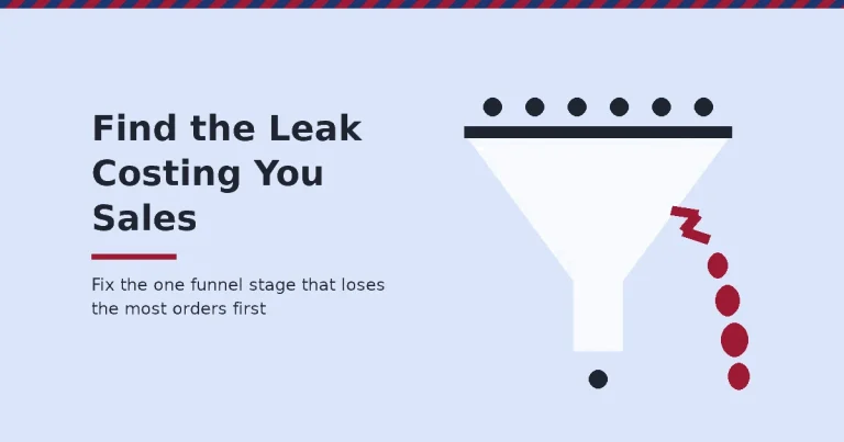
Most pages that fail this website conversion checklist do not fail everywhere at once. They usually fail at exactly one gate: speed, clarity, trust or forms. Finding that one gate matters more than redesigning the whole page, because a fix aimed at the wrong gate changes nothing measurable.
How A Page Actually Loses A Conversion
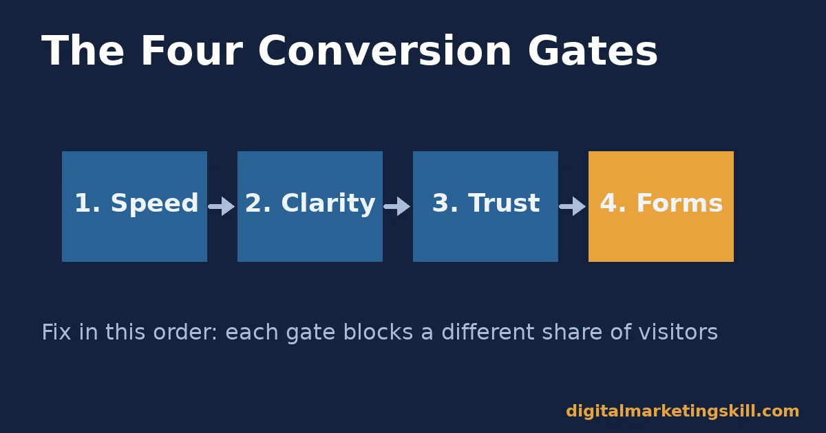
A “conversion” is simply a visitor completing the action you defined as success. That might be a form filled in, a cart checked out, or a demo booked. Most underperforming pages lose visitors at one of four points, almost always in this order: before the page loads, before the visitor understands the next step, before the visitor trusts the offer, or inside the form itself.
The Speed And Clarity Gates
Speed sets the ceiling for everything else here. Nielsen Norman Group’s research describes three thresholds. A response inside 0.1 seconds feels instantaneous. A response inside 1 second still feels like the visitor is in control.
Past 1 second, the visitor tolerates the wait, up to about 10 seconds. After 10 seconds, attention drifts elsewhere entirely. No headline can win the visitor back at that point, because they are no longer looking.
Google’s own guidance sets a “good” Largest Contentful Paint at 2.5 seconds or less. A page that misses that bar loses visitors before the offer is even on screen. That is a speed problem, not a copywriting problem. Many slow pages trace back to oversized images; running one through Google’s own PageSpeed Insights tool will usually show you the exact cause.
Clarity sets the next ceiling. 79% of visitors scan a page rather than reading it fully, per Nielsen Norman Group’s testing. A page that buries its call to action inside a paragraph is asking the visitor to do extra work. Most visitors will not do that work. They will simply leave. Our own guide to landing page optimization covers this scanning pattern in more depth.
The Trust And Forms Gates
These two gates are easy to miss, because neither one shows up as an error. The page loads, the form technically works, and nothing looks broken. The visitor simply decides not to proceed, quietly, and the data shows a drop-off with no obvious cause.
Trust decides whether a visitor who understands the offer believes it enough to act. An unfamiliar brand, an oversized form, or no reassurance near the decision point all raise that bar. Form friction is the final gate, and it is where otherwise-strong pages quietly leak conversions.
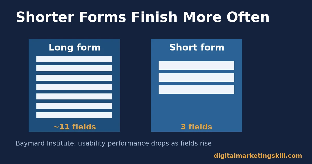
Baymard’s benchmark found usability performance drops as form fields rise. 17% of shoppers report abandoning a checkout purely over complexity, a pattern that holds for lead forms too (Baymard Institute).
These four gates sit in a fixed order because each one blocks a different share of visitors. Speed blocks everyone equally, before they see anything. Clarity blocks visitors who arrived but cannot find the next step.
Trust blocks visitors who understood the offer but are not yet convinced. Forms block the smallest group: visitors who were ready to act and almost finished. Work the gates in that order, and you fix the biggest leaks first.
What Differs By Page Type In A Website Conversion Checklist
One checklist cannot apply identically everywhere. Different page types extract a different kind of commitment. The biggest point of friction changes with the page type.
Lead-Generation Pages: Built For One Decision
A lead-generation page collects contact details in exchange for something: a guide, a quote, a consultation. The visitor is asked one decision: is this worth my email address? Everything on the page should support that single question. Unbounce’s benchmark data shows traffic source changes the answer sharply. Visitors from an email you already sent convert far better than cold paid-social visitors. They already said yes once before arriving.
E-Commerce Product Pages: Built For Comparison
A product page is rarely the visitor’s only open tab. They are comparing price, reviews and return policy against another seller, often in real time. The page has to win a comparison, not just make its own case. That is why trust signals and policy clarity carry more weight here than on a lead-generation page.
Shipping cost and delivery time are two of the most common reasons a comparison is lost at the last step. State both clearly instead of leaving the visitor to discover them at checkout.
A Quick Note On Freemium Versus Demo-Request Pages
Some SaaS pages ask for a demo booking instead of a self-serve sign-up. That is really a lead-generation page wearing a SaaS skin, and it should follow the lead-generation rules above: one calendar link, one clear next step, no second path competing for the click.
SaaS Sign-Up Pages: Built For Low-Friction Trial
A software sign-up page asks for the lightest commitment: an account, not a payment. The visitor’s real objection is usually “will this take too long to set up.” The page’s job is to make starting feel small, even if the product itself is complex once they are inside it.
A free-trial or freemium step, before any card details are requested, usually converts better than asking for payment up front. It removes the visitor’s biggest objection before they have even tried the product.
How To Lead With Clarity On Each Page Type
Once you know what a page type is built for, lead with the one element that removes the visitor’s biggest hesitation. Do not spread effort evenly across the whole page.
Lead-Generation Pages: Lead With A Single, Visible Call To Action
Put one action above the fold. State exactly what happens after the click: “get the checklist by email,” not “submit.” Remove every competing link, including the main navigation if your platform allows it. Repeat the same call to action at the bottom for visitors who scroll to read supporting detail first.
Never offer two different actions on the same page. A visitor choosing between two paths often leaves without choosing either. This single change, from several buttons to one, is usually the highest-impact item in the entire website conversion checklist, because it removes a decision the visitor never asked to make.
E-Commerce Product Pages: Lead With Trust Signals Next To The Price
Place your strongest trust signal, a return policy, a guarantee, a review count, directly beside the price and the add-to-cart button. Do not tuck it into a footer link. A visitor comparing you to a competitor makes that comparison near the price. That is exactly where reassurance has to live.
Be specific rather than generic. “Free returns within 30 days” reassures more than “satisfaction guaranteed,” because it answers the visitor’s actual question instead of asking them to trust a vague promise. The same specificity rule applies to every trust signal on a website conversion checklist: a named number beats a general claim.
SaaS Sign-Up Pages: Lead With A Shorter Form
Ask only for what you need to create the account: typically name, email and password. Move every other question, company size, phone number, use case, to after sign-up, inside the product. Baymard’s finding that usability performance drops as fields increase applies directly here. Each extra field before account creation is a point where a ready visitor decides, in that moment, it is not worth the effort yet.
Measuring The Website Conversion Checklist: KPIs And How To Read Them
A website conversion checklist only earns its place if you can measure the effect of each fix.
The Five KPIs To Track, In Order
Track these five numbers, and read them in this order:
- Conversion rate — completions divided by total visitors, as a percentage. Compare it to a median benchmark for your page type, such as the 6.6% landing-page median from Unbounce, not to an arbitrary internal target.
- Bounce rate — the share of visitors who leave after viewing only the landing page. A bounce rate that rises alongside a slow load time points to a speed problem, not a copy problem.
- Largest Contentful Paint (LCP) — how long the main content takes to appear, in seconds. Anything above Google’s 2.5-second “good” threshold should be fixed before any copy change. Check it with PageSpeed Insights.
- Form completion rate — visitors who start the form, divided into visitors who finish it. Track it field by field with your analytics tool; a gap that grows sharply at one question names the exact field costing you conversions.
- Click-through rate on the primary call to action — clicks on your one button divided by visitors who viewed it. This isolates whether visitors understand what to do, separate from whether they finish the next step.
Read these five together, not one at a time. A page with good LCP and a healthy CTA click-through rate, but weak form completion, has a forms problem specifically. A page with poor LCP undercuts every other fix until it is resolved. If you are new to tracking any of this, our Google Analytics for beginners guide covers how to set up the underlying reports.
The One Decision Rule Behind Every Website Conversion Checklist
If your page fails a hard, measurable blocker, slow load, a broken form, more than one competing call to action, fix that blocker before you A/B test anything else. A persuasion test run on top of an unfixed blocker tells you nothing real. The visitors who would have converted never reached the test.
Illustrative, invented numbers, to show scale: a lead-generation page gets 10,000 monthly visitors at a 2% conversion rate. That is 200 leads. Its LCP is 4.5 seconds against a 2.5-second “good” threshold.
Fix the load time, and the page moves closer to the typical 6.6% median once visitors can actually see the offer in time. That is roughly 660 leads from the same traffic, before a single word of copy changes.
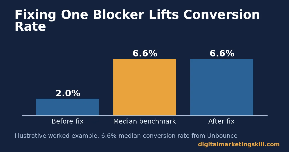
Only after a blocker like that is fixed does it make sense to test headlines or images. At that point, every visitor in the test actually reached the decision. Skipping straight to a persuasion test on an unfixed page is the single most common mistake in this entire website conversion checklist, because the test result will look inconclusive no matter how good the new headline is.
A Real Case: Clarity Changed What A Visitor Did Next
Digital Marketing Skill Institute student Olajire Jacob’s story, published on the Institute’s reviews page, shows the same principle applied to a service offer rather than a landing page. Jacob described starting out “charging an average of $500 to set up email marketing flows for clients.” He later was “able to expand my digital marketing services and scale to $5K/mo.”
The jump came from making the offer and the next step unmistakably clear to the people deciding whether to hire him. That is the same shift this website conversion checklist asks a web page to make: one clear thing to do next, stated plainly, with nothing competing for attention.
This is one published result, not a typical or guaranteed outcome. Dollar figures like this vary by market, effort and client base; see the Institute’s earnings disclaimer for the limits on any income example.
Frequently Asked Questions About Website Conversion
What is a good website conversion rate?
There is no single good number. It depends on your page type, industry and traffic source. Unbounce’s benchmark report puts the median landing page conversion rate at 6.6% across industries, from a sample of more than 41,000 pages. Treat that as a comparison point, not a universal target.
How much does page load speed really affect conversions?
Enough that it should be the first thing you check. Google’s guidance treats 2.5 seconds as the threshold for a “good” Largest Contentful Paint. Nielsen Norman Group’s research shows attention drops sharply once a response passes roughly 10 seconds. A slow page loses visitors before any persuasive element gets a chance to work.
Should I use more than one call to action on a page?
For a lead-generation or sign-up page, no. One clear action, repeated at the top and bottom, performs better than several competing options. A visitor who has to choose between paths will often leave instead of choosing either one.
How many fields should a form have?
As few as the task genuinely requires. Baymard Institute’s checkout research found usability performance declines as form fields increase. 17% of shoppers report abandoning a checkout specifically because it felt too complex. Move optional questions to after the visitor has already committed.
Where should trust signals go on a page?
Next to the decision point, not in a footer. On a product page, that means beside the price and the add-to-cart button, exactly where a comparing visitor is deciding.
What should I test first on an underperforming page?
Nothing, until you rule out hard blockers: load speed, a broken or overly long form, and more than one competing call to action. Test persuasion elements, like headlines or images, only once those blockers are fixed.
Does device type change how a conversion checklist should be applied?
Yes. Tracking from StatCounter shows roughly 59% of global web traffic is mobile and about 39% desktop, with tablets making up the rest. Treat mobile as the primary layout to test first, not as a secondary version of a desktop design. Our mobile marketing guide covers device-specific tactics beyond page layout.
How long should a website conversion checklist review take?
A first pass through speed, clarity, trust and form length usually fits in a single sitting, once you have analytics and a page-speed test open. Implementing fixes, and waiting for enough traffic to read the new numbers, takes longer. That part is a measurement question, not a checklist question.
Can small changes really move conversion rate, or does the whole page need a redesign?
Small changes at the right gate usually beat a full redesign. A redesign changes dozens of variables at once, so you cannot tell which change helped. Fixing one gate at a time, speed, then clarity, then trust, then forms, lets you see exactly which fix moved the number, and keeps a working page from being replaced by an unproven one.
Who should own a website conversion checklist inside a business?
Usually whoever can touch both the page and the analytics: a marketer with developer access, or a marketer paired with one developer. Splitting speed fixes, clarity fixes and copy fixes across separate teams with no shared view of the numbers is the most common reason a checklist stalls halfway through.
Turn What You Have Learned Into A Skill You Can Use Anywhere
Fixing one page with a website conversion checklist is a single project. Knowing how to diagnose and fix the next ten pages, for your own business or for clients, anywhere in your country or beyond it, is a skill.
Digital Marketing Skill Institute’s Master Diploma in Digital & AI Marketing is built around that kind of practical, execution-first training. It offers four AI-powered tracks: AI-Powered Social Media Management and Advertising, AI-Powered Lead Generation and Email Automation, AI-Powered Google Specialist, and AI-Powered WordPress and SEO Specialist. Together they total ten courses, with a Full Stack option for completing all four. See the full curriculum at digitalmarketingskill.com.
Every track includes unlimited 1-on-1 coaching and mentoring, plus a U.S. Project Internship with a verified U.S. Work Reference Letter. The conversion principles in this checklist get applied to real work, not just theory. The program is dual US and UK accredited, recognised in more than 100 countries, and 100% online, so you can study wherever you live.
See the full program details on the Master Diploma page. Browse more guides like this one on the blog, and when you are ready, apply here. Learn more at digitalmarketingskill.com, training built for people serious about applying these skills professionally, wherever in your country you happen to be.
Every figure in this guide was checked against its original source before publication. Figures marked as illustrative are invented examples, not real results.
![9 Amazing Digital Marketing Skills to Make Money Online [With Proof]](https://digitalmarketingskill.com/wp-content/uploads/2019/07/9-Amazing-Digital-Marketing-Skills-to-Make-Money-Online-With-Proof-17.png)