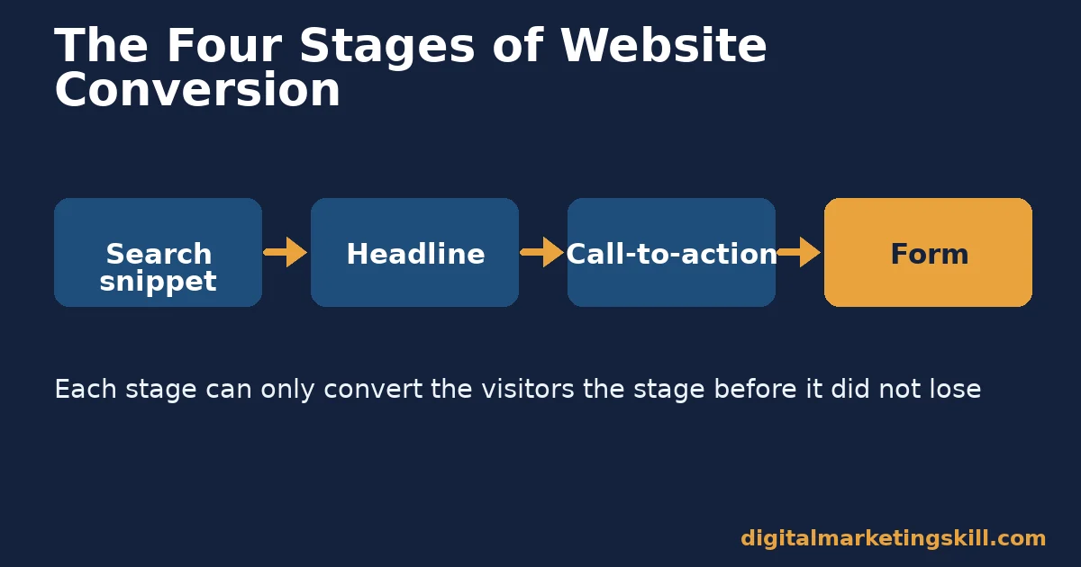
Website conversion improves fastest at four points: the search snippet, the headline, the call-to-action and the form. Each one leaks visitors before the next. Fixing the weakest point first lifts website conversion more than any single design trick. This guide shows how to find that point and fix it.
Key Takeaways
- Short forms convert far better. HubSpot’s analysis of over 40,000 landing pages found 3-field forms converted at slightly over 25%, with a sharp drop once a fourth field was added.
- Fewer fields is not just theory. When Imaginary Landscape cut its contact form from 11 fields to 4, its conversion ratio rose 120%, with no drop in lead quality.
- The top search result wins most of the clicks. Backlinko’s study of 4 million-plus search results found the #1 organic result averages a 27.6% click-through rate, about 10 times the #10 result.
- Personalised calls-to-action beat generic ones. HubSpot’s analysis of over 330,000 calls-to-action found personalised CTAs convert 202% better than basic ones.
- Readers scan before they commit. Nielsen Norman Group’s eye-tracking study of 232 users found visitors read web pages in an F-shaped pattern, so the first few words of a headline carry the most weight.
In this guide
- What Most Website Conversion Advice Gets Wrong
- How a Visitor Actually Decides to Convert
- The Four Stages Where Website Conversion Breaks
- How to Fix Each Stage of Website Conversion
- How to Measure Website Conversion at Each Stage
- The One Decision Rule: Fix the Stage With the Biggest Drop First
- A Real Case: Cutting a Contact Form From 11 Fields to 4
- Frequently Asked Questions About Website Conversion
- Start With Your Highest-Traffic Page
What Most Website Conversion Advice Gets Wrong
Most website conversion advice jumps straight to tactics: brighter buttons, urgency words, a popup. Those tactics can help, but only after a bigger problem is fixed. If visitors never read the headline, a brighter button changes nothing.
This guide follows the path a visitor actually takes, in order: the search snippet that earns the click, the headline that earns the next ten seconds, the call-to-action that asks for the next step, and the form that collects it. Each stage can only convert the visitors the stage before it did not lose.
A ground rule first. The figures below come from named studies and one real case, each with its own sample and date. Treat them as evidence from their own context, not universal law for every business. The order-of-the-funnel framework is an informed way to apply that evidence, not a fixed formula.
How a Visitor Actually Decides to Convert
A visitor rarely converts on a single impulse. They move through a short chain of small decisions, and website conversion depends on every link holding. First they decide whether a search result is worth clicking. Then they decide, in seconds, whether the page matches what they expected. Then they decide whether the offer is worth a click. Finally they decide whether the form is worth finishing.
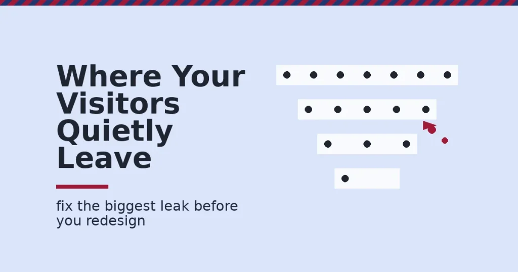
Nielsen Norman Group’s eye-tracking research shows how little attention each step gets. Readers scan in an F-shaped pattern: across the top, partway across a line further down, then down the left edge. A visitor who does not find a reason to stop scanning within those first lines moves on, regardless of how good the offer further down the page actually is.
Why Website Conversion Leaks Happen at Every Stage
Each stage has its own failure mode. A weak search snippet loses the click before the page even loads. A vague headline loses the scan, a generic call-to-action loses the visitor who was still undecided, and a long form loses the visitor who had already decided to buy.
Most sites fix only one of these, usually the one the owner notices most, like the button colour. Website conversion improves faster when you check all four, because a strong offer behind a weak headline never gets read.
The Four Stages Where Website Conversion Breaks
These four stages cover most of what a standard marketing page asks a visitor to do. Each is explained first, then fixed in the next section.
Search Snippets: Built on a Promise
The title tag and meta description are a promise made before the click. Google rewrites a large share of title tags it judges unclear or badly matched to the query. Zyppy’s study of nearly 81,000 title tags across 2,370 sites found Google rewrote 61.6% of them overall, while titles between 51 and 60 characters had the lowest rewrite rate, 39% to 42%.
A rewritten title is not catastrophic, but it is a title you did not write and cannot fully control. The safer path is a clear, specific, correctly sized title that Google has less reason to replace.
Headlines: Built on the First Few Words
The headline is the first thing a visitor reads once the click lands. Because readers scan in an F-pattern, the first handful of words decide whether the rest gets read at all. A headline that buries the point past word six is already losing readers who never reach it.
A strong headline states the benefit plainly. Use the reader’s own words, as close to the front as the sentence allows. Clever wordplay that makes the reader work to understand it loses exactly the visitors a landing page can least afford to lose.
Calls-to-Action: Built on Specificity
A call-to-action fails when it describes the mechanism instead of the outcome. “Submit” describes what the visitor’s click does to a database; it says nothing about what the visitor gets. HubSpot’s analysis of over 330,000 calls-to-action found personalised, specific CTAs converted 202% better than generic ones.
The gap is not really about personalisation technology. It is about specificity. “Get Your Free Guide” and “Submit” ask for the identical click, but only one tells the visitor what happens next.
Forms: Built on Friction
Every form field is a small cost the visitor pays before they get anything back. HubSpot’s analysis of landing pages from more than 40,000 of its customers found 3-field forms converted at slightly over 25%, and conversion dropped sharply once a fourth field was added.
The real-world version of that pattern is not rare. Imaginary Landscape, a web agency, tested an 11-field contact form against a 4-field version on its own site. The shorter form lifted its conversion ratio by 120%. Lead quality did not drop, based on the agency’s own measurement.
How to Fix Each Stage of Website Conversion
The sections below mirror the four stages above. Fix them roughly in order, because a gain at a later stage is wasted on visitors lost earlier.
Search Snippets: Lead With a Specific Promise
Write a title under 60 characters that states the page’s one clear promise, with the main keyword near the front. Write a meta description of 120 to 156 characters that restates that promise in a complete sentence, because Google often uses it as the visible summary in results.
Make every title on the site different from every other title. A duplicate or near-duplicate title gives Google a reason to rewrite it, and gives the visitor no reason to pick your result over a near-identical one.
Headlines: Lead With the Benefit, Not the Topic
Open with what the visitor gets, not the name of the subject. “A Four-Week Plan to Cut Cart Abandonment” earns more attention than “About Cart Abandonment,” because the first version already answers the reader’s unspoken question: what is in this for me.
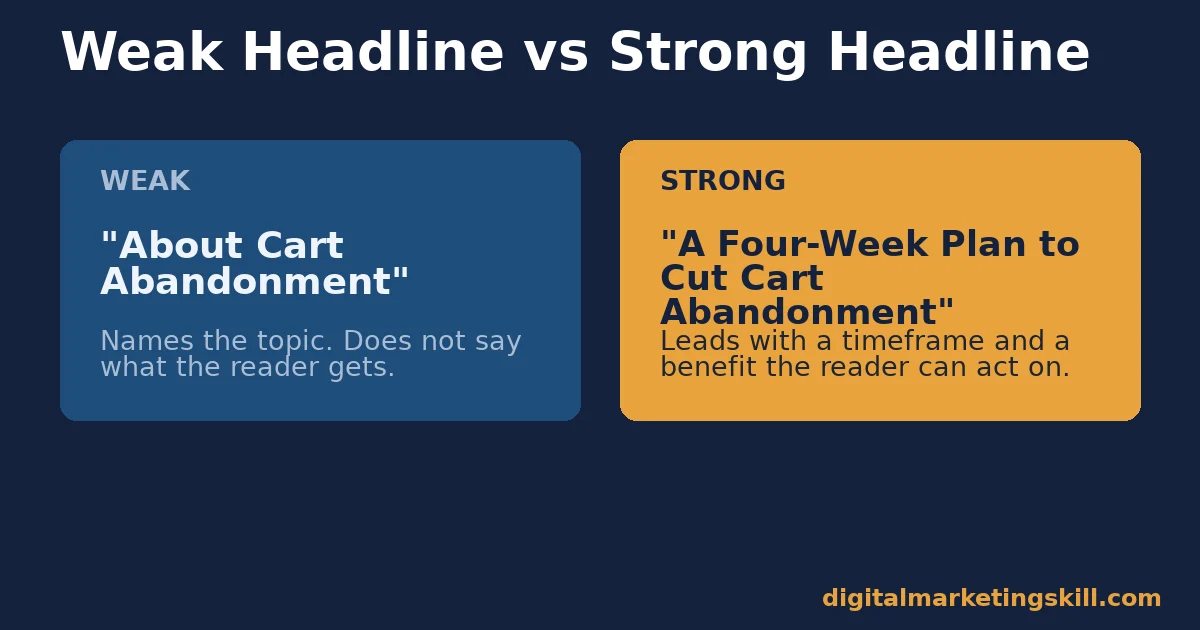
Test two or three headline options on your highest-traffic page before writing new ones elsewhere. A single strong headline, reused as a pattern, improves website conversion more than ten mediocre ones spread across the site. Our guide to landing page design covers how headline and layout work together once you move past a single headline test.
Calls-to-Action: Lead With the Outcome
Replace generic verbs with a specific outcome. “Start Your Free Trial” and “Download the Checklist” outperform “Submit” and “Click Here” because each tells the visitor exactly what the click produces.
Match the CTA to how far along the visitor already is. A first-time visitor responds better to a low-commitment offer, such as a free guide, than to a request to book a paid call. Save the highest-commitment CTA for visitors who have already read several pages or returned more than once.
Forms: Lead With the Minimum Field Count
List every field on your form, then remove any field the next step does not strictly require. A name and an email address are enough to start most relationships; everything else can be asked for later, once trust is higher.
Put the form near the top of the page the offer is strong enough to support, not buried below several scrolls. A visitor who has already decided to convert should not have to hunt for the way to do it. Our guide to landing page optimization walks through this same priority order for a full page rebuild, not just the form.
Check Mobile Separately, Not as an Afterthought
Mobile devices account for roughly 59% of global website traffic, according to Statcounter’s global stats. If your website conversion numbers are blended across devices, a mobile-only problem can hide inside an average that still looks acceptable.
Run the same four-stage check on mobile specifically. A form that looks fine on a laptop can need several taps per field on a phone, and a CTA button sized for a mouse can sit awkwardly under a thumb. Check click-through rate, bounce rate, CTA clicks and form completions for mobile visitors on their own, not folded into the site-wide number.
How to Measure Website Conversion at Each Stage
Website conversion is really four smaller conversion rates stacked together. Measuring only the final number hides which stage is actually losing visitors.
Four Numbers That Show Where the Leak Is
- Search click-through rate. In Search Console, this is clicks divided by impressions for a page. A low rate with strong rankings usually points to a weak title or description, not a ranking problem.
- Bounce or quick-exit rate. This is the share of visitors who leave almost immediately after landing. A high rate alongside a reasonable click-through rate usually points to a headline or page that does not match the promise that earned the click.
- CTA click rate. This is clicks on a specific call-to-action divided by views of the page it sits on. A page with good traffic and a low CTA click rate usually has an unclear or poorly placed CTA.
- Form completion rate. This is submitted forms divided by form views, not divided by total page visits. A gap between a strong CTA click rate and a weak completion rate usually means the form itself is the leak.
How to Read These Four Numbers Together
Walk the funnel in order. If click-through rate from search is weak, fix the title and description first; nothing downstream matters if visitors do not arrive. When arrivals are healthy but bounce is high, the headline or page match is the problem.
Visitors who stay but rarely click the CTA need a rewritten CTA before you touch the form. If the CTA converts well but the form does not, the form is the leak, and shortening it is usually the fastest fix available.
A Five-Minute Check Before You Redesign Anything
You do not need a full analytics audit to start. Open your highest-traffic page right now and run this short check first.
- Read your title and description as a stranger would. Does it state one clear promise? Is it under the character limits? If not, this is already your fastest fix.
- Read only the first two lines of your headline. Would you know what the page offers from those two lines alone? If not, the benefit is buried too deep.
- Find the main call-to-action without scrolling. Does its text say what you get, not just what happens when you click? Generic verbs are an easy win to fix.
- Count the form fields. Ask whether each one is truly needed for the very next step, not for a future step you could handle later by email.
Any stage that fails this quick check is a reasonable place to start, even before you pull formal numbers. The full funnel measurement below confirms which stage matters most once you have real traffic to work with.
The One Decision Rule: Fix the Stage With the Biggest Drop First
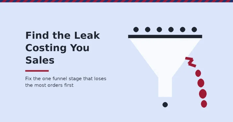
If you take one decision rule from this guide, make it this one. Find the single stage where the percentage drop between visitors is largest, and fix only that stage before touching any other.
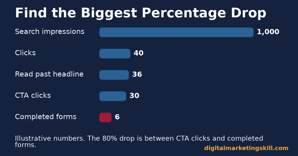
Here is an illustrative example, with invented numbers. A page gets 1,000 search impressions, 40 clicks, 36 visitors who read past the headline, 30 CTA clicks and 6 completed forms. The biggest percentage drop is between CTA clicks and completed forms, 30 down to 6, an 80% loss. Fixing the form first, before the headline or the CTA, targets the leak that is actually costing the most conversions.
The same rule works in reverse too. If the biggest drop sits between search impressions and clicks, rewriting the headline or form first wastes effort on stages that already have plenty of visitors reaching them; the title and description are the real bottleneck in that case, even though they feel like a smaller, less glamorous fix than a form redesign.
This rule stops a common mistake: polishing the stage that is already working well while the real leak stays untouched. A funnel is only as strong as its worst stage, so find that stage with real numbers before changing anything. Our guide to landing page conversion covers the friction audit behind this same rule in more depth.
A Real Case: Cutting a Contact Form From 11 Fields to 4
Imaginary Landscape, a web design and development agency, ran its own test on its contact form. It compared results from an 11-field version against a 4-field version, using page views from its own analytics checked against the number of forms actually received.
The shorter form lifted the site’s conversion ratio by 120%. Lead quality was a real worry going in, so the agency checked it directly, and found the quality of submissions held steady after the change.
The limit worth stating plainly: this is one company’s test on its own form, not a controlled study across many businesses, and the agency ran it on its own analytics rather than independent verification. Treat it as evidence that cutting unnecessary fields can work, not a guarantee of a 120% lift for every form.
Frequently Asked Questions About Website Conversion
What is a good website conversion rate?
There is no single good figure, since conversion rates vary sharply by industry, traffic source and offer. Compare each page against your own site’s past performance, and prioritise the stage of the funnel losing the most visitors.
Which matters more for website conversion, the headline or the call-to-action?
Both matter, but in sequence. A weak headline loses visitors before they ever see the call-to-action, so fix the stage with the bigger percentage drop first, whichever one that turns out to be on your own numbers.
How many fields should a lead form have?
As few as the next step genuinely requires, often just a name and an email address. HubSpot’s research found 3-field forms converting best, with a sharp decline once a fourth field was added.
Do popups help or hurt website conversion?
It depends on timing and relevance, which this guide has not tested directly. Apply the same rule used throughout: measure the stage a popup affects before and after, and keep it only if the numbers improve.
Should I rewrite the page title or leave it as Google rewrote it?
Rewrite it. Zyppy’s research found Google rewrites a large majority of titles it judges unclear, but titles in the 51-to-60-character range are rewritten least often, so a clear, correctly sized title keeps you in control more of the time.
How often should I review a page’s conversion funnel?
Check the four numbers in this guide monthly for your highest-traffic pages, and after any headline, CTA or form change. A short, regular review catches a new leak before it costs months of lost conversions.
Does website conversion differ much between mobile and desktop visitors?
Often, yes. Since mobile makes up roughly 59% of global traffic, a form or CTA that is awkward to use on a small screen can quietly suppress website conversion even while the desktop numbers look fine. Check mobile and desktop separately rather than trusting a single blended rate.
Start With Your Highest-Traffic Page
Website conversion improves fastest when you diagnose before you redesign. Pick your highest-traffic page, pull the four numbers above, find the stage with the biggest percentage drop, and fix only that stage first. Revisit the numbers a month later, then repeat the process on your next-busiest page.
For structured practice building pages, forms and funnels this way, Digital Marketing Skill Institute teaches it hands-on. Its Master Diploma in Digital & AI Marketing offers four AI-powered tracks totalling ten courses, including AI-Powered WordPress and SEO Specialist, which covers building and testing the pages this guide describes.
The diploma has a Full Stack option covering all four tracks, unlimited 1-on-1 coaching, a U.S. Project Internship with a verified U.S. Work Reference Letter, and dual US and UK accreditation, recognised in more than 100 countries.
The programme is fully online, so you can build these skills from anywhere in your country. Browse more guides on the Digital Marketing Skill Institute blog, read real outcomes on the reviews page, and when you are ready, apply for the Master Diploma or start from the Digital Marketing Skill Institute homepage.
Every figure in this guide was checked against its original source before publication. Figures marked as illustrative are invented examples, not real results.
![9 Amazing Digital Marketing Skills to Make Money Online [With Proof]](https://digitalmarketingskill.com/wp-content/uploads/2019/07/9-Amazing-Digital-Marketing-Skills-to-Make-Money-Online-With-Proof-17.png)