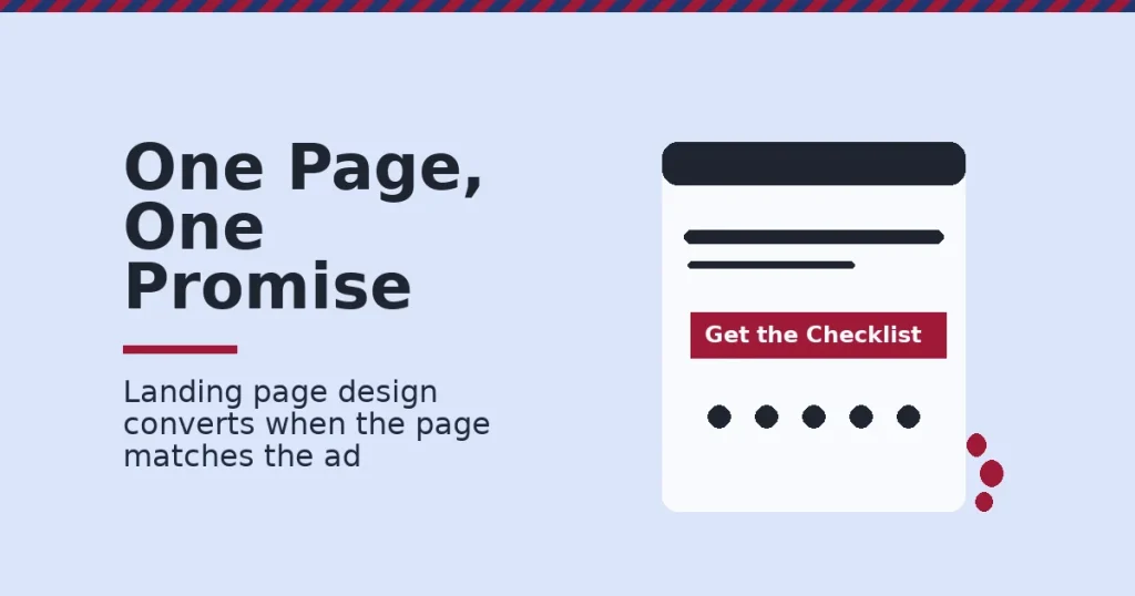
Landing page design decides whether a paid click becomes a lead or a lost visit. Give each page one goal, match it to the ad or email that sent the visitor, and put the offer and the action on the first screen. Unbounce found a median conversion rate of 6.6% across 41,000 landing pages, so most visitors still leave.
Key Takeaways
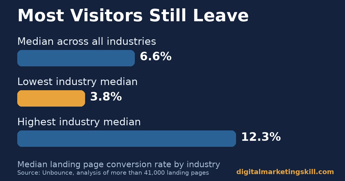
- Most visitors leave even on good pages. Unbounce analysed more than 41,000 landing pages and 464 million visitors. It found a median conversion rate of 6.6%, with industry medians from 3.8% to 12.3%.
- The first screen carries most of the weight. In a Nielsen Norman Group eyetracking study of 120 participants, people spent about 57% of their viewing time above the fold on desktop screens.
- Search ads reward pages that match. Google Ads counts landing page experience as one of the three parts of Quality Score, next to expected clickthrough rate and ad relevance.
- Speed moves leads. A Google-commissioned study of 37 brand sites tested mobile speed. On lead generation sites, a 0.1-second gain lifted progress to the form page by 21.6%.
- Basic design flaws are common. The WebAIM Million scan of one million home pages found low-contrast text on 83.9% of pages and missing form labels on 51%.
In this guide
- Why Most Landing Page Design Advice Falls Short
- How Visitors Decide on a Landing Page
- Landing Page Design Differs by Traffic Source
- How to Design a Landing Page for Each Source
- The Landing Page Design Checklist
- How to Measure Landing Page Design
- The One Rule: One Page, One Source, One Action
- What Vodafone’s Landing Page Test Showed
- Frequently Asked Questions About Landing Page Design
- Start With Your Busiest Page, Then Expand
Why Most Landing Page Design Advice Falls Short
Most landing page design advice is a single template: a headline, a hero image, three benefits and a button. That template is not wrong, but it ignores the most important fact about a landing page. Visitors arrive from different places, with different levels of intent, and each source needs a different first screen. This guide fills that gap by matching the design to the traffic source.
First, the ground rules. Conversion benchmarks are a snapshot, not a permanent target, because they shift with industry, offer and price. Most published figures come from vendors that sell landing page or email tools. So we name who collected each number and what it does not show. Where we explain why a design works, treat it as an informed inference, not a settled fact, until your own test confirms it.
A landing page here means a single page built for one campaign and one action. That action might be booking a call, downloading a guide or buying a product. It differs from a home page, which serves every visitor and offers many paths. That single purpose is exactly what makes landing page design easier to test than a whole website.
How Visitors Decide on a Landing Page
Every visitor makes three quick judgements. Is this the page I expected? Is the offer worth my time? And how much effort will the next step take? Good landing page design answers all three before the visitor scrolls, because each unanswered question is a reason to leave.
The First Screen Carries Most of the Weight
Attention is front-loaded. In its scrolling and attention study, Nielsen Norman Group analysed more than 130,000 eye fixations from 120 participants. People spent about 57% of their page-viewing time above the fold, and 74% within the first two screenfuls. The study used desktop screens, so phone behaviour may differ, but the lesson holds: what matters most must appear first.
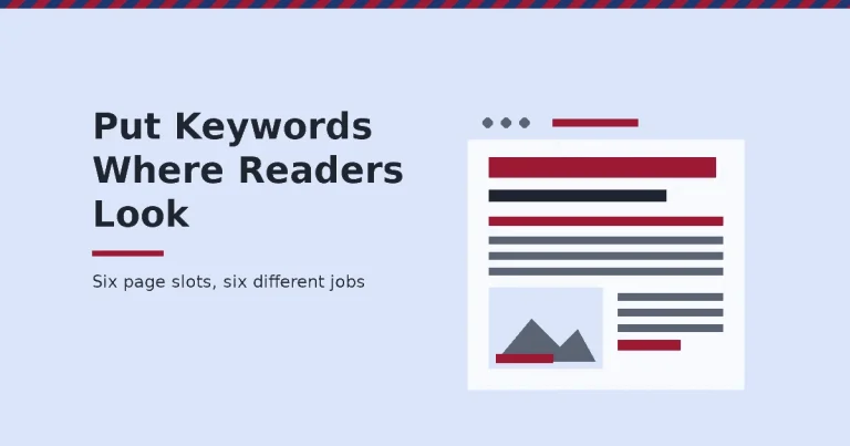
So good landing page design puts four things on the first screen. You need a headline that names the outcome, one line on the offer, a visual of the product or result, and the call to action. A call to action is the button or link that asks for the one step you want, such as “Get the checklist”. Anything else on the first screen competes with those four elements.
Message Match Decides Whether Visitors Stay
Message match means the page repeats the promise that earned the click. If an ad says “free tax checklist”, the headline should say “free tax checklist” too, not “Welcome to our firm”. Google’s guidance to optimise ads and landing pages says to choose a landing page that closely matches your ad and keywords.
The match also affects cost on search ads. According to Google Ads Quality Score help, Quality Score combines expected clickthrough rate, ad relevance and landing page experience. Google defines landing page experience as how relevant and useful the page is to people who click your ad. A mismatched page therefore loses visitors and can also weaken the ad itself.
Every Field and Second Adds Friction
Friction is anything that makes the next step harder, such as a slow load, a long form or text that is hard to read. Speed is the first friction point. The Milliseconds Make Millions study, commissioned by Google and run by 55 and Deloitte, tracked 37 brand sites. On lead generation sites, a 0.1-second faster mobile site lifted progress to the form submission page by 21.6%.
Readability and forms come next. The WebAIM Million is an automated scan of one million home pages. It found low-contrast text on 83.9% of them and missing form input labels on 51%. Those are home pages rather than landing pages, but the same templates and habits carry over. Text that people cannot read and fields that people cannot identify both cost conversions.
Forms deserve their own check because they sit right at the moment of decision. Place each label above its field, use the right keyboard on phones for email and phone fields, and show errors next to the field instead of at the top. These small details decide whether a willing visitor actually finishes.
Landing Page Design Differs by Traffic Source
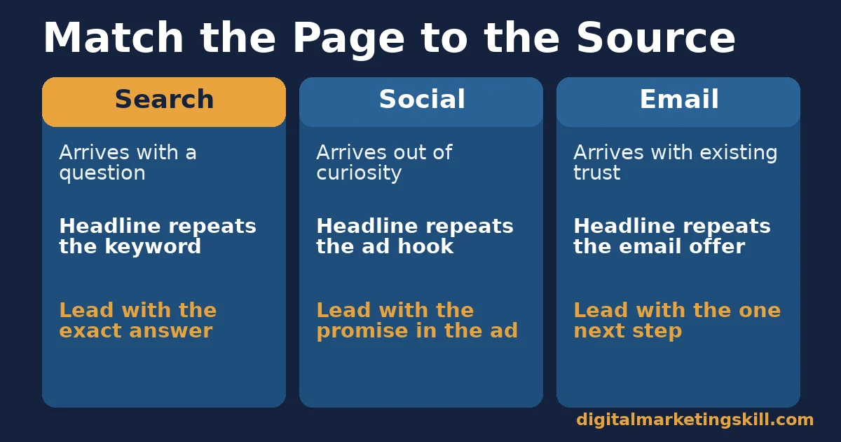
Where a visitor comes from shapes what they already know and what they need to see. A searcher, a person scrolling a feed and a subscriber who opened your email arrive with very different intent. Therefore, sort your traffic into the three groups below before you change any page.
Search Visitors: Built on a Specific Question
Search visitors typed a query, so they arrive with a clear need and a short list of options. They compare fast, often opening several results in tabs. For them, landing page design is about proof that the page answers the exact query. They also want the price, terms and next step without hunting.
Because they are comparing, search visitors punish vague pages quickly. A page that opens with a slogan instead of the searched words looks like the wrong result. Google’s landing page guidance also warns against cluttering a page with too many ads or pop-ups, which slows down a comparison.
Social Visitors: Built on Interruption
Social visitors did not search for anything. An ad interrupted their scroll, so their interest is fragile and their context is a feed, usually on a phone. They clicked because of one hook in the ad. They will leave the moment the page stops paying off that hook.
That makes social traffic the least patient of the three groups. These visitors need more explanation than search visitors, since they may not know the problem has a solution. Yet they tolerate less reading, so the page has to explain quickly with visuals, short sections and a low-commitment first step.
Email Subscribers: Built on Existing Trust
Email subscribers already know you, because they signed up and then chose to click. Mailchimp’s email marketing benchmarks report an average click rate of 2.62% across its users. That figure covers campaigns sent to at least 1,000 subscribers. So the people who reach your page from email are a small, motivated slice of your list.
Those visitors do not need an introduction to your brand. Instead, they need the specific offer from the email and the fastest way to act on it. A long brand story on an email landing page delays people who were ready to act.
How to Design a Landing Page for Each Source
Each source needs a different first move. Build one page per source where you can afford it, or at least one headline variant per source, and test them separately. The steps below show what to lead with for each group.
Search Visitors: Lead With the Words They Searched
Start the headline with the words from the keyword or the ad, then state the outcome in plain language. Put the price or the free offer, the main proof point and the call to action on the first screen. Next, add a short comparison or an FAQ lower down, because search visitors often check details before they commit.
Build one page per keyword theme, not one page for every campaign. For example, “bookkeeping for freelancers” and “payroll for small teams” deserve different pages, even if both lead to the same sign-up form. For ideas on structure, see our collection of landing page examples.
Social Visitors: Lead With the Promise in the Ad
Repeat the ad’s hook in the headline and reuse its main image. That way the visitor knows at once they are in the right place. Then explain the problem in one or two short lines before you explain the product. Design for a phone screen first, with large text, a sticky button and no more than two or three form fields.
Offer a smaller first step than you would for search traffic. A free guide, a quiz or a short demo video asks for less commitment than a sales call. You can then move those leads toward a purchase by email. Our guide to email deliverability shows how to reach the inbox.
Email Subscribers: Lead With the Next Step
Put the exact offer from the email at the top, with the call to action visible without scrolling. Prefill any details you already hold, such as the subscriber’s email address, so the form takes one click. Remove the brand introduction and the general benefits list, because these readers have already said yes once.
Keep the email and the page visually consistent, with the same colours, the same image and the same words for the offer. If a subscriber has to reread the page to check it, the design has added friction. Trust should have removed it.
The Landing Page Design Checklist
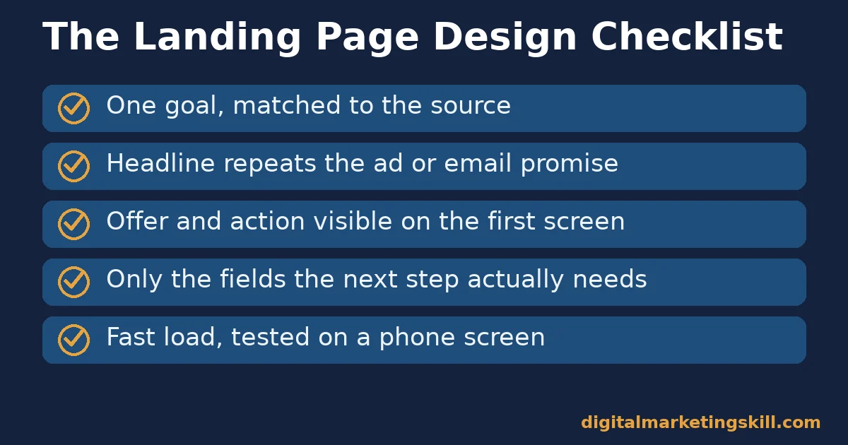
Whatever the traffic source, a few elements belong on almost every page, and a few almost never do. Use this list to review any page in about fifteen minutes.
- One goal: a single call to action, repeated lower down on longer pages.
- A matching headline: the same promise as the ad, post or email that sent the visitor.
- The offer above the fold: what the visitor gets, in one line, before any scrolling.
- Proof near the button: a review, a result or a recognisable client, placed where doubts arise.
- A short form: only the fields you will actually use, each with a visible label.
- Readable text: strong contrast and body text large enough to read on a phone.
- A fast load: a compressed hero image and no heavy scripts the page does not need.
Equally, good landing page design leaves things out. Drop the main navigation menu, links to unrelated pages and decorative images that do not explain the offer. Drop fields such as fax number or job title too. Each one gives the visitor another way to leave without acting.
How to Measure Landing Page Design
Measure landing page design with a few numbers that each answer one question. Read them together, because a page can win on one metric while it loses on another.
- Conversion rate: conversions divided by visitors. Compare it with your own past pages first, and use the Unbounce median of 6.6% only as a rough reference.
- Load loss: the gap between ad clicks and recorded page visits. A large gap means people leave before the page appears, so check speed before you touch the design.
- Engagement rate: the share of visits where people scroll, click or stay a meaningful time. Low engagement with high traffic usually points to a message mismatch.
- Form start and completion: how many people begin the form versus how many finish it. A big drop between the two means the form asks for too much.
- Cost per conversion: ad spend divided by conversions. This is the number that shows whether a better page actually saves money.
- Largest Contentful Paint: how fast the main content appears. Per web.dev’s Web Vitals guide, 2.5 seconds or less at the 75th percentile counts as good.
Segment every landing page design metric by traffic source and device. Otherwise a strong email audience can hide a weak social page, and the average will tell you nothing useful.
The One Rule: One Page, One Source, One Action
If you remember one thing, make it this. Every landing page should serve one traffic source and ask for one action, and its first screen should repeat the promise that earned the click. When a page tries to serve every source, it ends up matching none of them.
Here is how the rule works on an imaginary business (illustrative, invented numbers). A bookkeeping service sends search ads, social ads and a monthly email to one shared page. Overall, that page converts 3% of 2,000 monthly visitors, or 60 leads.
The owner then splits traffic into three pages. The search page leads with “Bookkeeping for freelancers” and converts 6% of 900 visitors. Meanwhile, the social page offers a free tax checklist and converts 4% of 800 visitors. Finally, the email page pre-fills the form and converts 12% of 300 visitors.
Together, the three pages produce 54, 32 and 36 leads, or 122 in total. That is roughly double the 60 leads from the shared page, from the same traffic and the same ad budget. The numbers are invented, but the arithmetic shows why matching beats a single page that is merely well designed.
The rule has one sensible exception. If a source sends only a handful of visitors a month, a separate page will never collect enough conversions to test. In that case, keep a shared page but swap the headline by source with a URL parameter, so each visitor still sees the promise they clicked on. Then build a full page once that source grows.
What Vodafone’s Landing Page Test Showed
A real test shows how much the technical side of landing page design can matter. In the Vodafone case study on web.dev, Vodafone ran an A/B test on a landing page. It split traffic 50/50 between two versions. The optimised version had a 31% better Largest Contentful Paint and produced 8% more sales.
The same test reported a 15% better lead-to-visit rate and an 11% better cart-to-visit rate. Vodafone moved a widget’s rendering from the browser to the server, which cut render-blocking JavaScript. It also optimised its images, including resizing the hero image. In other words, the content and offer stayed the same, and only the speed changed.
Know the limits, though. This was one company, one page and one test, and absolute traffic numbers were not published. Speed fixed only one kind of friction, so it cannot tell you whether a better headline would have done more. Still, it shows that a faster page can lift sales without new copy, which makes speed a sensible first check for any page.
If your pages mostly get phone traffic, our guide to mobile conversion rate explains the next fixes. For stores, our ecommerce sales funnel guide shows how a landing page fits the stages that follow it.
Frequently Asked Questions About Landing Page Design
What makes a good landing page design?
A good landing page has one goal and a headline that matches the ad or email that sent the visitor. It shows the offer and button on the first screen, with proof nearby and a short form. It also loads fast and uses readable, high-contrast text.
What is a good landing page conversion rate?
Unbounce found a median of 6.6% across more than 41,000 landing pages, with industry medians from 3.8% to 12.3%. Compare yourself mainly with your own past pages, because offer, price and traffic source change the result.
Should a landing page have a navigation menu?
Usually not. A navigation menu gives visitors other places to go. That pulls attention from the one action you want, so most campaign pages remove it.
How long should a landing page be?
Match the length to the commitment you ask for. A free download can work on a short page, while an expensive service needs more proof, comparisons and answers lower down.
How many form fields should a landing page have?
Ask only for what you will use in the next step, often just a name and an email address. Every extra field adds effort, so add one only when it clearly improves lead quality.
Do I need a different landing page for each ad?
You need one page, or at least one headline variant, for each distinct promise or traffic source. Ads that make the same promise to the same audience can share a page.
How do I test landing page design changes?
Run an A/B test that changes one element at a time, such as the headline, and split traffic evenly between versions. Wait for enough conversions to trust the result before you declare a winner.
Start With Your Busiest Page, Then Expand
Landing page design improves fastest when you start where the traffic already is. Pick your busiest paid page, check which source sends most of its visitors, and rewrite the first screen so it repeats that source’s promise. Then measure conversion rate by source for a few weeks before you build the next page. For a deeper list of tests, see our landing page optimisation hacks.
If you want guided practice, Digital Marketing Skill Institute teaches these skills hands-on. The Master Diploma in Digital & AI Marketing includes a Lead Generation track, with courses in AI-Powered Lead Generation and AI-Powered Email Marketing & Automation. You build lead magnets and landing pages, then nurture leads with email.
The diploma comes with unlimited 1-on-1 mentoring and project-based work experience with the Institute’s U.S. partner company. It is dual US and UK accredited and recognised in more than 100 countries. You can follow it from anywhere in your country. Browse more guides on the Digital Marketing Skill Institute blog, then apply for the Master Diploma or start from the Digital Marketing Skill Institute homepage.
Every figure in this guide was checked against its original source before publication. Figures marked as illustrative are invented examples, not real results.
![9 Amazing Digital Marketing Skills to Make Money Online [With Proof]](https://digitalmarketingskill.com/wp-content/uploads/2019/07/9-Amazing-Digital-Marketing-Skills-to-Make-Money-Online-With-Proof-17.png)