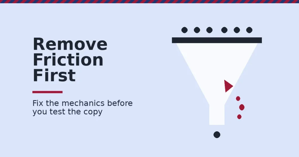
Landing page conversion improves when you remove what slows a visitor down and add proof that answers their real question. Most pages lose visitors to a carousel nobody clicks, a form with too many fields, or an image that adds nothing. The offer is rarely the real problem. Fix the mechanics first, then test everything else.
Key Takeaways
- Most pages convert far below what owners assume. Unbounce’s analysis of 41,000 landing pages, 464 million visitors and 57 million conversions found a median landing page conversion rate of 6.6% across industries.
- An image can hurt landing page conversion if it does not earn its place. In a HubSpot A/B test, the version without an image got 24% more form submissions, because the image pushed the form further down the page.
- Carousels get almost no engagement. Notre Dame’s own tracking of its homepage carousel found a click-through rate near 1%. 84% of those clicks went to the first slide. Four other sites studied showed the same pattern.
- Reviews move purchase likelihood more than most owners expect. Northwestern’s Spiegel Research Center found a product with five reviews has 270% greater purchase likelihood than one with none.
- Shorter forms generally convert better, but not evenly. HubSpot’s analysis of more than 40,000 landing pages found conversion rates decline as form fields increase, with multi-line text areas and dropdown fields causing the steepest drops.
In this guide
- What Most Landing Page Advice Skips
- How Landing Page Conversion Actually Works
- Four Friction Points That Quietly Kill Landing Page Conversion
- How to Fix Each Friction Point
- The Proof Elements That Close the Gap Once Friction Is Gone
- How to Measure Whether Your Fixes Are Actually Working
- The One Decision Rule: Fix Friction Before You Test Copy
- A Real Case: What an Honest A/B Test Looks Like
- Frequently Asked Questions About Landing Page Conversion
- Start by Removing One Piece of Friction, Then Test
What Most Landing Page Advice Skips
Most landing page advice jumps straight to copywriting formulas and button colors. Those matter less than people think. The bigger wins for landing page conversion sit in mechanics: what slows a visitor down before they read your headline, and what proof you show before you ask for their information.
The gap is not creativity. It is discipline about removing friction and testing instead of guessing. This guide walks through the mechanics that move conversion the most, in the order they matter. Then it covers the proof elements that close the gap once friction is gone.
None of this replaces a strong offer. A landing page cannot fix a product nobody wants. No amount of form-shortening saves an offer with no real value behind it. This guide fixes the more common case: a decent offer losing visitors to friction before they judge it fairly, which is a far more fixable problem than most owners assume.
How Landing Page Conversion Actually Works
A landing page converts when three things line up. The visitor arrives expecting what they find. Nothing on the page slows them down. Something on the page proves the offer is real. Miss any one of the three, and the visitor leaves, regardless of how good your product is.
Expectation match comes first. A visitor who clicked an ad for a specific product and lands on a general homepage has to re-orient themselves, and most will not bother. Friction comes second: sliders, long forms and slow load times all tax patience before the visitor reaches your offer. Proof comes third. Even a frictionless page will not convert a skeptical visitor without evidence.
These three layers stack. Fixing proof on a page visitors never finish loading does nothing. Fixing load time on a page that mismatches the ad does nothing either. Work through them in order: expectation, then friction, then proof.
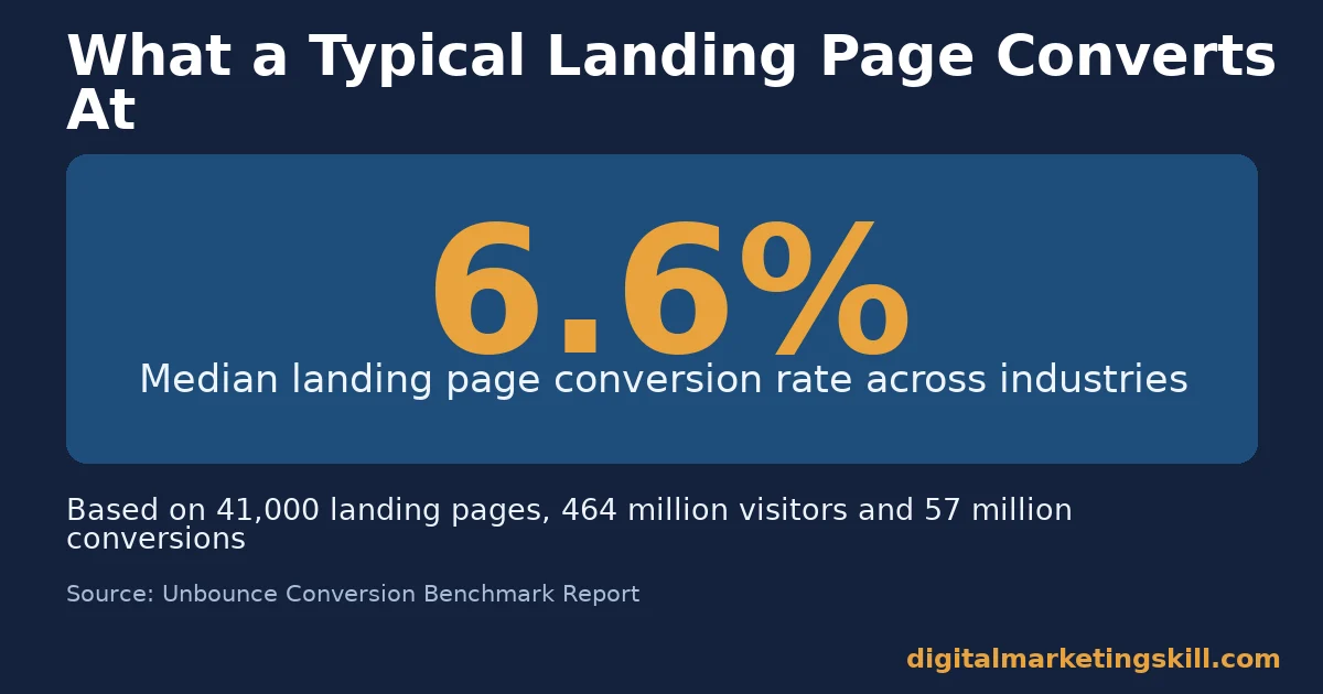
That median landing page conversion rate hides a wide range. Unbounce’s benchmark found results varying several times over between industries. The right comparison is your own page’s past performance, not someone else’s number from a different market.
Why Carousels Fail at the One Job They Have
Image sliders look busy, which makes them feel productive to build. The engagement data says otherwise. Notre Dame’s own carousel tracking found a click-through rate near 1%, and 84% of the clicks it did get landed on the first slide. The other slides were nearly invisible to visitors. The same skew showed up across four more sites examined.
A slider also forces several headline-level messages into rotation, which splits your page’s focus instead of sharpening it. One static, specific message beats five rotating ones nobody waits to read, and it does more for landing page conversion than any amount of slide polish.
If a carousel already exists on a page you cannot redesign today, make the first slide your single best message. The data above shows it is the only slide most visitors will ever see.
Four Friction Points That Quietly Kill Landing Page Conversion
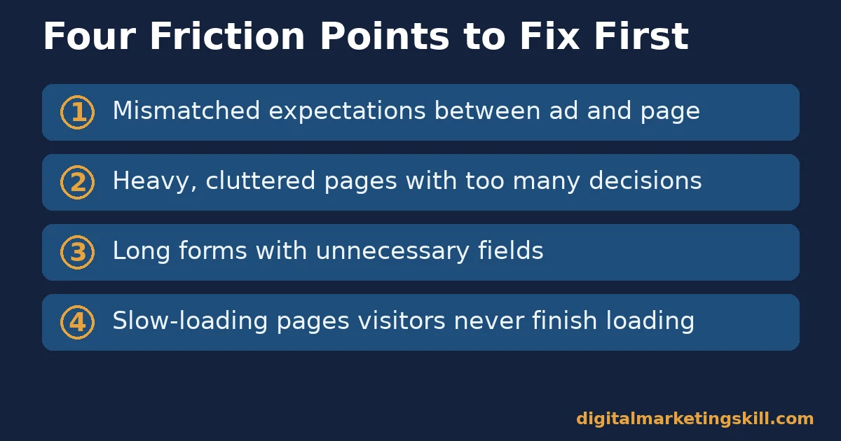
Four mechanical problems account for most of the conversion lost before a visitor reads your offer closely. Each behaves differently. Each needs a different fix.
Mismatched Expectations: Built to Confuse on Arrival
When an ad promises one thing and the landing page delivers another, the visitor has to work to confirm they are in the right place. Most will not do that work. They assume they clicked the wrong link and leave, even when the right product is one click away.
This mismatch is common when one landing page serves several ads or campaigns. Each ad raises a slightly different expectation, and a single generic page cannot satisfy all of them. The fix is not a cleverer generic page. It is more specific pages, each matched to the promise that sent the visitor there.
Heavy, Cluttered Pages: Built to Overwhelm
A page stacked with text, animations, multiple offers and a long form gives the visitor too many decisions at once. Decision fatigue, not disinterest, often causes the exit. The visitor does not reject the offer. They reject the effort required to understand it.
Clutter also competes with itself for attention. Every extra banner, badge or secondary offer pulls focus from the one action you want. A visitor forced to choose where to look often chooses to leave instead, which quietly drags down landing page conversion.
Long, Unnecessary Forms: Built to Filter Out the Impatient
Every additional field is a small new reason to abandon the form. HubSpot’s review of more than 40,000 landing pages found conversion rates decline as the field count rises. Multi-line text boxes and dropdown menus cause a sharper drop than simple single-line fields.
Slow-Loading Pages: Built to Lose Impatient Visitors
Heavy images, auto-playing video and unnecessary scripts all add load time before a visitor sees anything useful. Web performance research consistently finds that bounce probability rises as load time rises. A visitor who leaves before the page finishes loading never reaches your offer, your form or your proof. A slow page does not just convert worse. It never gets the chance to convert at all.
How to Fix Each Friction Point
Each friction point above needs its own fix, and the fixes are specific enough to apply this week, not a vague principle to keep in mind. Work through them in the same order they are listed above.
Mismatched Expectations: Lead With the Exact Promise
Match your landing page headline to the exact wording and image of the ad, email or link that sent the visitor there. If the ad promised “20% off running shoes,” the headline should say exactly that, not a generic welcome message.
Where budget allows, build a separate landing page for each distinct campaign instead of sending every click to one shared page. A dedicated page costs more to set up, but the match it creates is usually worth far more than the time it saves.
Heavy, Cluttered Pages: Lead With One Offer and One Visual
Cut the page down to one offer, one supporting visual that explains something the copy does not, and one call to action repeated at most twice. Remove every element that does not support that single decision, rather than just shrinking it.
Before you add anything new to a landing page, ask what decision it helps the visitor make. If the honest answer is “none,” it does not belong on the page, no matter how good it looks on its own.
Long, Unnecessary Forms: Lead With Only What You Need Right Now
Ask only for the fields you need to deliver the next step, not every field your sales team might eventually want. Add a field later, once an actual drop in a later stage gives you a reason, instead of collecting it upfront on guesswork.
Slow-Loading Pages: Lead With the Fewest Heavy Elements
Compress every image, remove scripts the page does not need, and question any auto-playing video before you add one. Each heavy element is a trade. It has to earn the extra load time it costs, or it should come out, the same discipline you apply to form fields and clutter.
The Proof Elements That Close the Gap Once Friction Is Gone
Once the page is fast, focused and asking for the minimum, visitors still need a reason to believe the offer is real. Two forms of proof do most of the work for landing page conversion: realistic claims and visible social proof.
Make Realistic Claims, Then Let Testing Decide
An offer that sounds too good is read as too good to be true, and skepticism kills conversion as fast as confusion does. If you are unsure whether a bold claim or a modest one will convert better, run both as an A/B test rather than guessing which one “sounds right.”
A specific, modest claim (“cut setup time by 20%”) usually earns more trust than a vague, dramatic one (“transform your business overnight”), because the specific number signals that someone actually measured it. Visitors notice the difference even when they cannot say why.
Use Social Proof Even With a Small Number of Customers
Northwestern’s Spiegel Research Center found that a product with five reviews has 270% greater purchase likelihood than one with none. The conversion lift from displaying reviews ranged from 190% on lower-priced products to 380% on higher-priced ones.
You do not need hundreds of reviews to use this. Two or three specific, attributed testimonials beat a vague claim of popularity with no proof behind it. A real buying decision leans on exactly this kind of evidence.
How to Measure Whether Your Fixes Are Actually Working
Four numbers tell you whether a change is helping landing page conversion or just moving the problem elsewhere. Track them together, because a page can improve on one number while quietly getting worse on another.
- Conversion rate is the share of visitors who complete the goal action, calculated as conversions divided by visitors. Compare it against your own page’s history, not an industry number, since industries vary several times over.
- Form abandonment rate is the share of visitors who start the form but never submit it. A high rate points at form length or an unclear next step, not at the offer itself.
- Bounce rate is the share of visitors who leave without any interaction. A high bounce rate paired with a good conversion rate among visitors who stay usually signals a traffic-match problem, not a page problem.
- Statistical significance is the confidence level that an A/B test’s result is real and not random noise. Stopping a test before reaching significance is the most common reason landing page experiments give misleading answers.
Low-traffic pages need patience here. A page that gets a handful of visitors a day will take weeks to reach significance on any test. Prioritise the friction fixes research already supports, like shorter forms and removing carousels, instead of testing every small change when traffic cannot support it.
Save formal split tests for your highest-traffic pages, where fixing where buyers quit before they pay has the biggest return.
The One Decision Rule: Fix Friction Before You Test Copy
The single most useful rule here: remove mechanical friction (carousels, mismatched headlines, bloated forms) before you spend time testing headlines, colors or copy variations. A page with a slider and a seven-field form will not be rescued by a cleverer headline, because most visitors never get far enough to read it.
Here is an illustrative, invented example, not a real result. Suppose your landing page gets 1,000 visitors and converts at 2%, for 20 conversions. Removing a carousel and cutting the form from seven fields to four might realistically lift conversion toward 4% to 5%, based on the patterns above.
That is a worthwhile test to run before touching headline copy at all. Treat that range as a hypothesis, not a guarantee.
The order matters, because each fix changes the baseline the next fix is measured against. Test copy on a page still carrying friction, and you risk crediting a headline for a lift that friction removal would have produced anyway. That sends you chasing the wrong lesson for your next page.
A Real Case: What an Honest A/B Test Looks Like
HubSpot’s own split test is a useful example of testing beating assumption. The team expected the version with a supporting image to outperform the plainer version. Instead, the image-free version won by 24%, because the image pushed the form lower on the page and added nothing the copy did not already say.
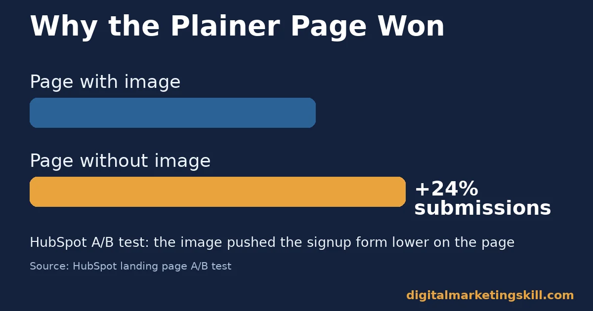
The lesson is not “never use images.” It is that assumptions about what helps landing page conversion are frequently wrong, which is why testing, not opinion, has to settle the question. The same discipline applies before you build the page at all. An online business that validates its offer with real customers starts landing page testing with a far stronger hypothesis than one guessing from scratch.
Frequently Asked Questions About Landing Page Conversion
What is a good landing page conversion rate?
There is no single good number, because rates vary several times over by industry. Unbounce’s analysis of 41,000 landing pages found a 6.6% median across all industries, so use that as a rough baseline and prioritise improving your own page’s past rate.
Should I remove images from my landing page entirely?
No. The lesson from the HubSpot test is not that images hurt conversion by default. It is that an image with no clear job can hurt more than it helps. Keep images that explain something the copy does not, and test the ones you are unsure about.
How many form fields should a landing page have?
As few as you can justify for the next step. HubSpot’s review of more than 40,000 landing pages found conversion rates fall as field count rises, with multi-line and dropdown fields causing the sharpest declines. Cut anything you do not need immediately.
Are image carousels ever worth using on a landing page?
Rarely, for a page built around one offer. Carousel engagement data consistently shows most clicks go to the first slide, which means a single static message usually serves the visitor just as well, with less risk of burying the offer.
How many customer reviews do I need before they help conversion?
Very few. Research from Spiegel Research Center found most of the conversion lift happens by the first five reviews, with diminishing returns after that. Two or three specific, attributed testimonials can already outperform a page with none.
Should I test landing page changes one at a time or all together?
One change at a time, tested until you reach statistical significance, if you want to know which specific change caused the result. Bundling several changes together can lift landing page conversion, but it will not tell you which one did the work.
Does page speed really affect landing page conversion?
Yes. A visitor who leaves before the page finishes loading never reaches your offer, your form or your proof, so slow load time caps your conversion rate before any other fix can help. Compress images and cut unnecessary scripts first.
Start by Removing One Piece of Friction, Then Test
Pick the single biggest friction point on your landing page right now, whether that is a carousel, a mismatched headline or a form with too many fields. Remove it before you touch anything else. Measure the change against your page’s own history, then move to the next friction point once the result is clear.
Work through the list in order, so each result tells you something you can reuse on your next page.
Digital Marketing Skill Institute’s Master Diploma in Digital & AI Marketing covers landing page and conversion optimisation as part of its nine practical courses, alongside paid and organic customer acquisition. The program includes unlimited one-on-one coaching and mentoring and real project work inside a US company.
It is dual US and UK accredited and recognised in more than 100 countries, delivered 100% online. You can apply these fixes to real pages from anywhere in your country.
See the full program on the Master Diploma page, browse more guides on the digital marketing blog, or go straight to apply when you are ready. Learn more at digitalmarketingskill.com, wherever you live, and see real outcomes on the reviews page. Visit digitalmarketingskill.com to get started.
Every figure in this guide was checked against its original source before publication. Figures marked as illustrative are invented examples, not real results.
![9 Amazing Digital Marketing Skills to Make Money Online [With Proof]](https://digitalmarketingskill.com/wp-content/uploads/2019/07/9-Amazing-Digital-Marketing-Skills-to-Make-Money-Online-With-Proof-17.png)