Good landing page examples share one trait. They give a visitor a single call to action. They show proof near the top. The form is short enough to finish in under a minute. This guide breaks down what separates a landing page that converts above 10% from one stuck under 4%. You get the data, one decision rule, and a real case you can copy.
Key Takeaways
- The median landing page converts visitors at 6.6%. The gap between industries runs from 3.8% to 12.3% (Unbounce).
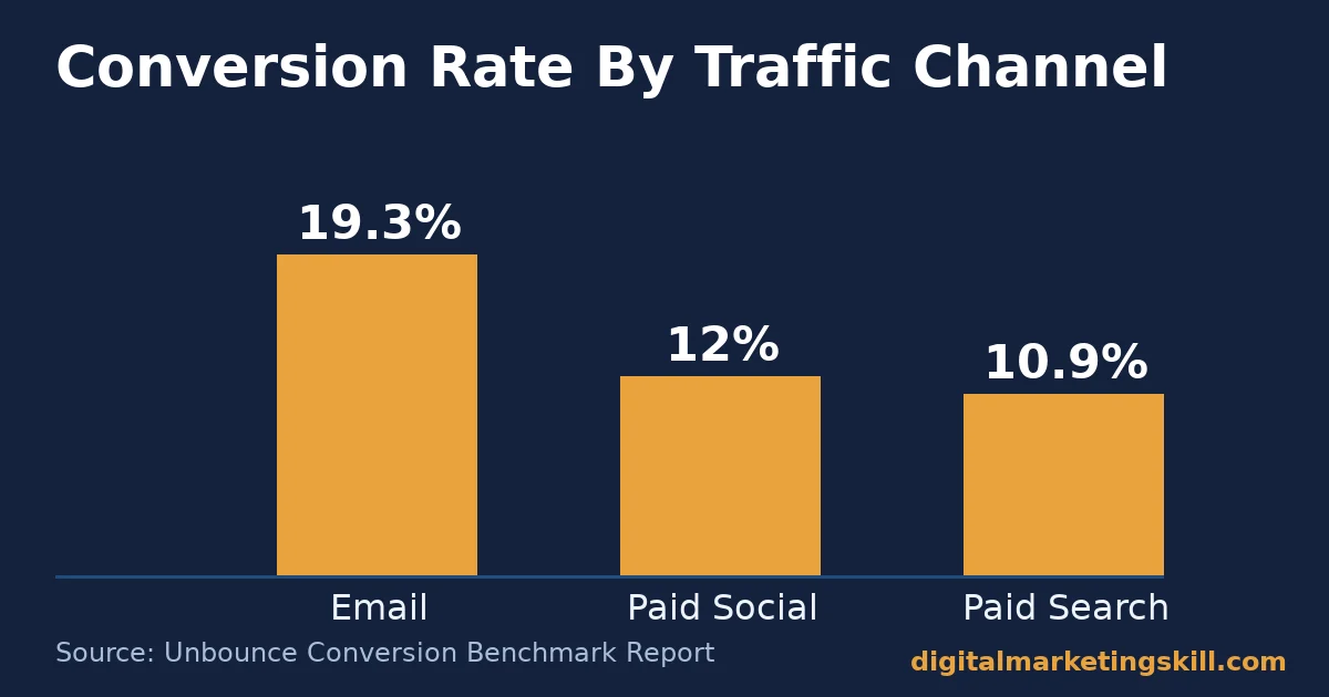
- Email-driven traffic converts at 19.3% on average. That is the highest of any channel tracked, ahead of paid social (12%) and paid search (10.9%) (Unbounce).
- Mobile traffic makes up 83% of landing page visits. It still converts about 8% worse than desktop (Unbounce).
- Pages written at a 5th-7th grade reading level convert at 11.1%. That is more than double the 5.3% rate of pages written at a professional, advanced reading level (Unbounce).
- More than 6 billion people are online worldwide (DataReportal). That is exactly why a page built around one country’s currency or platforms quietly loses visitors everywhere else.
In this guide
- The Gap: Why Most Landing Page Examples Still Underperform
- What A Landing Page Actually Does
- Landing Page Examples By Type: What Differs
- How To Lead With Each Type Of Landing Page
- Landing Page Examples In Practice
- Common Mistakes That Sink Landing Page Examples
- Measuring Whether Your Landing Page Is Working
- The One Decision Rule For Choosing A Layout
- A Real Case: Turning A Small Ad Budget Into Measurable Sales
- Frequently Asked Questions About Landing Page Examples
- Build Pages Like These With Expert Guidance
The Gap: Why Most Landing Page Examples Still Underperform
Most round-ups of landing page examples show a screenshot and stop there. They point at a headline or a button colour and call it the reason the page converts. That is a guess, not a fact, since nobody outside the company can see the traffic, price, or test history behind that screenshot.
The more common and more fixable gap is simpler. A lot of paid and social traffic still lands on a homepage instead of a dedicated page. A homepage has to serve everyone. It carries a menu, several offers, and a dozen exits.
A visitor clicked one ad for one reason. They get dropped into all of that, then they have to find their own way to the thing they wanted. A simple digital marketing strategy audit usually finds this gap in minutes, by checking where each ad and email link actually sends people.
Two ground rules sit ahead of the data below. First, these numbers are a snapshot of current measured behaviour across many accounts. They are not a permanent ranking. Traffic quality and offer strength move the number more than layout does. Second, nothing here guarantees that copying a layout will reproduce someone else’s conversion rate. Treat it as a guide to the mechanism. Then judge your own page against it.
The channel sending the traffic moves the conversion number more than almost anything on the page. See that gap below, before layout enters the picture at all.
What A Landing Page Actually Does
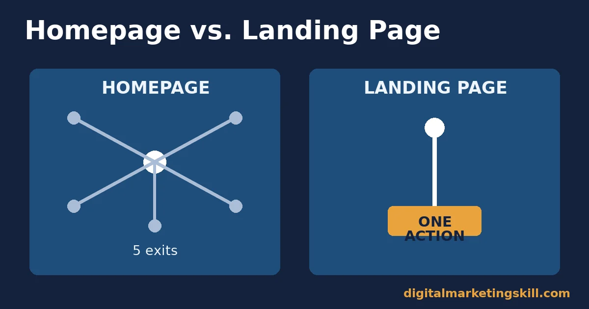
A landing page is the page a visitor reaches right after clicking an ad, an email link, or a social post. By contrast, a homepage has to serve many goals at once, while a landing page serves exactly one. For example, that one goal could be booking a call, downloading a guide, or starting a training application.
A typical website carries a full menu, a blog feed, and a dozen competing links. A landing page strips all of that out instead, so the one action is the only thing left to do on the page.
That focus is the whole mechanism. A visitor arrives already curious about one specific thing, so they act far more often when the page answers only that thing, in the same words as the ad that brought them there. Compare that to landing somewhere general, where a visitor instead has to go hunting for the answer themselves, which is often where the drop-off happens.
Landing Page Examples vs. A Website Homepage
A homepage, like the digitalmarketingskill.com homepage, works as a hub. It links out to services, a blog, and contact details. It has to serve visitors who arrive for dozens of different reasons. A landing page drops all of that structure. It delivers one promise, one piece of proof, and one button. Every sentence on the page exists to move a visitor toward that one button, not away from it.
Landing Page Examples By Type: What Differs
Not every landing page chases the same action. The best landing page examples are built differently depending on what they are chasing. Two types show up most often, and they pull in opposite directions.
Lead-Generation Pages: Built For Capturing Contact Details
A lead-generation page trades something useful for a name and an email address. The offer might be a guide, a free audit, or a webinar seat. The page’s whole job is to make that trade feel worth it within about ten seconds of reading. After that, the page needs to get out of the way of the form.
Writing that single trade well is easier once you know exactly who you are writing it for. A clear customer avatar gives you the one worry or goal the headline should speak to, instead of writing copy that tries to appeal to everyone at once.
Click-Through Pages: Built For Warming Up Before The Ask
A click-through page does not ask for anything on the page itself. It spends its space on proof, specifics, and detail instead. Then it sends the visitor on to a separate page to buy, book, or sign up. This type suits offers that need more convincing before someone commits. The real “cost” of the click is reassurance, not a filled-in form.
How To Lead With Each Type Of Landing Page
Once you know which of the two jobs your page is doing, the fix for a weak page usually comes from the same short list.
Lead-Generation Pages: Lead With A Short Form
Every extra field on a lead-generation form gives a visitor one more reason to bounce. A short form, asking only for a name and an email, removes the biggest point of friction between a curious visitor and a captured lead. Drop the phone number field, and drop the company-size dropdown too.
Instead, pair that short form with a headline that restates exactly what the visitor clicked to get there. Nothing should feel like a bait-and-switch, because a visitor who feels tricked rarely finishes the form at all.
Here is a worked example. A cold-traffic ad for a free guide sends 1,000 visitors to a page. A nine-field form on that page gets only 40 completions, a 4% rate.
Now cut that same form to two fields, with no other change on the page. As a result, pages like this have historically moved toward the 10%+ range Unbounce records for the strongest quarter of lead-generation pages. In other words, that gap, roughly 60 extra leads from the same 1,000 visitors, comes from the form rather than the traffic.
Click-Through Pages: Lead With Proof Before The Click
A click-through page should spend its first screen on the strongest, most specific proof available. Use a real result, name a real case, or cite a verifiable number. Skip a vague claim like “many people love this,” because vague claims do not answer doubt.
Save the actual button for after that proof appears, since the job of this page type is to answer doubt first. Otherwise, a button shown before the doubt is answered tends to get ignored.
Landing Page Examples In Practice
Seeing the mechanism named is useful. Seeing it applied is more useful. Three patterns show up again and again across strong landing page examples, regardless of industry or offer. None of the three require a designer, a developer, or a large budget. They are editorial choices, not technical ones, which is why they travel well across a no-code builder, a custom site, or a page built inside an email tool.
Pattern One: The Headline Repeats The Ad
A visitor who clicked an ad promising “a free seven-day email plan” should land on a page whose headline says exactly that, in close to the same words. A mismatch here, even a small one, makes a visitor pause and wonder if they clicked the wrong link. That pause is often the whole difference between a completed form and a closed tab.
Google’s own guidance on landing page experience treats exactly this kind of mismatch, between what an ad promises and what the page delivers, as a quality signal worth checking before anything else.
Pattern Two: One Button, Repeated, Never Replaced
Strong pages repeat the same call-to-action button several times down the page, worded the same way each time. They do not introduce a second, different action halfway down, like a newsletter sign-up next to a free-trial button. A second choice is not a bonus. It is a fork in the road that slows the visitor down.
Pattern Three: Proof Sits Close To The Ask
A testimonial, a number, or a named case works hardest when it sits right beside the button it is meant to support, not buried in a separate section. Visitors rarely scroll back up to check proof after they have already decided to leave, so proof placed far from the button usually arrives too late to change their mind.
These three patterns cost nothing to apply to an existing page. Before testing a brand-new layout, it is worth checking whether your current landing page examples already break one of them, since fixing a mismatch or moving a piece of proof can lift results faster than a full redesign.
Common Mistakes That Sink Landing Page Examples
Beyond the two patterns above, four smaller mistakes show up repeatedly across weak landing page examples. Each one is easy to fix once you know to look for it, and none of them require rebuilding the page from scratch.
Mistake One: A Full Navigation Menu Stays On The Page
If the main site menu is still visible, a curious visitor can click away before they ever reach the offer. As a result, the page quietly competes with itself. Removing the menu, or trimming it to a single logo with no links, keeps attention on the one action the page exists for.
Mistake Two: The Offer Shifts Between The Ad And The Page
An ad promises one thing, and the page delivers something slightly different. For instance, an ad for “a free checklist” that lands on a page selling a paid course breaks trust immediately. Consequently, visitors leave the moment they notice the gap, often before reading a single additional sentence.
A clear social media advertising strategy that plans the ad and the landing page together, before either one is built, avoids this mismatch from the start.
Mistake Three: Proof Is Vague Instead Of Specific
Phrases like “loved by thousands” carry almost no weight, because they cannot be checked. A named case, a real number, or a dated-free quote from an identifiable person carries far more weight instead, since a visitor can judge whether it applies to them.
Mistake Four: The Page Was Only Ever Tested On Desktop
Since mobile traffic now makes up the majority of visits to most landing page examples, a page that was only checked on a desktop screen often hides a broken form or a button that sits off-screen on a phone. Therefore, testing on a real phone before launch catches problems a desktop preview simply cannot show.
A quick way to check: load the live page on an actual phone. Then try to complete the form with one thumb, start to finish, before calling the page ready.
Measuring Whether Your Landing Page Is Working
Three numbers tell you most of what you need to know about a live page.
- Conversion rate: completed actions divided by total visits. Compare your page against the 6.6% median for similar traffic volume, not against a single competitor’s screenshot.
- Form completion rate: visitors who start the form divided by visitors who finish it. A low number here, even with decent traffic, usually points to too many fields or one confusing field. It rarely points to a weak offer.
- Largest Contentful Paint (LCP): how long the page’s main content takes to appear. Google’s Core Web Vitals standard calls anything within 2.5 seconds, measured across the middle three-quarters of visits, a “good” score. A page that misses this target loses visitors before they even read the headline.
Check all three together. A page with a strong conversion rate but a weak completion rate usually has a traffic-quality problem feeding it, not a design problem on the page itself. This is the same habit covered in a broader conversion rate optimization process: measure first, then change one thing at a time.
Give A Page Enough Time Before Judging It
Give any one of these numbers at least two full weeks of real traffic before judging it. A page can look weak on day one simply because the first batch of visitors came from an unusually cold or unusually warm source.
A short test window reads that early noise as a verdict, which is misleading. Therefore, treat the first few days as a check for broken links and broken forms, not as a final score for the page.
The One Decision Rule For Choosing A Layout
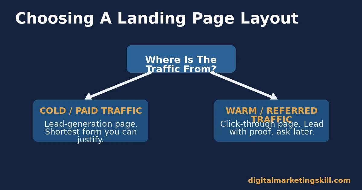
If the traffic is cold and paid, build a lead-generation page with the shortest form you can justify. If the traffic is warm, retargeted, or referred by someone they trust, build a click-through page that leads with proof instead of a form.
Cold traffic has no reason yet to trust you with more than a name and an email. Warm traffic already carries some trust. So the page’s job shifts. It moves from capturing contact details to closing the small amount of doubt left before a bigger ask.
A Worked Example Of The Decision Rule
Illustrative, invented numbers help show the size of the effect. A cold Facebook ad campaign sends 2,000 unfamiliar visitors to a nine-field lead form. That campaign might land near a 3% conversion rate. Send the same budget to a two-field version of the same offer, aimed at the same audience. Expect that version to land meaningfully higher, because the only variable that changed was the size of the ask.
A Real Case: Turning A Small Ad Budget Into Measurable Sales
Ayooluwa Osemi, a student at the Digital Marketing Skill Institute, reported spending $14 on a Facebook and Instagram ad campaign. That campaign generated $878 in sales, as published on the Institute’s student reviews page. The result depended on sending that paid traffic to a focused page, not a general homepage. That choice matches the cold-traffic rule above.
A few limits are worth stating plainly. This is one self-reported result from one campaign. It is not a typical or guaranteed outcome, and results vary by product, audience, and budget. Repeating this example promises no specific income or earnings outcome. Read the Institute’s earnings disclaimer for the full context.
Frequently Asked Questions About Landing Page Examples
What makes landing page examples different from a regular webpage?
A landing page is built around a single action. It carries no menu and no competing links. A regular webpage, like a homepage, serves many different visitor intents at once. It links out to dozens of other pages.
How many form fields should a landing page example use?
Use as few fields as the offer allows. Simple fields like name and email have only a small effect on completion as you add them. More complex fields, like dropdown menus and long text boxes, measurably reduce how many visitors finish the form. Each extra field beyond the essentials should earn its place.
What is a good landing page conversion rate to aim for?
The measured median across industries is 6.6%. The strongest quarter of pages reach above 10%. Judge your own page against your own traffic quality and offer. A cold-traffic page and a warm-referral page should not be judged against the same number.
Do landing page examples need to load quickly to convert?
Yes. Google’s Core Web Vitals standard treats a Largest Contentful Paint beyond 2.5 seconds as a weak score. A visitor who is still waiting for the page to render cannot yet see the offer, the proof, or the button.
Should a landing page example always have a form?
No. A click-through landing page skips the form entirely. It sends the visitor on to a separate page to buy or sign up, once enough proof has answered their doubt.
What tools can build a landing page example without custom code?
No-code page builders such as Elementor let you assemble a focused page with a drag-and-drop layout. You do not need to write markup by hand, which makes it easier to test more than one layout quickly. Sites like Khan Academy show the same single-purpose thinking applied to an educational sign-up page, even outside paid advertising.
Why do so many landing page examples still fail even with a good offer?
Most failures trace back to friction, not the offer itself. A long form, a slow-loading page, or a headline that does not match the ad all add friction a visitor was never asked to accept. Fix the friction first, then test the offer.
How long should I run a landing page test before changing it?
Aim for at least two weeks, or enough visits to collect a few hundred form starts, whichever comes later. Otherwise, a short test window often reflects which traffic source happened to run that week, rather than anything about the page itself.
Can one landing page work for more than one audience?
Rarely well. Two different audiences usually want different proof and a different headline, so a single page trying to serve both tends to feel vague to everyone. Building a second, near-identical page with its own headline for the second audience is normally quicker than trying to write one page broad enough for both.
Build Pages Like These With Expert Guidance
Do you want to design, launch, and test landing pages like the ones above, rather than only read about them? The Master Diploma in Digital & AI Marketing covers this inside its AI-Powered Lead Generation and Email Automation track. That track is one of four AI-powered tracks built from ten courses in total, with a Full Stack option for completing all four.
Every track includes unlimited one-on-one coaching and mentoring, plus a U.S. Project Internship with a verified U.S. Work Reference Letter. On top of that, the diploma carries dual US and UK accreditation, recognised in more than 100 countries. The whole programme runs 100% online, so you can study from anywhere in your country.
Explore the full digital marketing blog for more practical breakdowns like this one. Read real outcomes on the reviews page. Or go straight to the application page to start. Wherever you live, the programme is built so you can follow it online from day one. Learn more about the Institute at https://digitalmarketingskill.com/.
Every figure in this guide was checked against its original source before publication. Figures marked as illustrative are invented examples, not real results.
![9 Amazing Digital Marketing Skills to Make Money Online [With Proof]](https://digitalmarketingskill.com/wp-content/uploads/2019/07/9-Amazing-Digital-Marketing-Skills-to-Make-Money-Online-With-Proof-17.png)