Ecommerce checkout mistakes quietly drain revenue that marketing already paid to win. Most shoppers who reach checkout want to buy. They leave because of hidden costs, forced logins, or a process that asks for too much, too late. Fixing these ecommerce checkout mistakes recovers sales a store has already earned once.
Key Takeaways
- Abandonment is the norm, not the exception. The average documented cart abandonment rate is 70.22%, calculated from 50 studies (Baymard Institute).
- Hidden costs top the list. 40% of abandoners cite extra costs, like shipping or tax, appearing too late in the process (Baymard Institute).
- Forced accounts cost sales. 18% abandon a purchase when a site forces account creation before checkout (Baymard Institute).
- Complexity has a price. 17% abandon over a checkout process that is too long or complicated (Baymard Institute).
- Product pages miss the basics. 43% of ecommerce sites omit shipping information from the product page, though 64% of users look for it there (Baymard Institute).
In this guide
- What Most Checkout Advice Gets Wrong
- How Checkout Abandonment Actually Works
- What Differs Across the Four Checkout Levers
- How to Lead With Each Lever
- How to Measure Whether You Fixed These Ecommerce Checkout Mistakes
- Other Common Ecommerce Checkout Mistakes Worth a Quick Check
- The Ecommerce Checkout Mistakes Decision Rule: Fix the Surprise First
- A Real Case: What Checkout Usability Testing Reveals
- Frequently Asked Questions About Ecommerce Checkout Mistakes
- Fix the Surprise, Then Fix the Form
What Most Checkout Advice Gets Wrong
Most checkout advice says the same thing: add trust badges and shorten the form. Both can help, but neither addresses the biggest leaks. The biggest leaks happen earlier: on the product page, at the first sight of a price, and the moment a site demands an account.
This guide treats ecommerce checkout mistakes as a sequence of trust tests, not a single form to tweak. Each step of the path, from product page to confirmation, either earns the sale or loses it. Fixing the sequence recovers more revenue than polishing any one screen.
Ground rules first. The figures below come from Baymard Institute’s usability research, a named source with a defined sample. Treat the percentages as strong, repeated signals across many sites, not an exact match for every store or country. Every number is a snapshot, not a permanent law of ecommerce.
How Checkout Abandonment Actually Works
A shopper does not abandon a cart in one dramatic moment. They abandon it the instant trust drops below the effort required to continue. Each surprise, whether a cost, a form field, or a login wall, adds to that effort.
This is why the overall numbers look so large. Baymard Institute’s analysis of 50 studies found an average documented cart abandonment rate of 70.22%. Most of that is not lost forever. Some abandonment is simply browsing, but a large share is recoverable through better design.
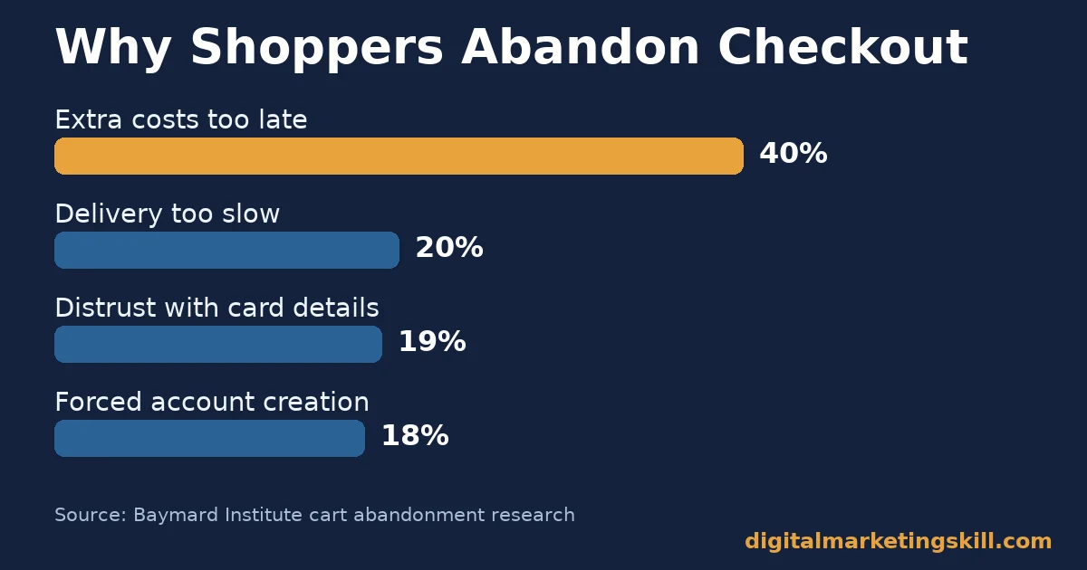
The reasons are not evenly weighted. Extra costs appearing late top the list at 40%, ahead of slow delivery at 20% and distrust over card details at 19%. Forced account creation, a complicated checkout, and site errors each sit close together in the high teens.
A smaller group of ecommerce checkout mistakes still matters even at lower percentages. Roughly 13% of abandoners cite an unclear returns policy, 12% could not see the total order cost upfront, and 9% left because their preferred payment method was missing. None of these alone looks dramatic, but together they add up to a large, fixable share of lost sales.
Why Cost Surprises Hurt More Than Any Other Mistake
A price that changes at the last step feels like a trick, even when the extra cost is legitimate. Shoppers mentally commit to the number they saw first. Any increase after that point reads as bad faith, not logistics.
This is also the easiest mistake to fix, because it is about timing, not pricing. Showing the full cost earlier does not change what a shopper pays. It only changes when they find out, and that timing decides whether they stay. Delivery speed adds a related pressure: about 20% of abandoners cite delivery that felt too slow, a close second to cost surprises.
Why Forced Accounts Hurt First-Time Buyers Most
Forcing an account before checkout adds a real cost: time, a password to remember, and a reason to hesitate. Baymard Institute’s research found that 18% of abandoners cite this requirement directly, and registered, logged-in customers convert well only because they are already committed, not because the account itself helped.
A first-time visitor has made no such commitment. For them, a mandatory account is one more reason to leave and compare prices elsewhere instead.
Ecommerce Checkout Mistakes That Hit Mobile Shoppers Hardest
Every mistake above gets worse on a small screen. A form that feels merely long on desktop can feel endless on mobile, where each extra field means more scrolling, more typing on a cramped keyboard, and more chances to lose a connection or get interrupted.
Autofill support, large tappable buttons, and a payment option like a digital wallet that skips manual card entry all matter more on mobile than desktop. A store that tests its checkout only on desktop is very likely missing the exact point where most of its mobile shoppers give up.
What Differs Across the Four Checkout Levers
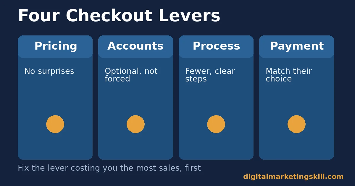
Ecommerce checkout mistakes cluster around four levers: pricing clarity, account friction, process length, and payment choice. Each lever fails a different type of shopper, so each needs its own fix. A store that only fixes one lever often sees a smaller lift than expected, because the other three mistakes are still quietly turning shoppers away at different points in the same journey.
These levers also interact. A shopper who survives a cost surprise may still leave at a forced login. One who accepts the account requirement may still quit over a long, unclear form. Treat the four levers as a sequence a shopper has to clear, not four independent fixes competing for priority.
Pricing Clarity: Built on No Surprises
Shoppers forgive a fair price. They do not forgive a price that moves. Pricing clarity means showing shipping, tax, and fees before the final step, not after a shopper has already invested time in the cart.
Account Friction: Built on Optional, Not Mandatory
An account should be a convenience offered after the sale, not a gate before it. Account friction is lowest when guest checkout is the default path and account creation is simply an offer at the confirmation screen. Once a buyer does create an account, our guide to a loyalty program that avoids common failure points covers how to make that account worth keeping.
Process Length: Built on Fewer, Clearer Steps
Every extra field or screen is a chance for a shopper to stop and reconsider. Process length is not just about step count. It is about whether each step clearly moves the shopper closer to done.
Payment Choice: Built on Matching What Shoppers Already Use
A shopper who cannot pay the way they prefer often will not switch cards just for one store. Payment choice is about meeting shoppers where they already are, not asking them to adapt to the store’s limitations.
How to Lead With Each Lever
The sections below mirror the four levers above. Start with whichever one is costing you the most sales today, since fixing that lever first turns these ecommerce checkout mistakes into recovered revenue the fastest.
Pricing Clarity: Lead With the Full Price, Early
Show a shipping estimate on the product page or cart, not only at the final checkout step. Our guide to cash flow strategies covers why pricing surprises hurt sellers too, not just buyers, by slowing collections and inflating returns.
If exact shipping cost depends on the destination, show a clear estimate or range as early as the cart. A rough number shown early beats an exact number shown too late.
Account Friction: Lead With Guest Checkout as the Default
Make guest checkout the first, most visible option, not a small link beneath a account-creation form. Offer account creation after the order confirms, when the shopper has already committed and the account feels like a convenience, not a gate.
If you need contact details for shipping updates, collect only what the order requires. Every additional field should earn its place by making the current order better, not by building a future marketing list.
Process Length: Lead With One Clear Step at a Time
Break the checkout into clearly labeled stages: cart, delivery, payment, confirmation. A visible progress indicator reduces the feeling of an open-ended process, even when the number of steps stays the same.
Always show an order confirmation with a reference number, an estimated delivery date, and a support contact. That single screen answers most of the questions a shopper would otherwise message support to ask. Our guide to post-purchase engagement covers what to do once that order ships.
Payment Choice: Lead With the Options Your Shoppers Actually Use
Offer at least one card network, one digital wallet, and one alternative method, such as a bank transfer or buy-now-pay-later option where relevant. The goal is not every possible method, just enough variety that most shoppers find their preferred one.
Review declined-payment messages too. A vague error forces a shopper to guess what went wrong, while a clear message tells them exactly what to fix or try next. Around 10% of shoppers abandon after a declined card specifically, often because the error message gave them nothing useful to act on.
How to Measure Whether You Fixed These Ecommerce Checkout Mistakes
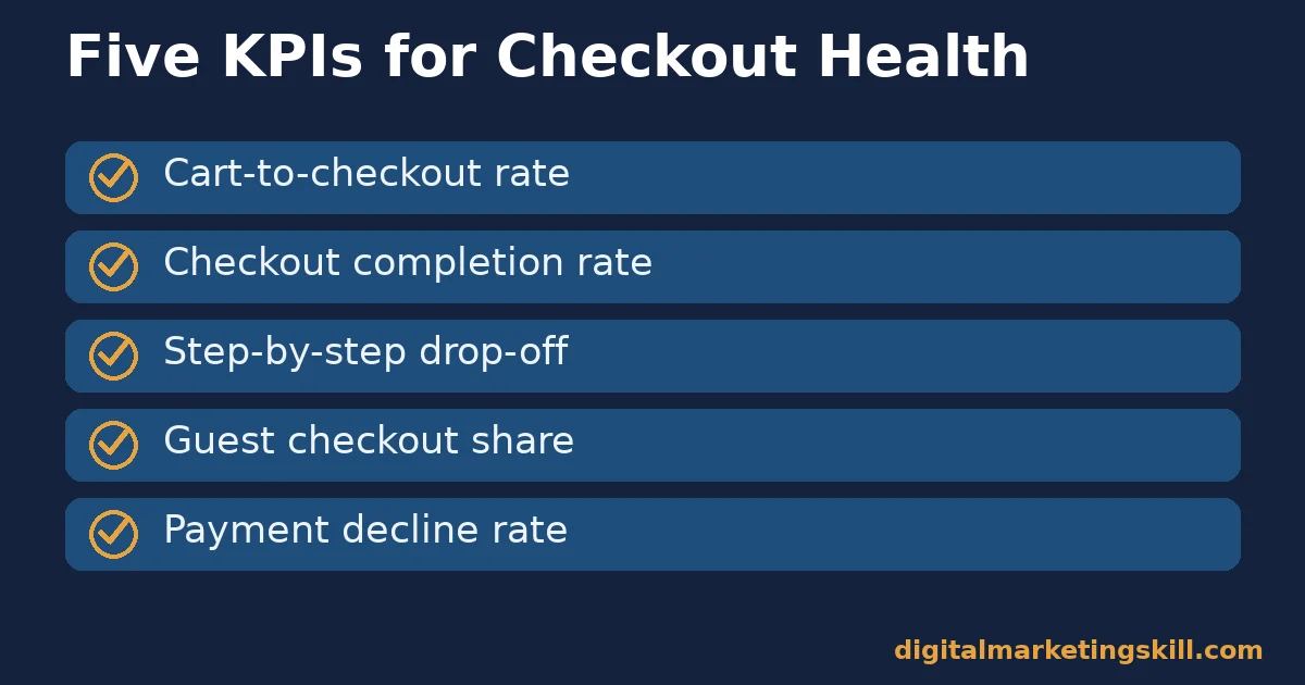
Track the path, not just the final conversion rate. Each metric below is defined in one sentence, with a note on how to read it, so you can see exactly where ecommerce checkout mistakes are still costing you sales.
Five KPIs That Show Where Shoppers Drop Off
- Cart-to-checkout rate. The share of shoppers who start checkout after adding something to their cart. A low rate often points to a pricing or trust problem shown in the cart itself.
- Checkout completion rate. The share of shoppers who finish checkout once they start it. This is the most direct measure of friction inside the checkout flow itself.
- Step-by-step drop-off. The share of shoppers who exit at each individual checkout step. A sharp drop at one step usually points straight at the mistake causing it.
- Guest checkout share. The share of orders completed as a guest versus a forced account. A low guest share, where guest checkout exists, suggests the option is hard to find.
- Payment decline rate. The share of payment attempts that fail. A rising rate can point to too few payment options or a confusing payment form.
How to Read These Numbers Together
Read cart-to-checkout rate first. A problem here points to pricing or trust issues shown before checkout even starts, not the checkout form itself. If that number is healthy but completion rate is low, the checkout flow itself is the likely cause.
Step-by-step drop-off tells you exactly where to focus next. Track all five metrics together for at least a few weeks of real traffic before judging any single change.
Segment these numbers by device whenever you can. A store with a healthy desktop completion rate can still be losing most of its mobile shoppers at the same step, and averaging the two together hides exactly the problem you are trying to find.
Other Common Ecommerce Checkout Mistakes Worth a Quick Check
Beyond the four main levers, a handful of smaller ecommerce checkout mistakes are easy to miss during a redesign but still cost real sales. None of these drives abandonment on its own at the scale of a cost surprise, yet each one adds friction a tired or distracted shopper may not push through.
- No visible security signals. Roughly 19% of abandoners say they did not trust the site with their card details. A visible padlock icon, a recognizable payment logo, and a clear privacy link all help close that trust gap.
- No way to edit the cart from checkout. Forcing a shopper back to a separate cart page to fix a quantity or remove an item adds a detour that some shoppers simply do not complete.
- Unclear return policy at checkout. Shoppers often decide to buy only once they know they can return an item easily. Burying that policy in a footer link, rather than showing it near the order summary, quietly costs sales.
- Session timeouts that lose the cart. A shopper who steps away briefly and returns to an empty cart has to start over, and many simply will not.
The Ecommerce Checkout Mistakes Decision Rule: Fix the Surprise First
If this guide leaves you with one decision rule, make it this one. Before redesigning the checkout form itself, remove whatever is surprising shoppers late in the process, because a surprise undoes good form design every time.
Here is an illustrative example, with invented numbers. A small home goods store has a checkout completion rate of 48%, with most drop-off happening at the shipping-cost step. The store moves its shipping estimate to the product page instead of the final step. Over the next month, checkout completion rises to 61%, without changing the checkout form at all.
The lesson is about where the real mistake lives. A clean checkout form cannot fix a surprise that happens one step earlier. Fixing the surprise first often makes the form redesign unnecessary. Once checkout itself converts well, our guide to repeat customer strategies covers how to turn that first sale into a second one.
A Real Case: What Checkout Usability Testing Reveals
Baymard Institute has run large-scale ecommerce usability testing for years, observing real shoppers as they try to complete purchases on live sites. Its checkout research consistently finds the same structural issues across unrelated stores and industries.
The research estimates that addressing documented, solvable checkout usability issues can lift conversion rate by around 35% on average for a large ecommerce site, simply by removing friction that testing shows shoppers hit again and again.
Keep the limits of this case in mind. That figure is an average across many sites with varying starting points, not a guaranteed result for any single store. Treat it as evidence that checkout usability work pays off, not a specific promise for your numbers. A site that already fixed its biggest cost-surprise and account-friction mistakes should expect a smaller remaining lift than one that has fixed nothing yet.
Frequently Asked Questions About Ecommerce Checkout Mistakes
What is the most common ecommerce checkout mistake?
Showing extra costs, like shipping or tax, too late in the process. Baymard Institute found 40% of abandoners cite this as their reason, more than any other single factor.
Does forcing account creation really hurt sales?
Yes. Baymard Institute found that 18% of cart abandoners cite forced account creation directly. Offering guest checkout as the default, with account creation offered after purchase, avoids this cost entirely.
How many steps should an ecommerce checkout have?
There is no fixed ideal number. What matters more is that each step is clearly labeled and visibly moves the shopper closer to finishing, with a visible progress indicator throughout.
What is a good checkout completion rate?
It varies by store and traffic source, so compare your own rate over time rather than chasing one universal benchmark. A rising trend after a specific fix is the most useful signal.
Should every ecommerce site offer guest checkout?
In most cases, yes. Making guest checkout the default and offering account creation after the order confirms captures both first-time buyers and the convenience of an account for repeat shoppers.
How do I know which checkout mistake to fix first?
Look at step-by-step drop-off data. The step with the sharpest exit rate is usually hiding the clearest, most fixable mistake, and fixing it first produces the fastest measurable result.
Do payment options really affect conversion?
Yes, though less than cost surprises or forced accounts. Baymard Institute found that roughly 9% of US online shoppers have abandoned a checkout because their preferred payment method was missing.
Can product page mistakes cause checkout abandonment too?
Yes. Many ecommerce checkout mistakes start before checkout even opens. Baymard Institute found that 43% of sites omit shipping information from the product page, even though 64% of shoppers look for it there, which pushes the cost surprise earlier into the journey than most teams realize.
Fix the Surprise, Then Fix the Form
Ecommerce checkout mistakes are rarely about a single broken button. They are usually a sequence of small surprises that add up to lost trust. Start with pricing clarity, since it causes the most abandonment, then work through accounts, process length, and payment choice in order.
Want guided practice building systems like these? Digital Marketing Skill Institute teaches practical skills hands-on inside its Master Diploma in Digital & AI Marketing. The program runs on four AI-powered tracks totaling ten courses, including AI-Powered Google Specialist and AI-Powered WordPress and SEO Specialist, with a Full Stack option for completing all four tracks together.
It comes with unlimited 1-on-1 coaching and mentoring, plus a U.S. Project Internship that ends with a verified U.S. Work Reference Letter. The Master Diploma is dual US and UK accredited, recognised in more than 100 countries, and delivered 100% online. You can study from anywhere in your country.
Browse more guides on the Digital Marketing Skill Institute blog, visit the Digital Marketing Skill Institute homepage, or apply for the Master Diploma directly.
Every figure in this guide was checked against its original source before publication. Figures marked as illustrative are invented examples, not real results.
![9 Amazing Digital Marketing Skills to Make Money Online [With Proof]](https://digitalmarketingskill.com/wp-content/uploads/2019/07/9-Amazing-Digital-Marketing-Skills-to-Make-Money-Online-With-Proof-17.png)