

Most visitors now reach a business on a phone, not a desktop. Responsive web design is what decides whether that visit works or fails. It is the single layout that reshapes itself for any screen, instead of a separate mobile site to maintain. Skip it, and a majority of visitors meet a cramped, slow page before they ever read a word.
This guide looks past the basic definition. It covers how a responsive layout actually works under the surface, where it commonly breaks down in practice, and the one order of fixes worth applying before any full redesign.
Key Takeaways
- Mobile is the majority now. StatCounter’s platform data, drawn from over 3 billion monthly page views, puts mobile at roughly 59% of global web traffic, ahead of desktop.
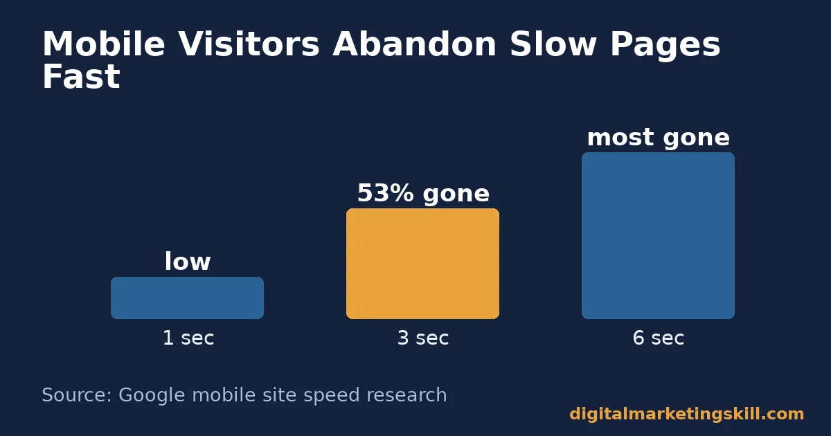
- Speed decides who stays. Google’s mobile speed research found 53% of mobile visitors abandon a page that takes longer than three seconds to load. The chance of leaving rises 32% between one second and three.
- Google judges the mobile version first. Google’s own announcement confirms mobile-first indexing is complete. The mobile version of a page is what gets crawled, indexed and ranked.
- Device gaps are narrowing, not fixed. Dynamic Yield’s rolling benchmark across its ecommerce dataset puts mobile and desktop conversion rates within a point of each other. That is closer than older studies suggested.
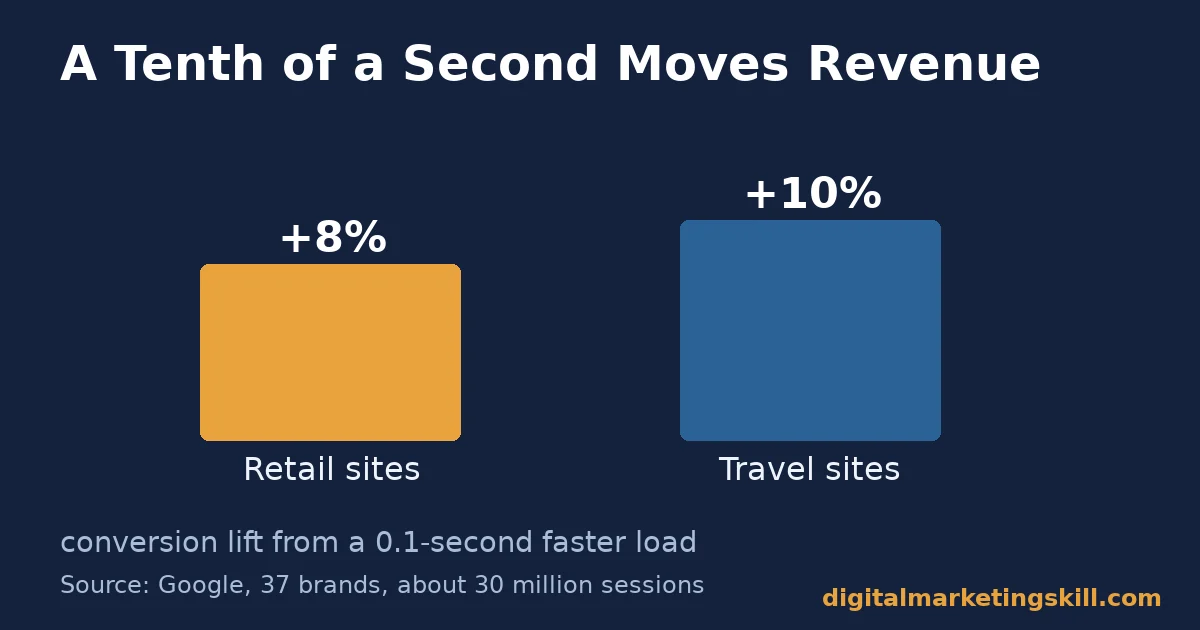
- Fractions of a second still move revenue. Google’s multi-brand speed study, covering 37 brands and about 30 million sessions, found a 0.1-second speed gain lifted retail conversions by roughly 8%.
In this guide
- Why So Many Business Sites Still Fail on Mobile
- How Responsive Web Design Actually Works
- What Differs By Approach
- How To Lead With Each Layer
- How To Measure Mobile Performance
- The One Decision Rule for Responsive Web Design
- Why Responsive Web Design Is Only the Starting Point
- A Real Case: What a Speed Study Found Across 37 Brands
- Common Mistakes That Quietly Break Responsive Web Design
- Frequently Asked Questions About Responsive Web Design
- Build This Skill Properly
Why So Many Business Sites Still Fail on Mobile
Responsive web design has been the standard approach for over a decade. Yet plenty of business sites still load slowly on a phone. Some show a desktop layout squeezed onto a small screen. Others hide the one action a visitor actually came to take. The code technically resizes. The experience does not actually work.
Three ground rules keep this guide honest. First, traffic-share and speed figures are global averages. They shift by month and by audience, so treat them as a reference point, not an exact figure for your own site.
Second, several figures come from retail and ecommerce datasets. A service or local business site may see a different pattern. Third, any number marked illustrative is an invented example, not a measured result.
The real gap is rarely the absence of responsive code. It is usually what happens after the layout resizes. A slow image loses patience. A menu built for a mouse frustrates a thumb. Filling in a contact form becomes painful instead of quick. Our website audit guide covers how to find these problems before a visitor does.
How Responsive Web Design Actually Works
A responsive page does not detect “mobile” as one fixed category. It reads the available screen width and rearranges itself. It does this using flexible grids, scalable images and CSS breakpoints. The same HTML and the same content serve every device. Only the layout instructions change.
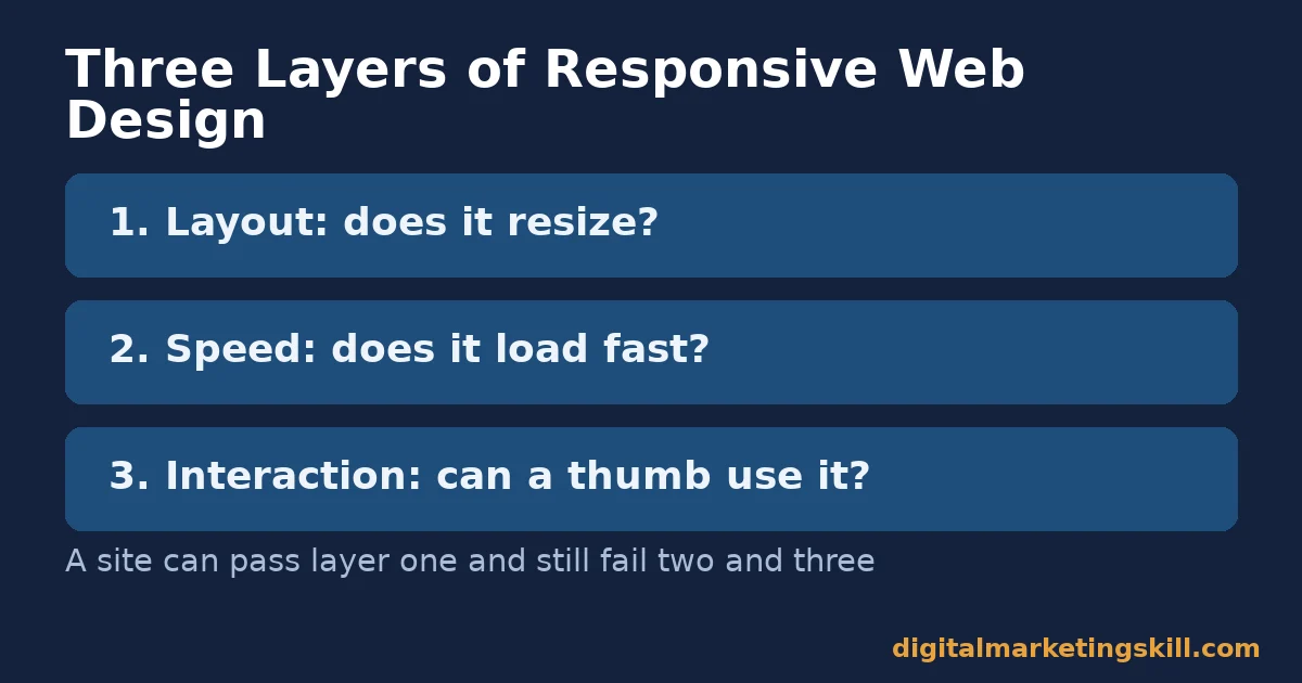
Three Layers That Have to Work Together
Layout is only the first layer. The second is performance. Images, fonts and scripts have to load fast enough on a mobile connection. That connection is often slower than the desktop one a site was designed on.
The third layer is interaction. Buttons, menus and forms have to work with a thumb, not just a mouse pointer. A site can pass the first layer and still fail the other two. Teams often stop testing once the layout looks right on a phone screenshot, which is exactly where the other two layers get missed.
That is why a page can look fine in a quick screenshot test and still perform badly for real visitors. Google’s own Core Web Vitals guidance measures exactly this gap. It checks loading speed, interaction responsiveness and visual stability, not just whether a layout technically resizes.
What Differs By Approach
Three approaches have been used to make a site work on a phone. They are not interchangeable, and each creates a different maintenance and performance problem.
Most modern themes and page builders default to the first approach below, so many businesses already have it without realising. The other two still show up on older sites, or on sites patched together from several different tools over time.
Responsive Design: Built on One Codebase
One set of HTML and CSS adapts to any screen through flexible grids and breakpoints. Content, URLs and SEO signals stay unified. That is also why Google’s mobile-first indexing rewards it: there is only one version of the page to crawl and rank.
Adaptive Design: Built on Fixed Snapshots
An adaptive site detects the device and serves one of several fixed layouts. Each layout is built for a specific screen width. It can load faster on the exact devices it was built for, since nothing is being resized on the fly. But it needs separate design and testing work for every new screen size that becomes common, which adds ongoing maintenance cost most small teams would rather avoid.
A Separate Mobile Site: Built on Duplication
An “m.site.com” style setup keeps a second, simplified version of the site entirely separate from the main one. It duplicates content and URLs. That creates redirect chains, split analytics and two codebases to keep in sync, so every content update has to happen twice or the two versions drift apart. It is the approach most businesses have already moved away from.
How To Lead With Each Layer
Fixing a mobile experience means working through the three layers from the mechanism section above, in order, rather than assuming responsive code alone is enough.
Layout: Lead With Real Devices, Not a Resized Browser
Shrinking a desktop browser window is not the same test as a real phone. Check the actual layout on a current phone and a current tablet. Not just a resized window. Fonts, tap targets and spacing render differently on real hardware.
Speed: Lead With Images and Fonts First
Oversized images and uncompressed fonts are the most common mobile speed problems on small business sites. Compress and resize images before upload. Limit custom fonts to one or two weights. Our page speed guide walks through the rest of the checklist.
This kind of fix directly affects whether a visitor stays past the first few seconds. Google’s mobile speed research tied slow loading to lost visitors again and again, across many different sites.
Interaction: Lead With Thumb-Sized Targets
Buttons, menu items and form fields need enough space for a thumb, not a mouse pointer. A contact form with tiny, closely packed fields will lose visitors on mobile. That happens even when the layout itself looks correct at a glance. The same friction rules covered in our landing page conversion guide apply directly to mobile forms.
How To Measure Mobile Performance
Five numbers show whether a responsive site is actually working, not just technically resizing.
- Mobile bounce rate versus desktop bounce rate. The share of mobile sessions that leave without interacting, compared with the same figure on desktop. A mobile rate well above desktop usually points to a speed or layout problem, not a content one.
- Mobile page load time. How long the main content takes to become usable on a mobile connection. Compare it against Google’s three-second abandonment point rather than against desktop load time alone.
- Mobile conversion rate. Completed goals divided by mobile sessions. Judge it against your own desktop rate on the same site, since industry-wide device gaps vary by dataset and are narrowing over time.
- Core Web Vitals pass rate. The share of mobile page loads that pass Google’s loading, interactivity and stability thresholds. A low pass rate often explains a bounce or conversion problem that layout testing alone will not catch.
- Mobile form completion rate. Started forms divided by submitted forms, tracked separately for mobile. A gap against desktop usually means field size or keyboard type, not visitor intent.
None of these numbers are useful in isolation. A low mobile conversion rate next to a normal bounce rate points to a different problem than the same low conversion rate paired with a high bounce rate. Read them together, not one at a time.
Checking Devices Separately Before Changing Anything
Segment every one of these numbers by device before acting on them. A healthy blended average can hide a badly underperforming mobile experience sitting underneath a strong desktop one. The fix for each is usually different too.
The One Decision Rule for Responsive Web Design
Decision rule: fix the three layers, layout, speed and interaction, in that order, before redesigning anything. A full redesign without first fixing speed and interaction usually just produces a better-looking version of the same slow, hard-to-tap page.
Worked example, illustrative, invented numbers: a local service site gets 4,000 monthly mobile sessions converting at 1.2%, or 48 leads.
Compressing images cuts load time from six seconds to under three. That moves the mobile bounce rate closer to the desktop figure. Conversion lifts to 1.8%, or 72 leads, without any new traffic. The layout never changed. Only speed and tap targets did.
Why Responsive Web Design Is Only the Starting Point
A responsive layout gets a visitor to a usable page. It does not guarantee they stay, trust the business, or take action. Those outcomes depend on what the page says and how fast it proves its point, not just how the grid rearranges itself.
That is why responsive web design works best alongside the content and conversion fixes covered elsewhere on this site, rather than as a one-time project treated separately from the rest of the ongoing marketing plan. A fast, well-structured mobile page still needs a clear offer and an easy next step, or the speed and polish go to waste on a visitor with nothing worth doing once they arrive.
This also changes how a redesign project should be scoped. Treating responsive web design as a one-off technical task, separate from copy, offers and tracking, is how businesses end up with a fast, pretty site that still does not convert. The fix is to plan layout, content and measurement together from the start, not in sequence, one after another, hoping the pieces line up later.
A Real Case: What a Speed Study Found Across 37 Brands
Google’s “Milliseconds Make Millions” research tracked 37 brands across retail, travel, luxury and lead-generation sites. The study covered about 30 million real user sessions. A site speed improvement of just one-tenth of a second was linked to an average 8% lift in conversions for retail sites, and about 10% for travel sites.
Read the limits carefully. This is an aggregate, Google-published study across many brands and sectors. It is not a guaranteed result for any single site. The relationship is a correlation across a large dataset. A site already near the fast end of the range should expect smaller gains than one starting from a slow baseline.
Common Mistakes That Quietly Break Responsive Web Design
Beyond the three layers above, a handful of recurring mistakes undo otherwise solid responsive web design. Each one is easy to miss on a desktop screen and obvious the moment a real visitor hits it on a phone. A short, honest audit usually catches most of them in one pass. None require a full rebuild to fix.
Full-Screen Popups With No Easy Close
A popup that covers the entire mobile screen, with a tiny close button in the corner, drives visitors straight back to search results. It also conflicts with Google’s own guidance on intrusive interstitials. Keep any mobile popup small, and make the close action easy to find and easy to tap.
Desktop Tables and Wide Content That Force Scrolling
A wide table, a fixed-width embed, or an image that is not set to scale will force horizontal scrolling on a phone. That one mistake alone can make an otherwise responsive page feel broken. Every element on the page, not just the main layout, needs to respect the screen width. Good responsive web design treats every embedded element as part of the layout contract, not an exception to it.
Text Too Small to Read Without Zooming
Body text under roughly 16 pixels forces visitors to zoom in just to read a paragraph. That extra effort pushes many visitors to leave rather than keep adjusting the page. Responsive web design should scale type for readability, not just resize the layout around it.
Mobile Redirects That Send Visitors to the Wrong Page
A leftover mobile redirect rule, often inherited from an old separate mobile site, can send a visitor to a generic homepage instead of the specific page they clicked. That breaks the entire point of the link they followed, and it is worth auditing for directly after any site migration or theme change.
A Call to Action Buried Below the Fold
Desktop layouts can afford a long scroll before the main call to action appears, because wide screens show more content at once. The same spacing on a phone can push that same button out of sight for several scrolls, costing the one action the whole page exists to get. Put the primary action within easy reach on mobile specifically, not only on desktop.
Frequently Asked Questions About Responsive Web Design
What is responsive web design?
It is an approach where one set of HTML and CSS automatically reshapes a page’s layout to fit the visitor’s screen, using flexible grids, scalable images and CSS breakpoints. It is different from a separate mobile site, which duplicates content on its own URLs.
Why does responsive web design matter for a small business?
Because most visitors now arrive on a phone. StatCounter’s data puts mobile at roughly 59% of global web traffic, so a site that performs poorly on mobile is failing the majority of its visitors, not an edge case.
Is a resizing layout enough, or does speed matter too?
Layout alone is not enough. Google’s mobile speed research found 53% of mobile visitors abandon a page that takes over three seconds to load, regardless of how well the layout itself resizes. Speed and layout have to both work.
Does responsive web design affect search rankings?
Yes, indirectly but significantly. Google’s mobile-first indexing means the mobile version of a page is what gets crawled and ranked, so a broken or slow mobile experience can affect visibility even for searches made on desktop.
What is the difference between responsive and adaptive design?
Responsive design uses one flexible layout for every screen size. Adaptive design serves one of several fixed layouts based on detected device type, which needs separate work for each new common screen size that appears.
How should a business test its own mobile experience?
Test on real current phones and tablets, not just a resized desktop browser window. Pay attention to load time, whether buttons and forms are easy to tap, and whether any content is cut off or requires horizontal scrolling.
Do images really make that much difference to mobile speed?
Often, yes. Oversized, uncompressed images are one of the most common causes of slow mobile load times on small business sites. They are also one of the cheapest problems to fix, through compression and correct sizing before upload.
How often should a responsive site be retested?
Retest after any major content, template or plugin change, and on a regular schedule even without a change, since browsers and devices keep shifting. A site that passed a mobile test a while back is not guaranteed to still pass today.
Is responsive web design expensive to add to an existing site?
It depends on how the current site was built. A modern theme or page builder, like the one most small business sites already run on, usually supports responsive layouts without a full rebuild. An older, custom-coded site built before responsive layouts were standard is more likely to need deeper work, so an audit before quoting any project is worth the time and saves surprises later.
Should a business keep separate pages for mobile shoppers?
Generally no. Separate mobile pages duplicate content and URLs, which complicates both maintenance and search visibility. A single responsive page that adapts its layout is the approach Google’s own mobile-first indexing is built around, and it is simpler to maintain over time. One page, one URL, one set of analytics to read: that simplicity is the whole point.
Build This Skill Properly
Responsive web design is one technical piece of a much larger skill set: planning a site around real visitor behaviour, measuring it honestly, and fixing the layer that is actually losing visitors, a skill covered more broadly in our website optimization guide. Digital Marketing Skill Institute’s Master Diploma in Digital & AI Marketing builds that skill set through nine practical courses, including website optimization and conversion-focused marketing.
It is backed by unlimited one-on-one coaching and mentoring, plus real project work inside a U.S. company. The program is dual US and UK accredited and recognised in more than 100 countries, 100% online, so you can study and apply it anywhere in your country.
What a Working Site Enables Next
A fast, well-built mobile experience is table stakes now, not a differentiator on its own. What separates businesses that grow from those that stay flat is what they do with the visitors a working site actually keeps: the offers, the follow-up and the measurement behind every page, built on top of a layout that never gets in the way of the visitor trying to reach them.
Wherever you live, the fastest way to see how the courses connect to work like this is to look at the curriculum yourself. Browse more practical breakdowns on the digital marketing blog, read outcomes on reviews, and when you are ready, apply through https://digitalmarketingskill.com/. The Institute keeps its full program details current at https://digitalmarketingskill.com/.
Every figure in this guide was checked against its original source before publication. Figures marked as illustrative are invented examples, not real results.
![9 Amazing Digital Marketing Skills to Make Money Online [With Proof]](https://digitalmarketingskill.com/wp-content/uploads/2019/07/9-Amazing-Digital-Marketing-Skills-to-Make-Money-Online-With-Proof-17.png)